| id | age | degree | race | num_kids |
|---|---|---|---|---|
| 1 | 47 | Bachelor | White | 3 |
| 2 | 61 | High School | White | 0 |
| 3 | 72 | Bachelor | White | 2 |
| 4 | 43 | High School | White | 4 |
| 5 | 55 | Graduate | White | 2 |
Data visualization II
POL51
October 1, 2024
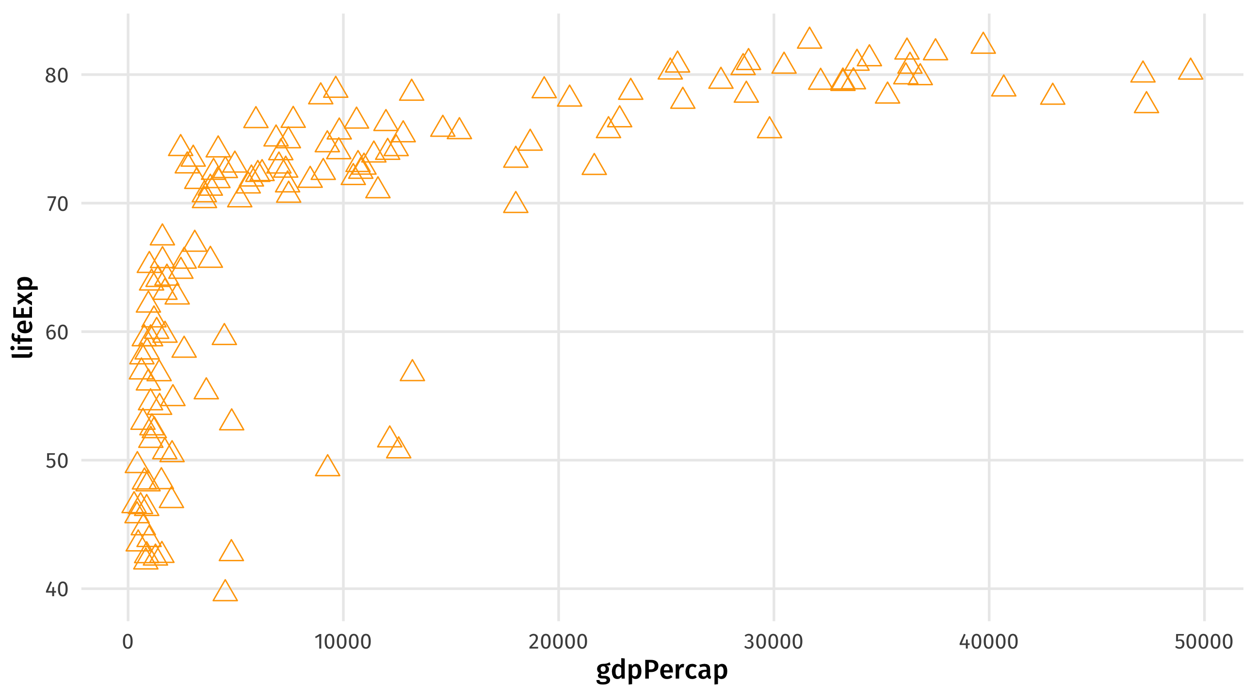
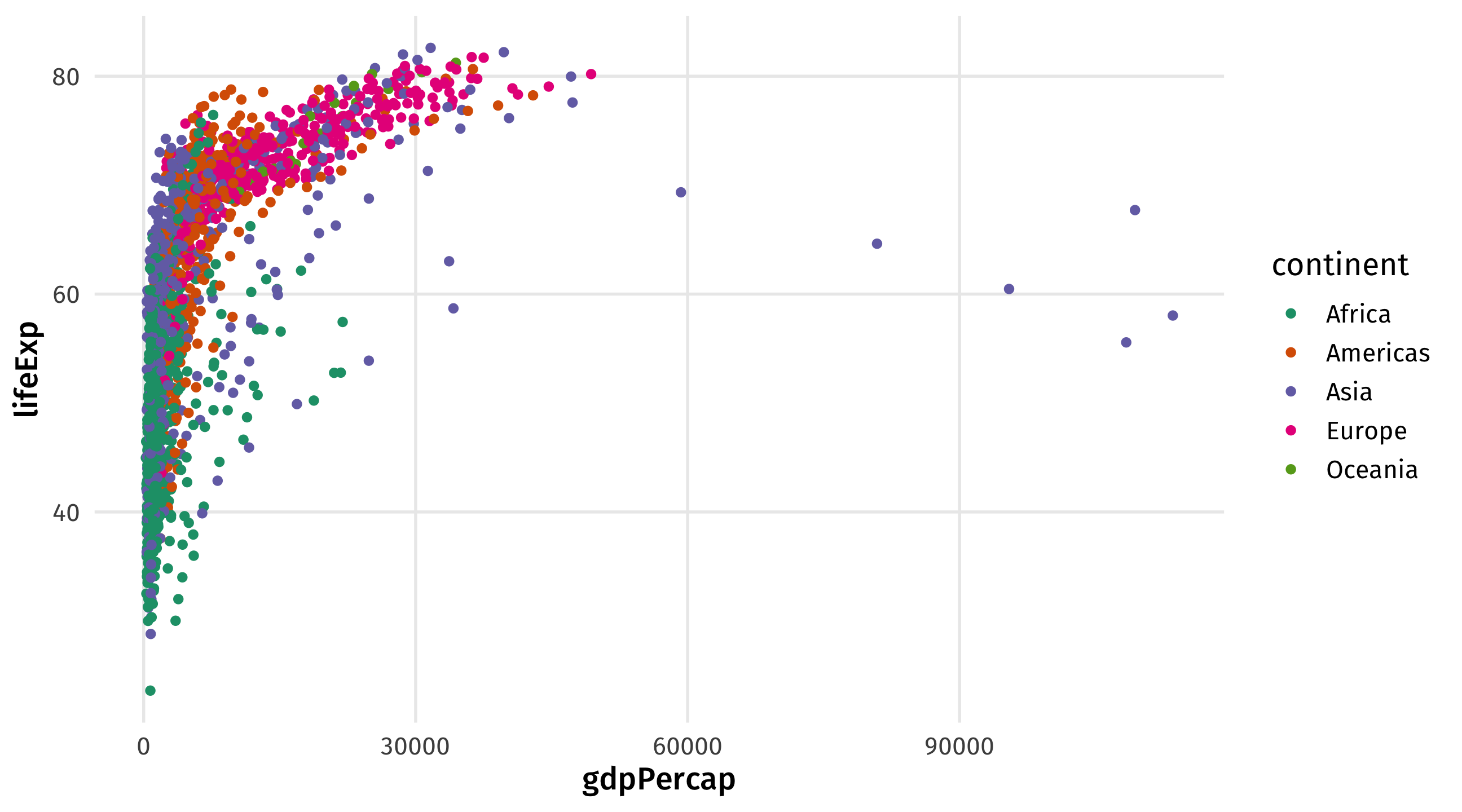
Graph 1: the scatterplot
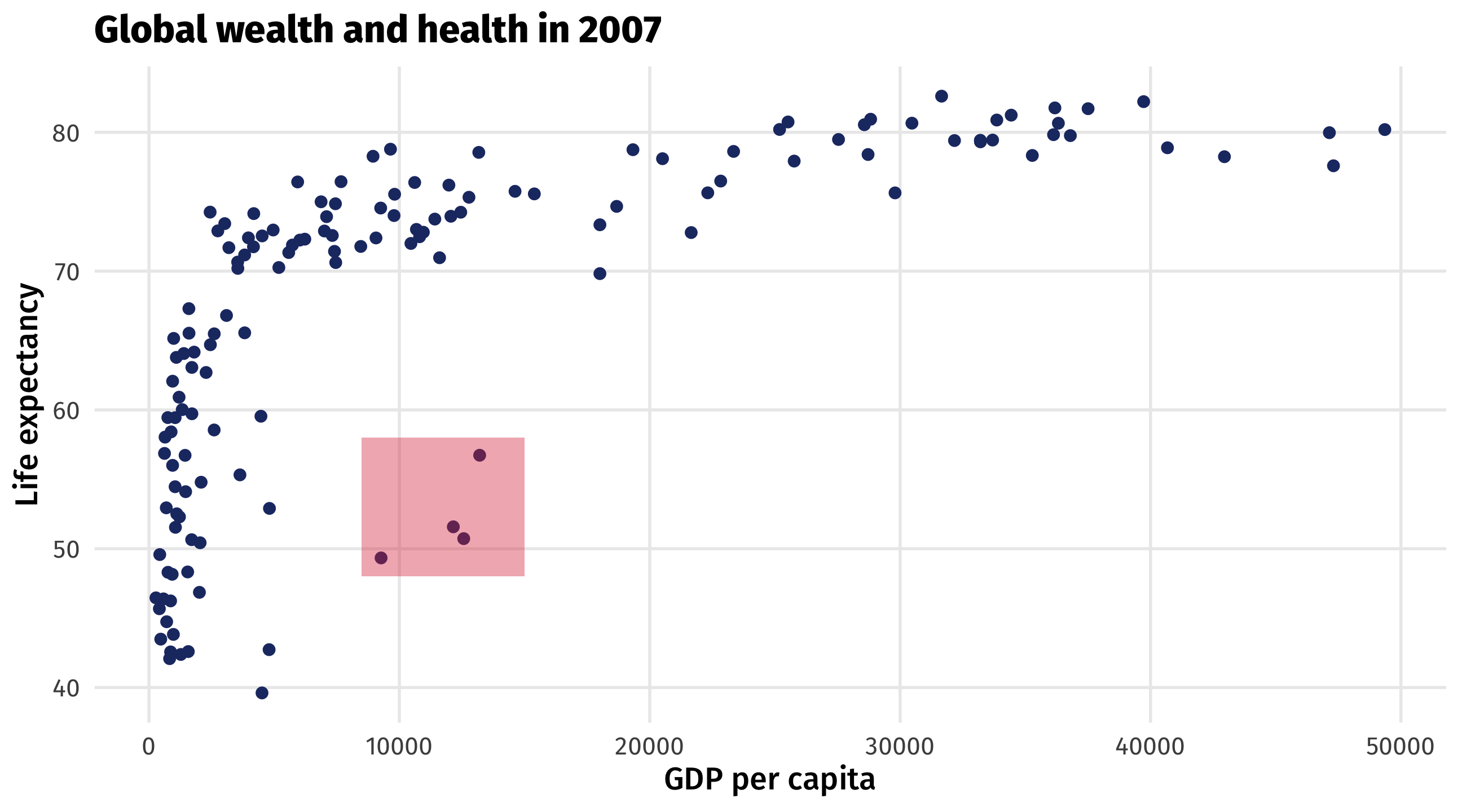
The scatterplot visualizes the relationship between two continuous variables
Shows every point in the data, reveals trends and outliers
Scatterplots are for continuous variables
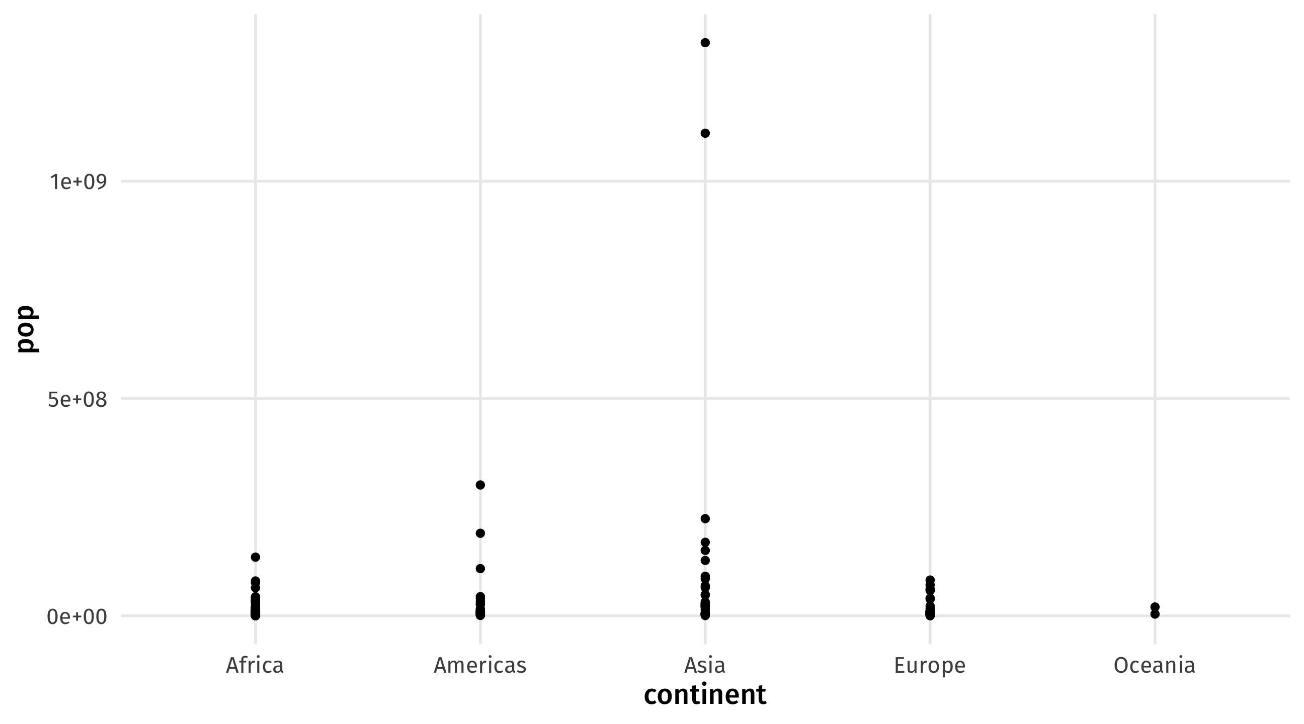
Plot is uninformative because continent is discrete (i.e., a category)
US Presidents
Code
# libraries
library(tidyverse)
library(socviz)
library(ggrepel)

# plot
ggplot(elections_historic, aes(x = popular_pct, y = ec_pct, label = winner_label,
    color = win_party, shape = two_term, label = winner_label)) + geom_hline(yintercept = 0.5,
    size = 1.4, color = "gray80") + geom_vline(xintercept = 0.5, size = 1.4, color = "gray80") +
    geom_point() + geom_text_repel() + labs(x = "Percent of popular vote", y = "Percent of Electoral College vote",
    title = "Presidential Elections: Popular & Electoral College Margins", subtitle = "1824-2016",
    color = NULL, size = NULL) + scale_y_continuous(labels = scales::percent) + scale_x_continuous(labels = scales::percent) +
    scale_color_manual(values = c(yellow, red, blue, "gray")) + theme(legend.position = "none")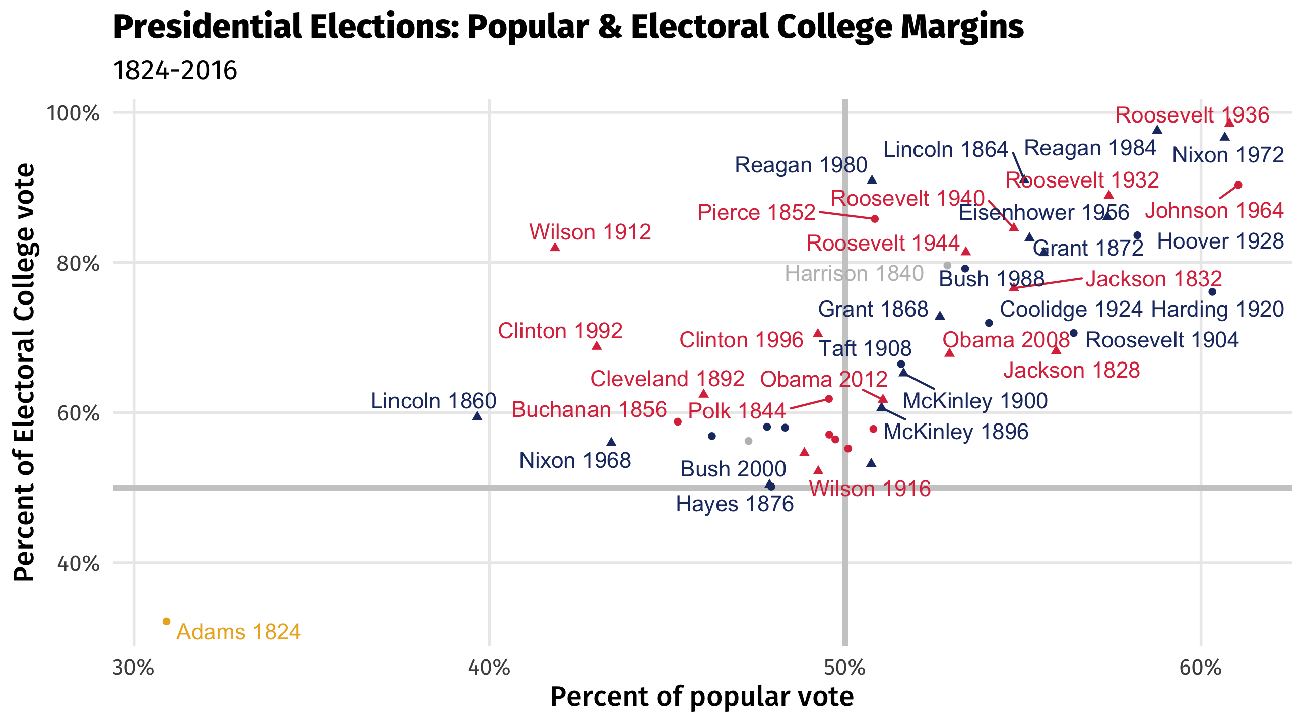
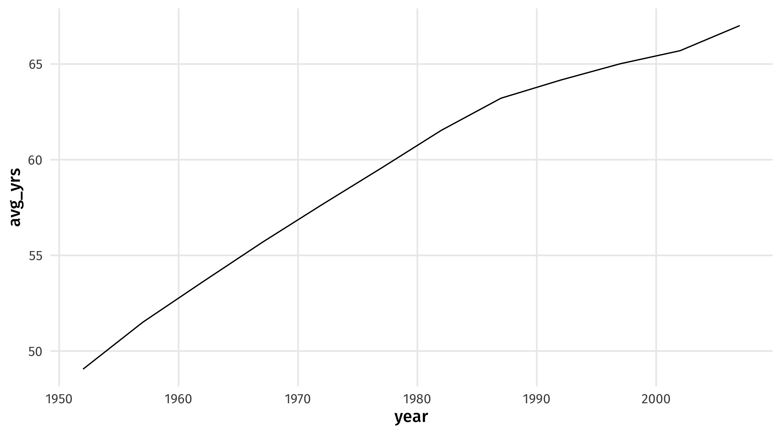
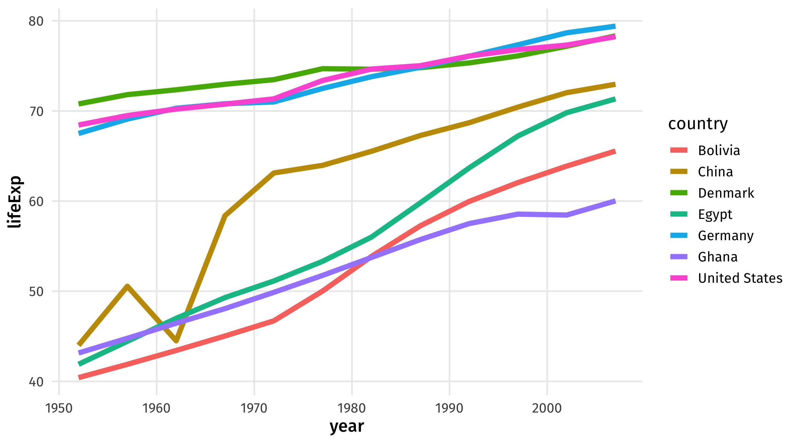
Graph 2: the time series
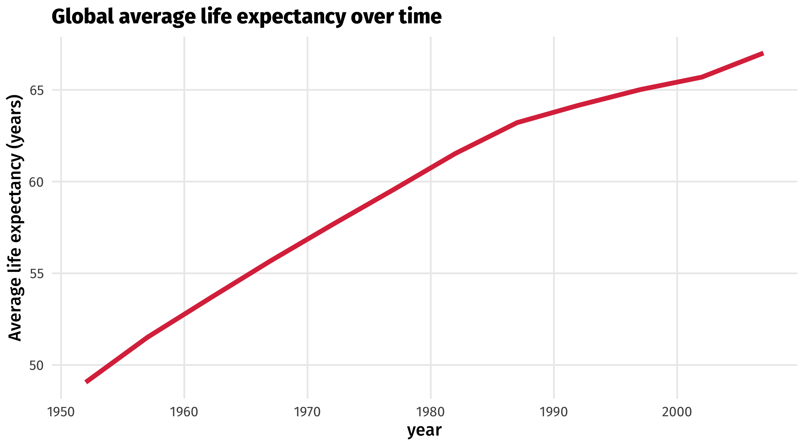
The time series uses a line to show you how a variable (y-axis) moves over time (x-axis)
The time series
What we want:
Start from scratch

Add aesthetics
Add geometry: 🤢
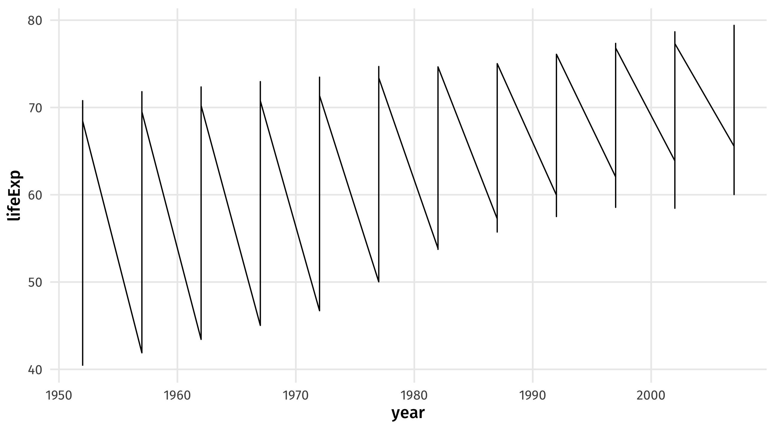
Why?
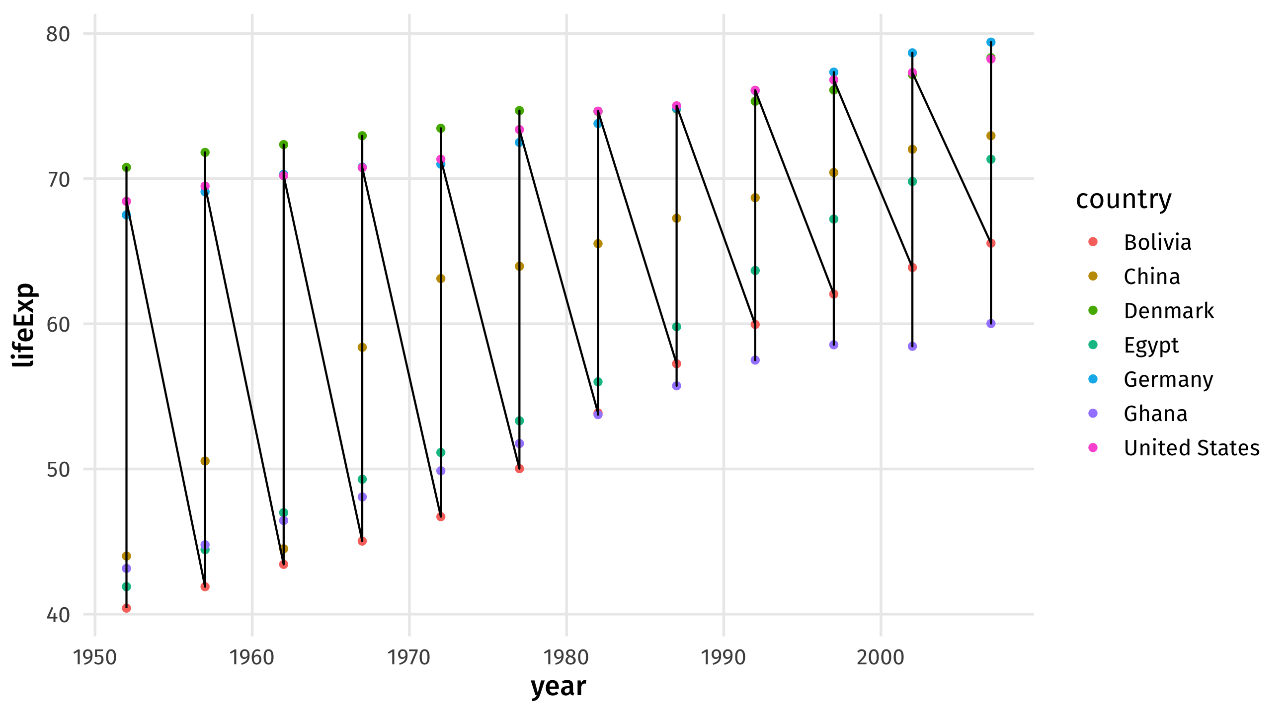
In each year we have multiple points (because multiple countries), ggplot() tries to connect them all
using color to separate lines
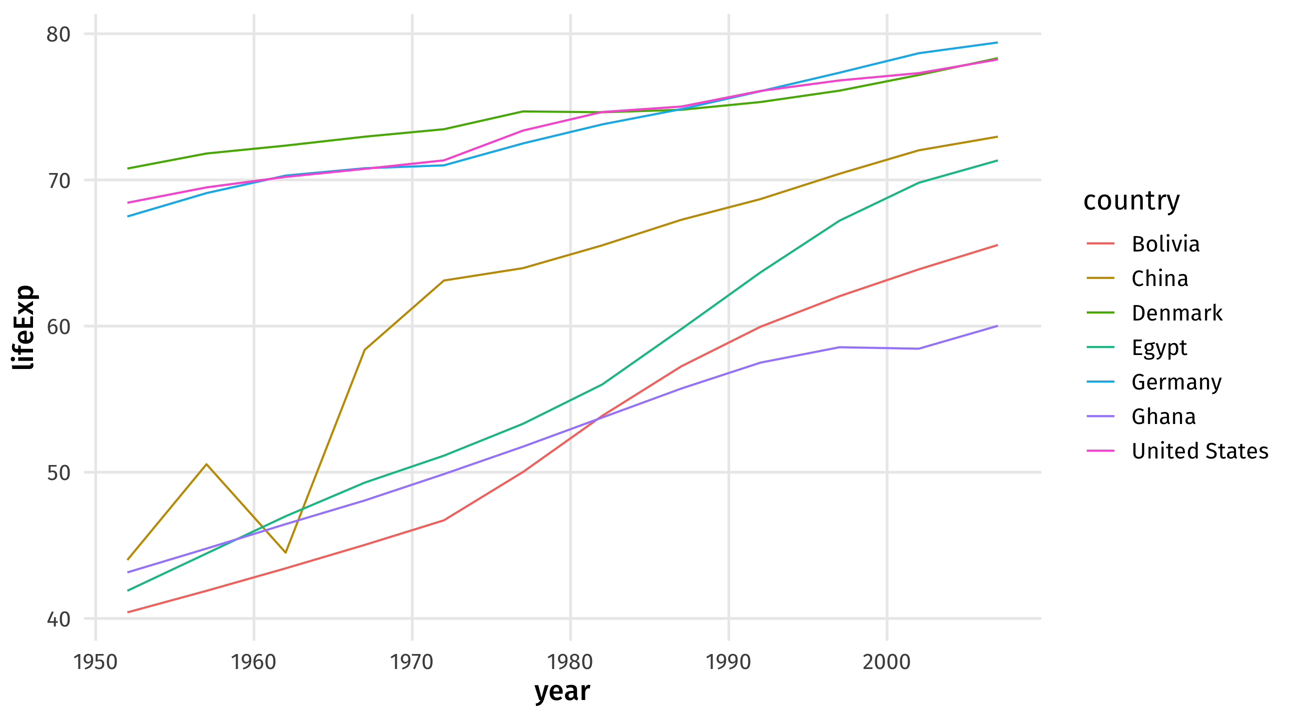
Multiple time series

These are useful for comparing trends across units (countries, places, people, etc)
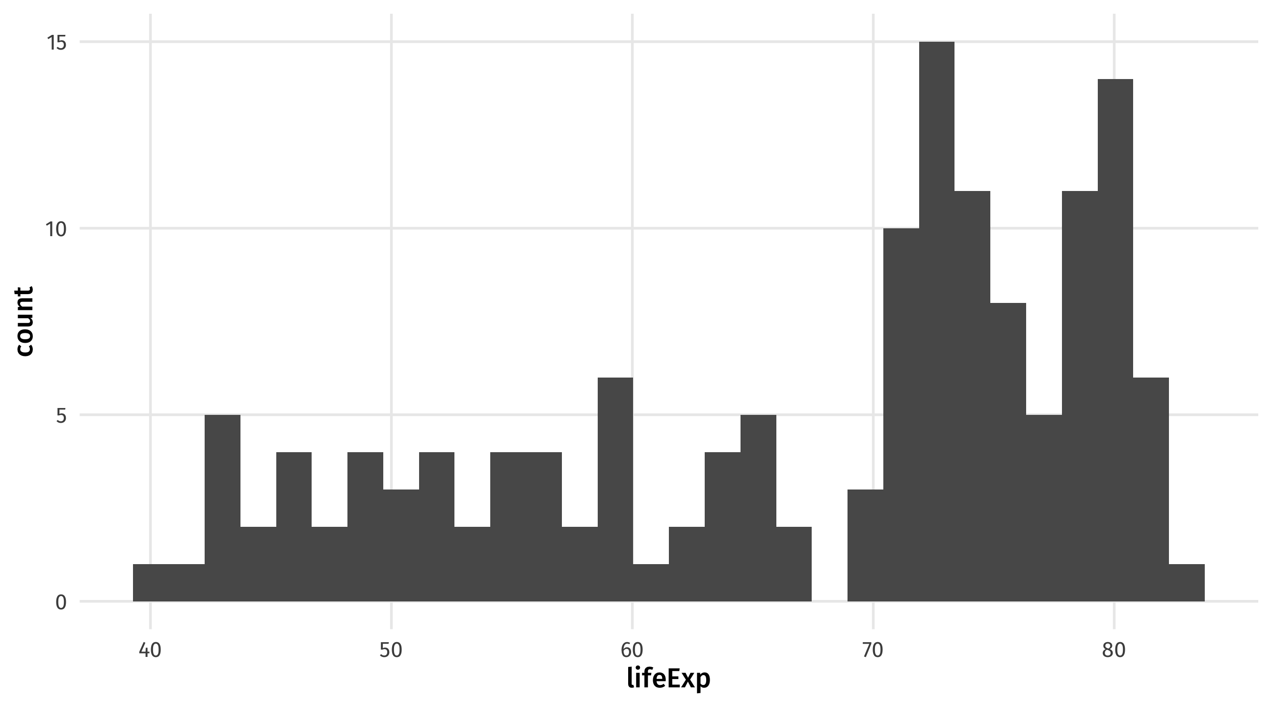
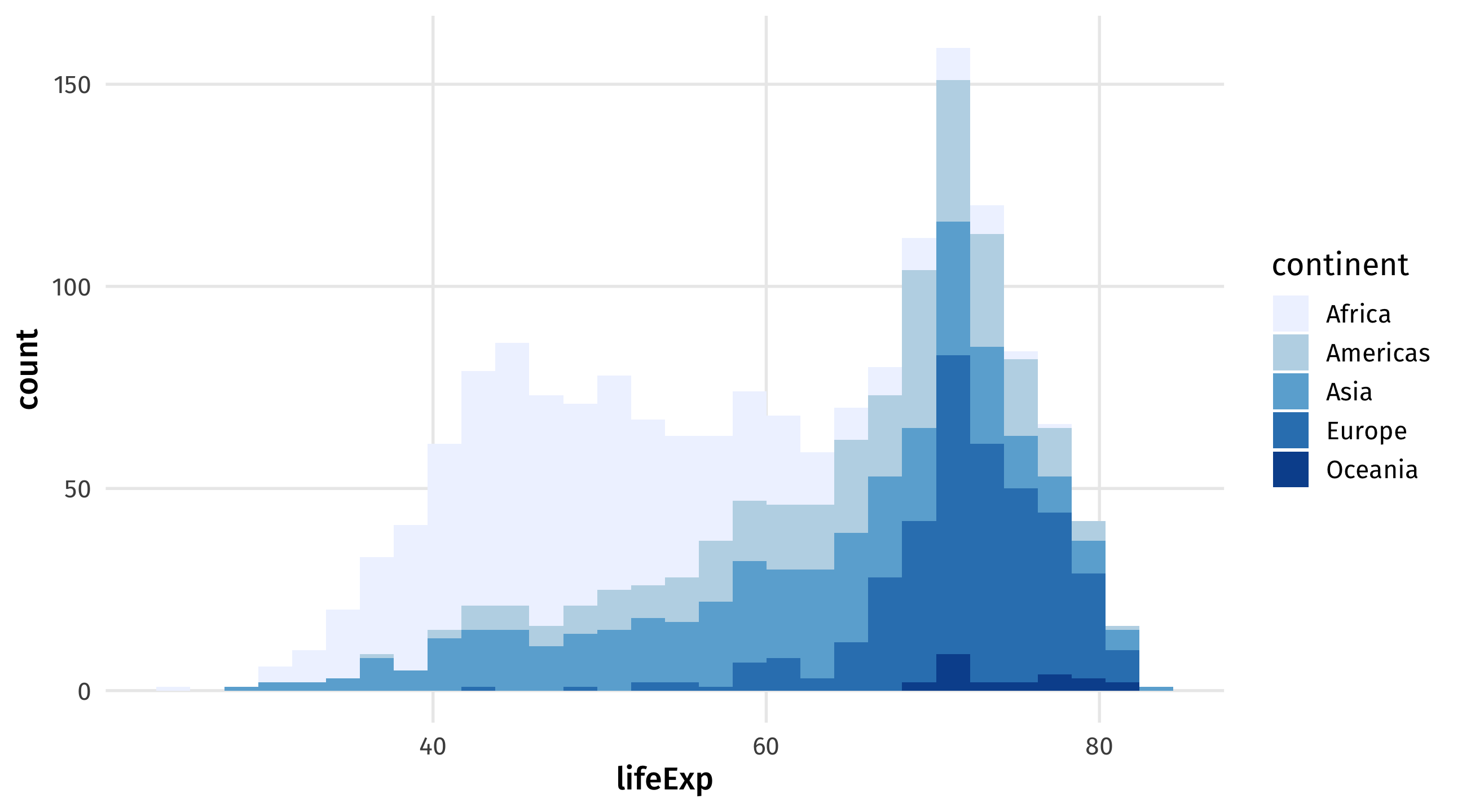
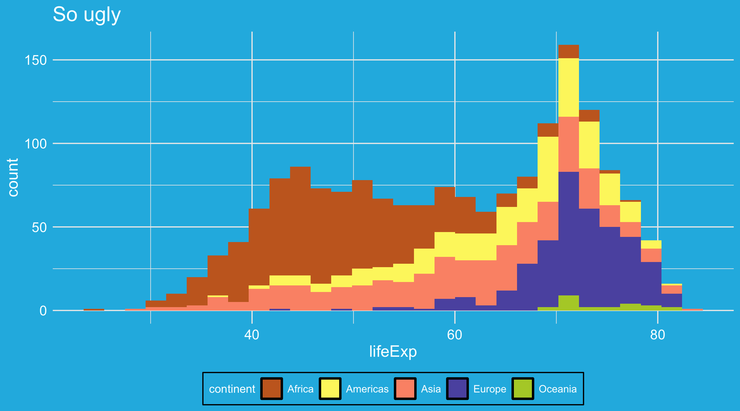
Graph 3: the histogram

A histogram shows you how a continuous variable is distributed
Interpreting histograms
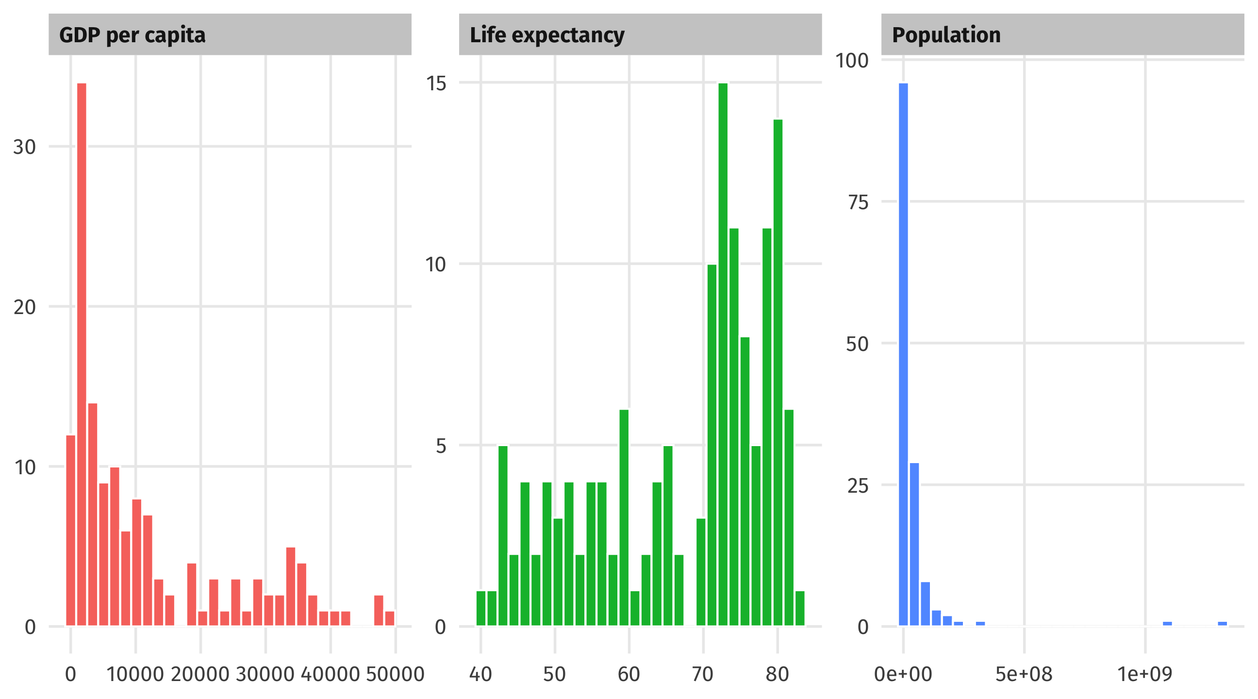
The histogram
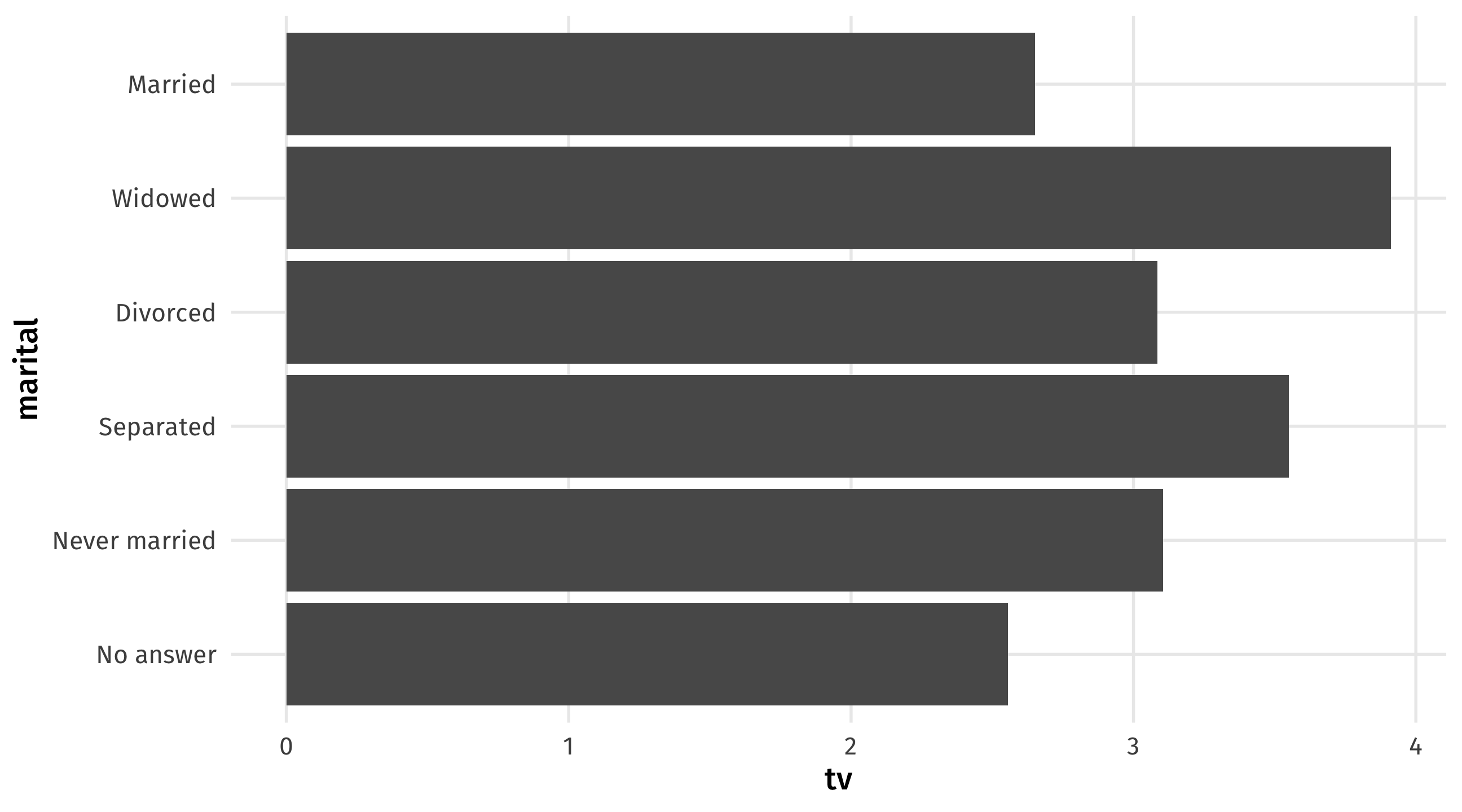
Graph 4: the barplot

Barplots place a category (place, country, person, etc) on one axis and a quantity (amount, average, median, etc.) on another
Useful for making comparisons, highlighting differences
The barplot
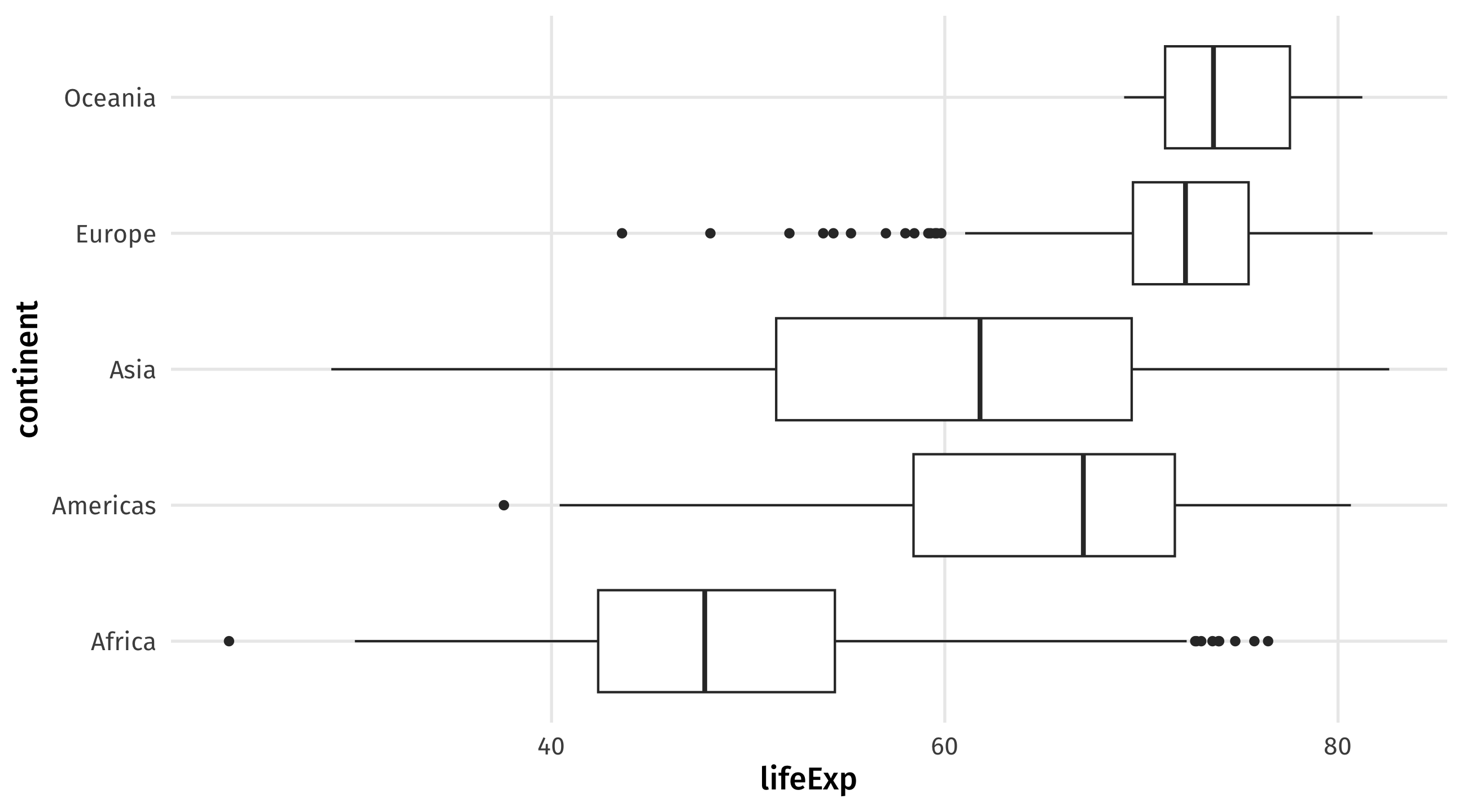
Graph 5: the boxplot
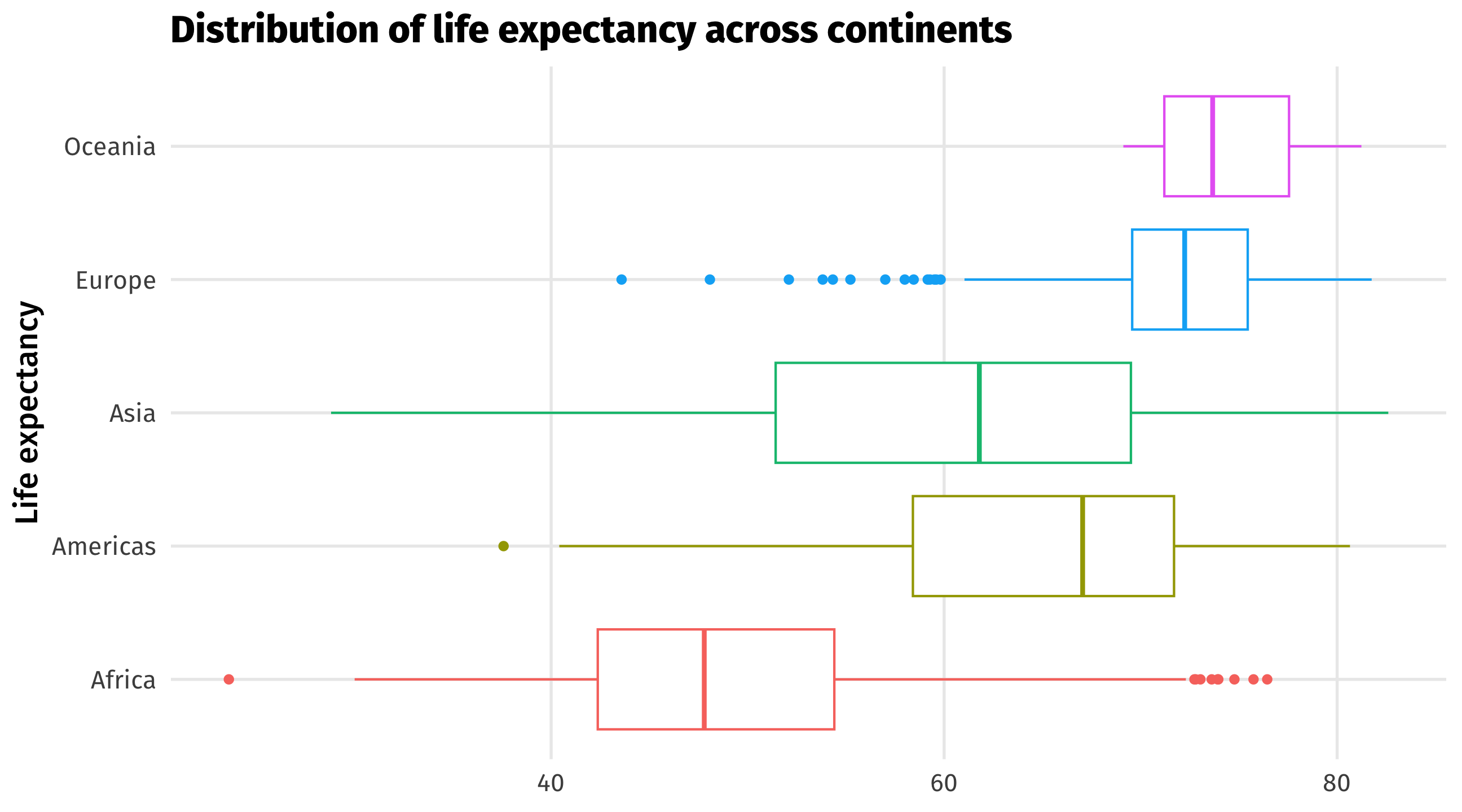
Boxplots compare distributions of continuous variables across groups
Compare distributions: the boxplot
Boxplots contain a lot of info 🥵:
- bold line is the median observation
- box is the middle 50% of observations
- thin lines show you min and max value, except…
- the dots, which are outlier observations

The boxplot
Customize geometries
Change your geometries by adding arguments to geom_*(), like size, shape, color, etc.
Use different color and fill scales
scale_fill_brewer() for fill, which we use for columns, histograms, 2D stuff
Use different color and fill scales
scale_color_brewer() for color, which we use for points, lines, less than 2D stuff
My favorite scale (right now)
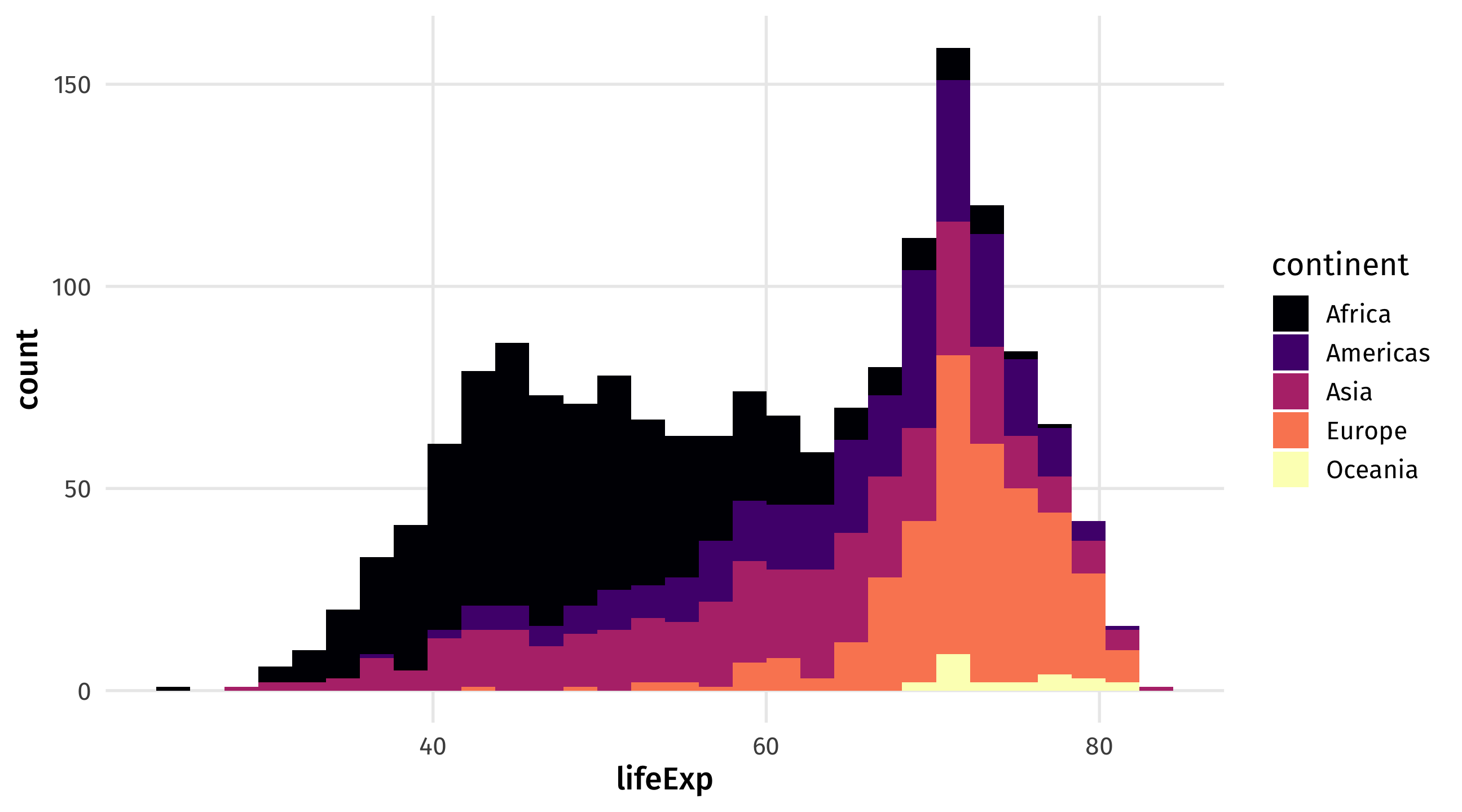
scale_fill_viridis_d for discrete variables, scale_fill_viridis_d for continuous
Add themes
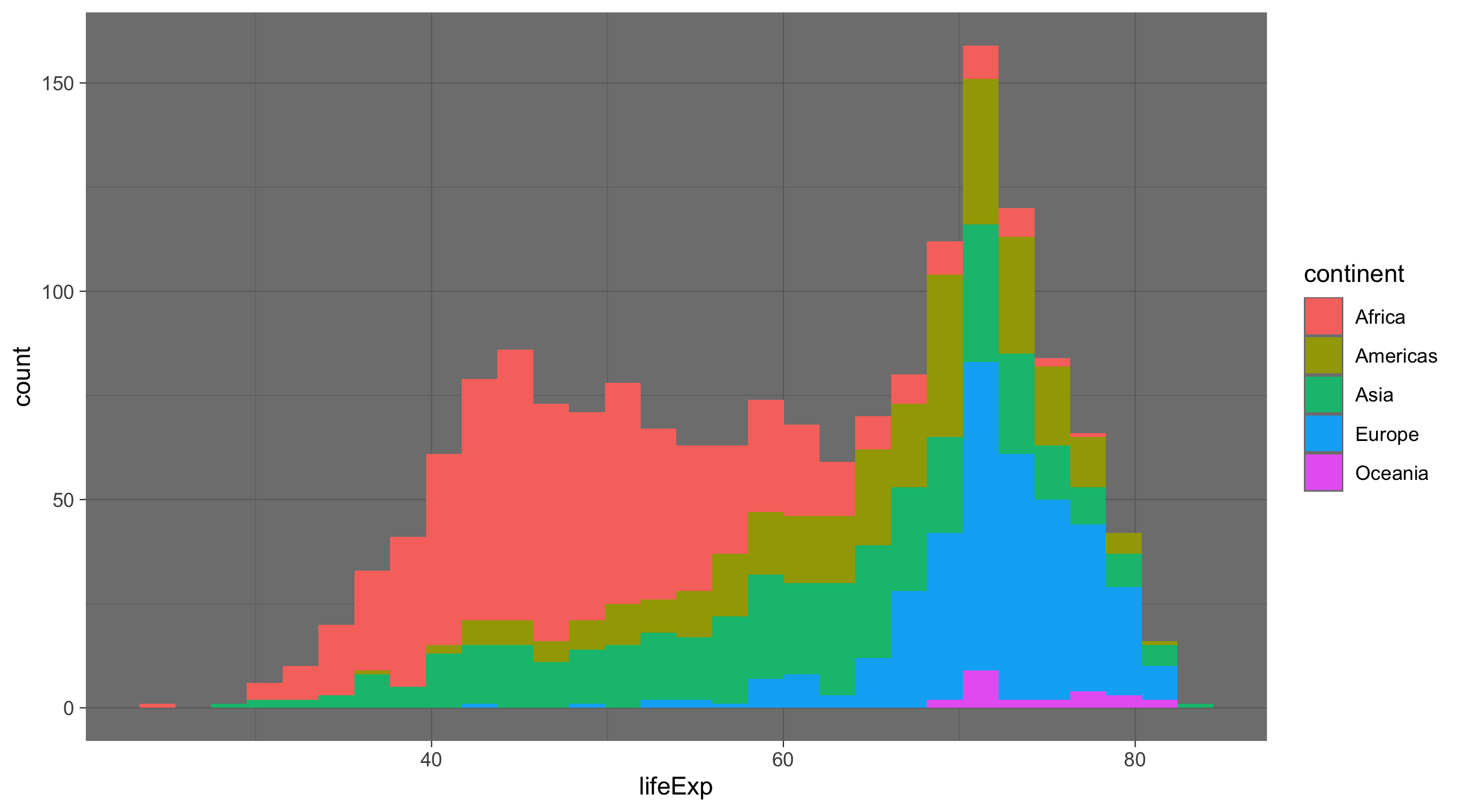
Preset themes in tidyverse include theme_dark(), theme_light(), theme_minimal(), theme_void()
Many other custom themes
theme_spongeBob() from tvthemes package, many more online