Data visualization I
POL51
September 30, 2024
Not telling The Truth™️
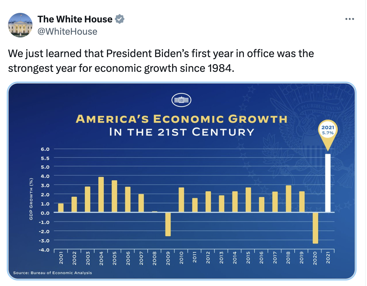
What’s not true here?
Selectively presenting data
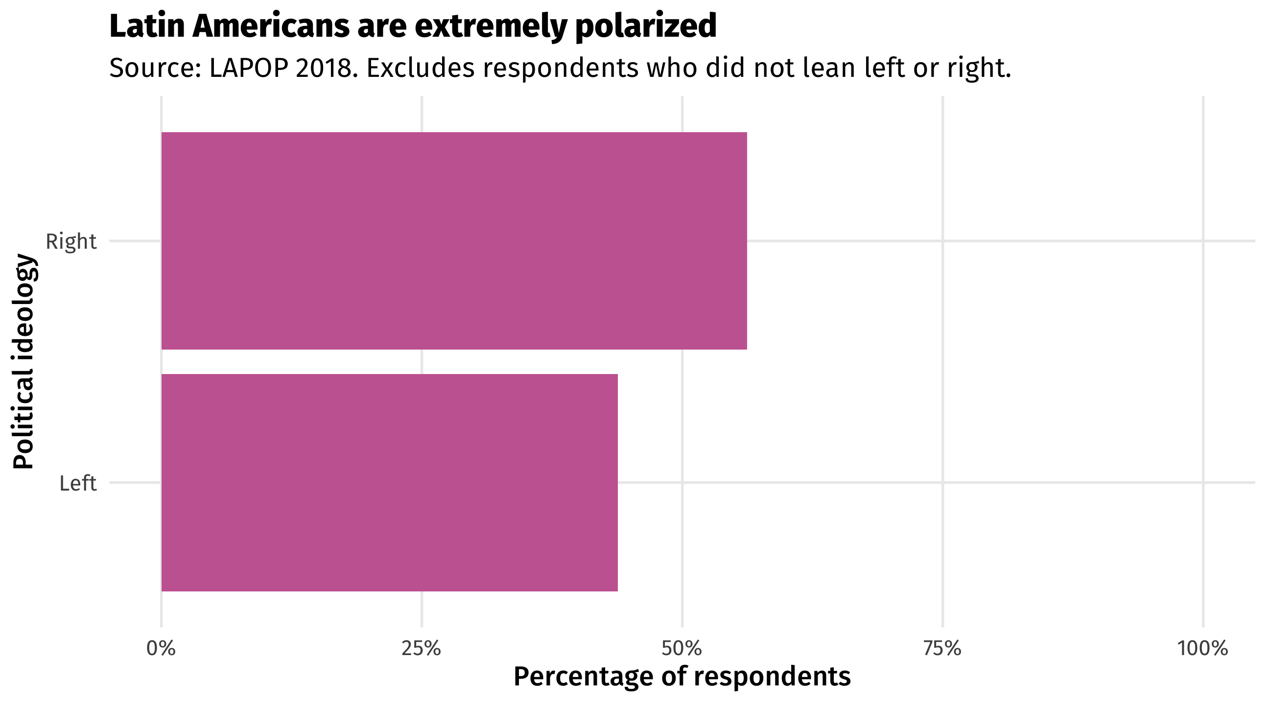
Selectively presenting data
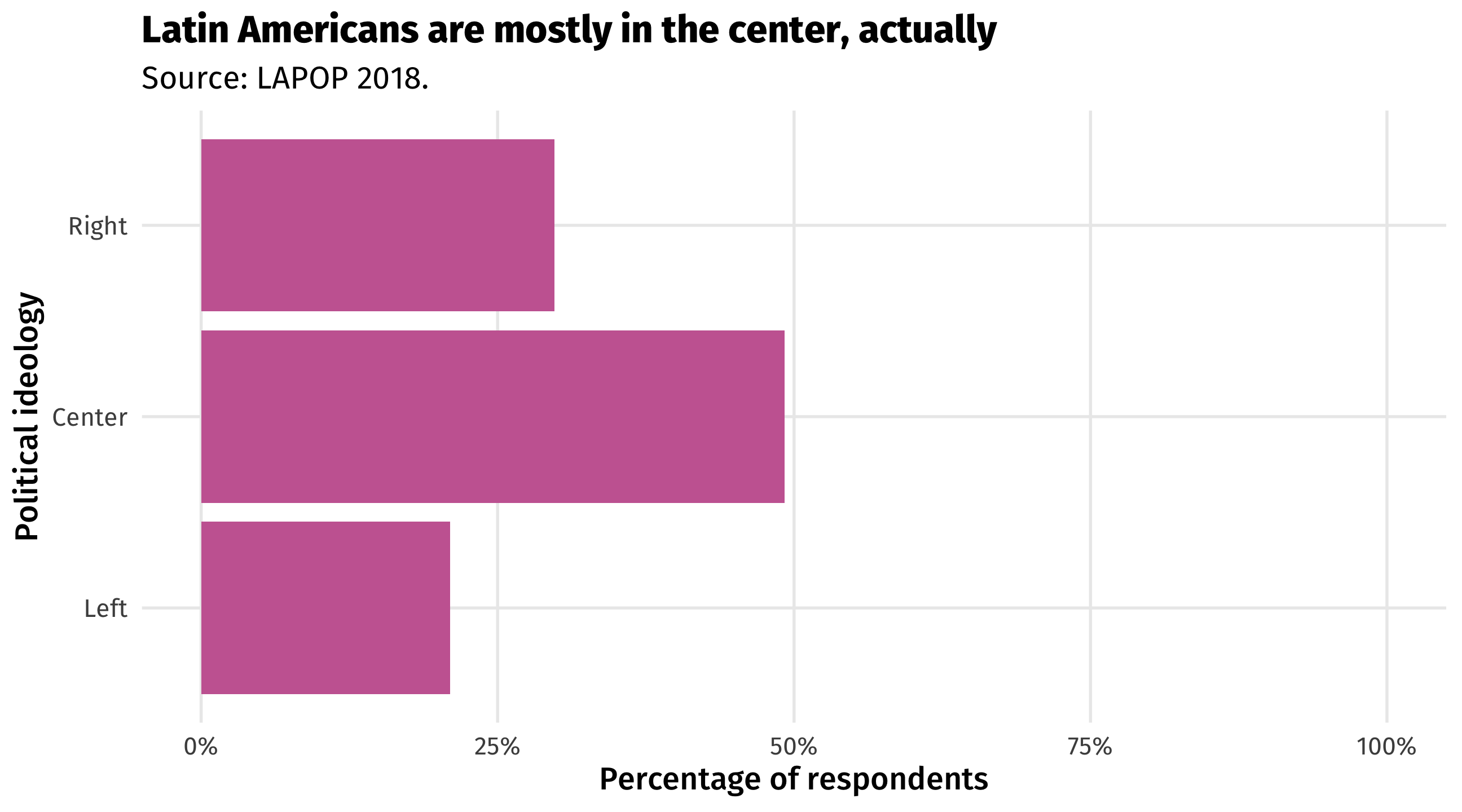
Selectively presenting data is one way of not telling The Truth™️
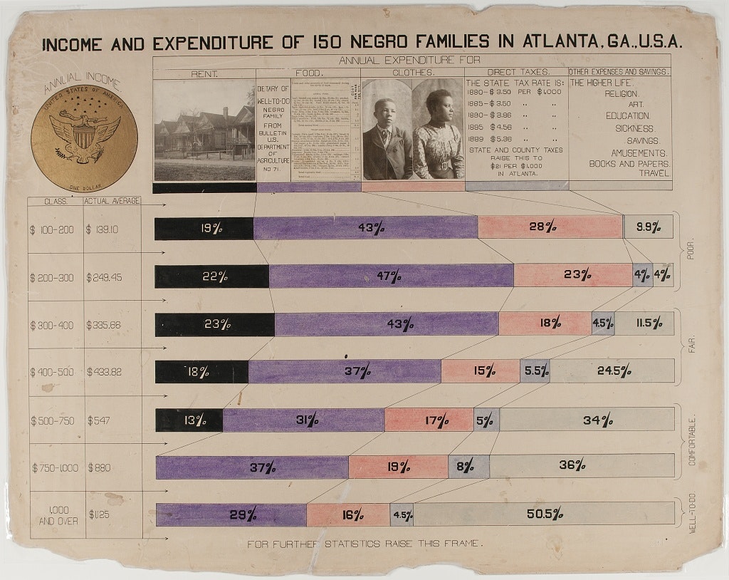
Summarized data can hide important details
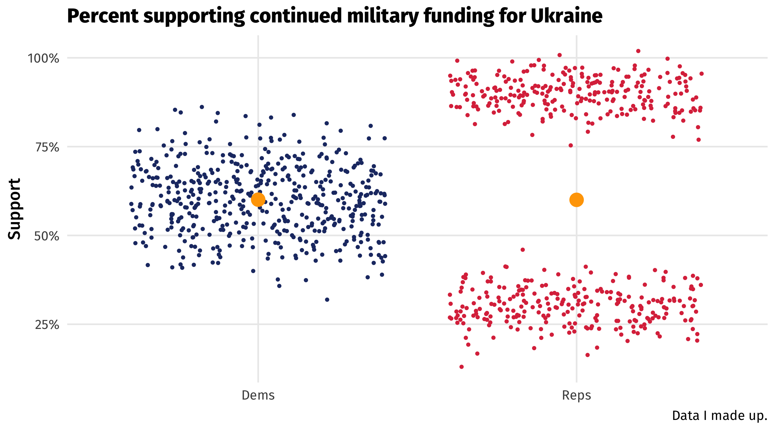
Averages (left) are useful, but can be misleading
Raw data (right) can be more informative
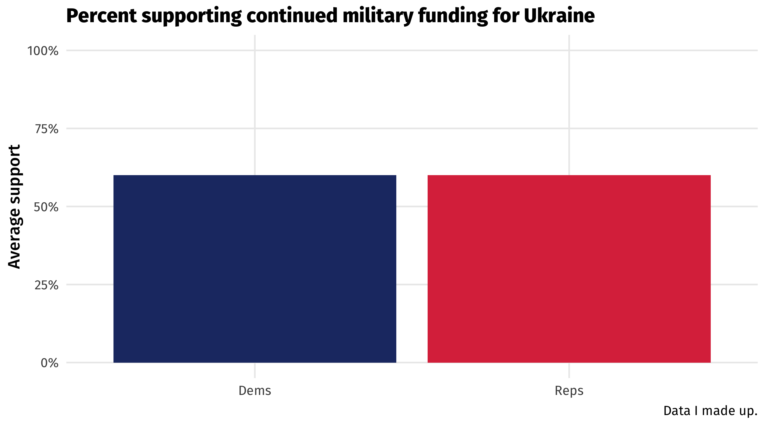
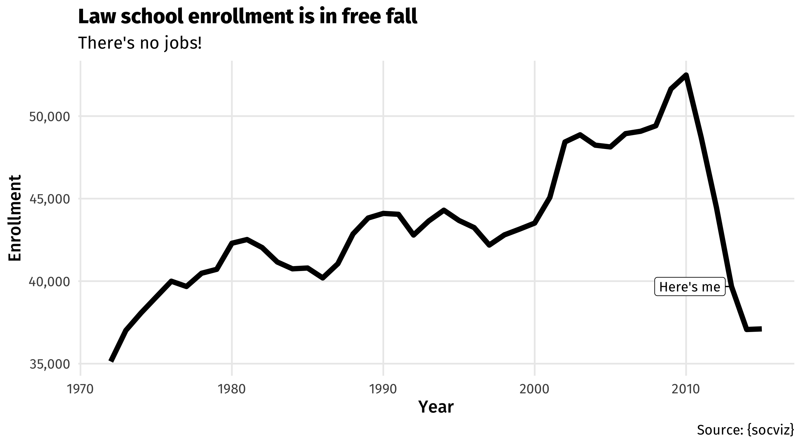
Lying with the Y-axis
- Lots of shenanigans with the Y-axis, especially when it doesn’t start at zero \(\rightarrow\) exaggerates differences
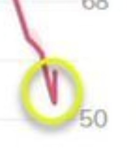
Is a y-axis that excludes zero misleading?
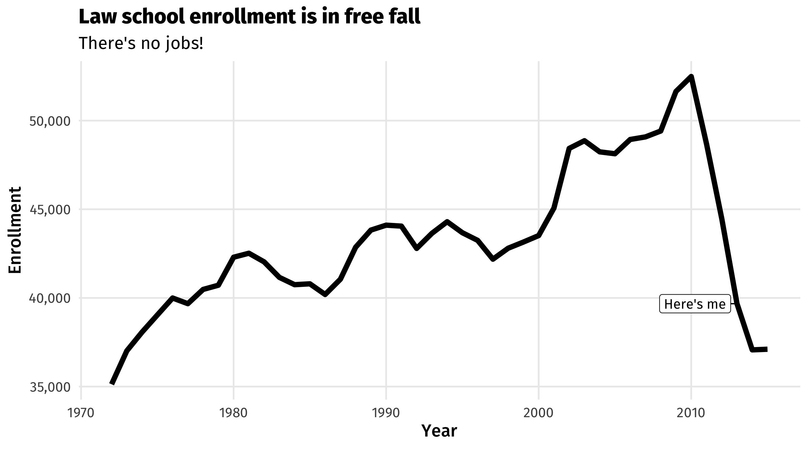
- When I was in your shoes, there was a panic about oversupply of lawyers
Is a y-axis that excludes zero misleading?
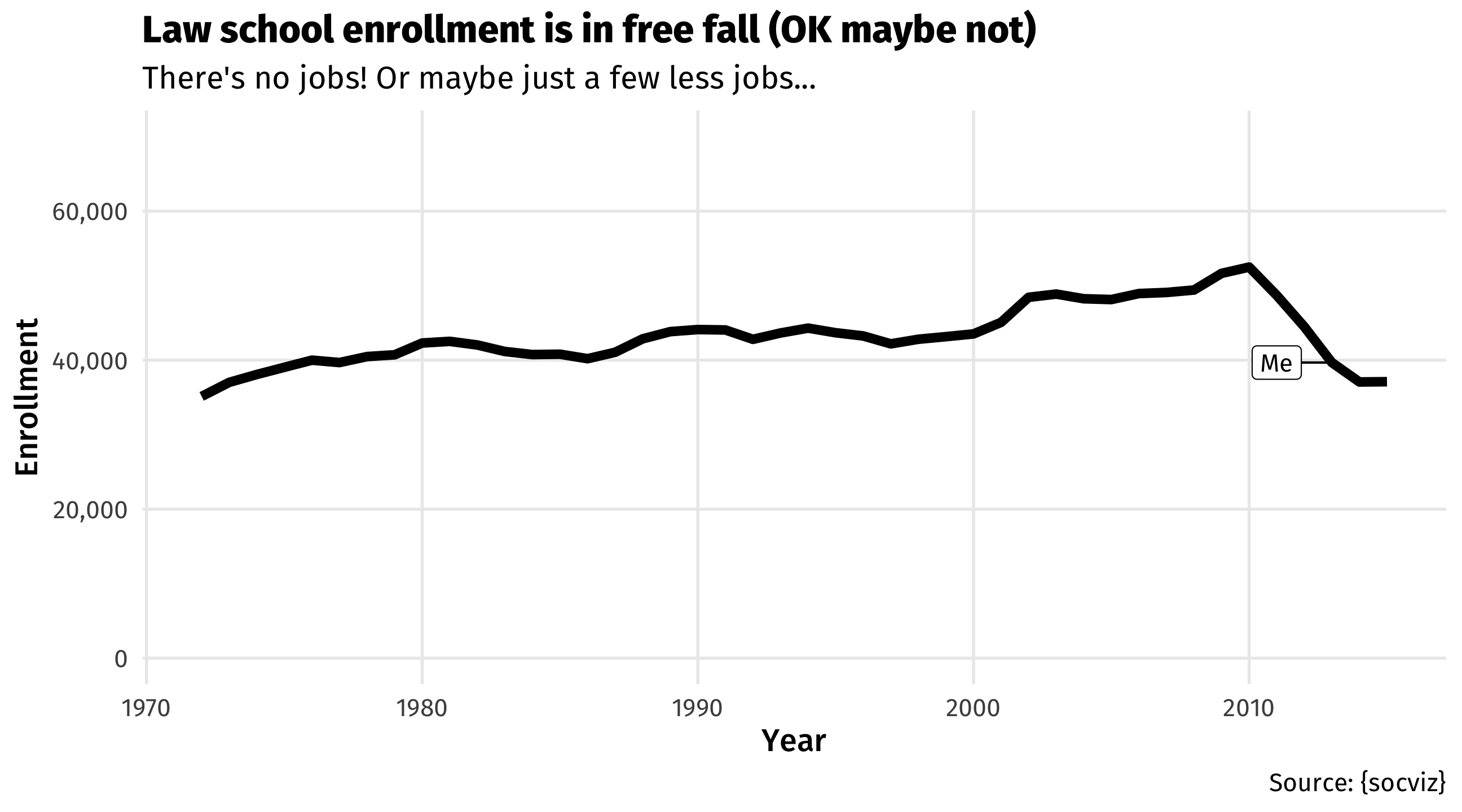
- A Y-axis that starts at zero can give us context (and relief) about the magnitude of the change
Should the y-axis always start at zero?
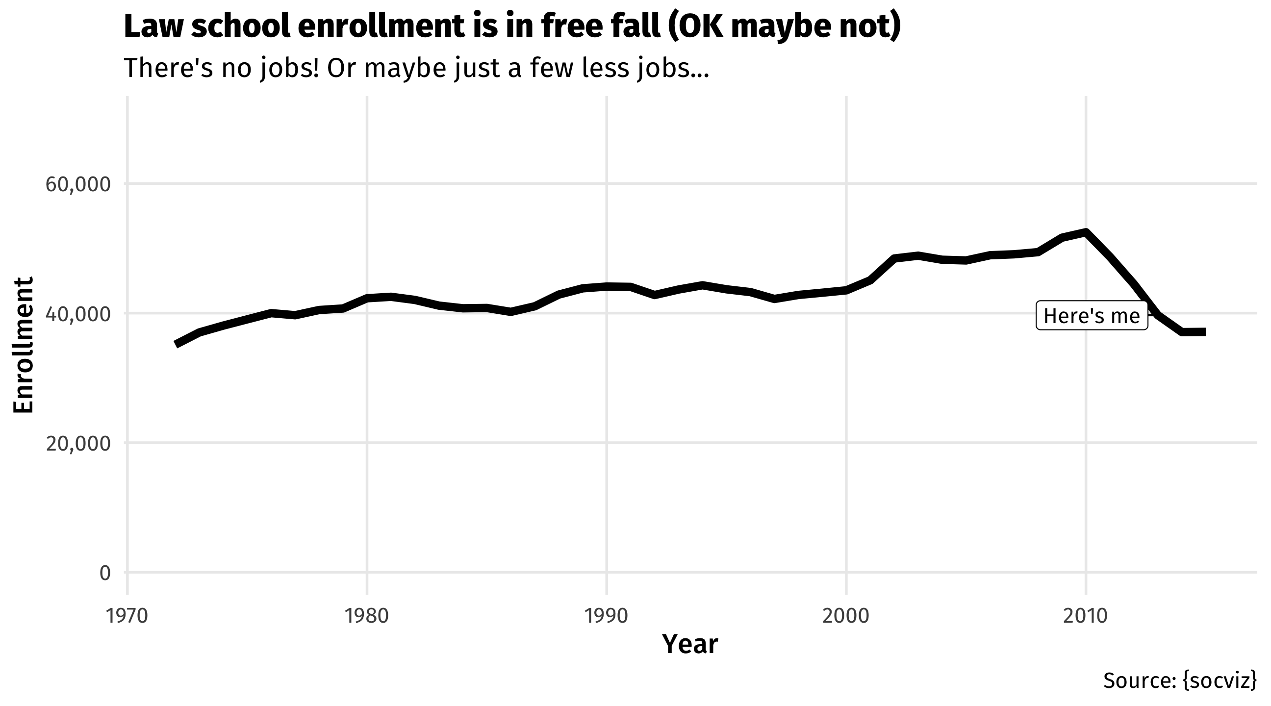
“graphs that don’t go to zero are a thought crime” (Fox, 2014)
is this necessarily true though?
Counterpoint: both of these graphs contain useful information
Which graph is more informative?
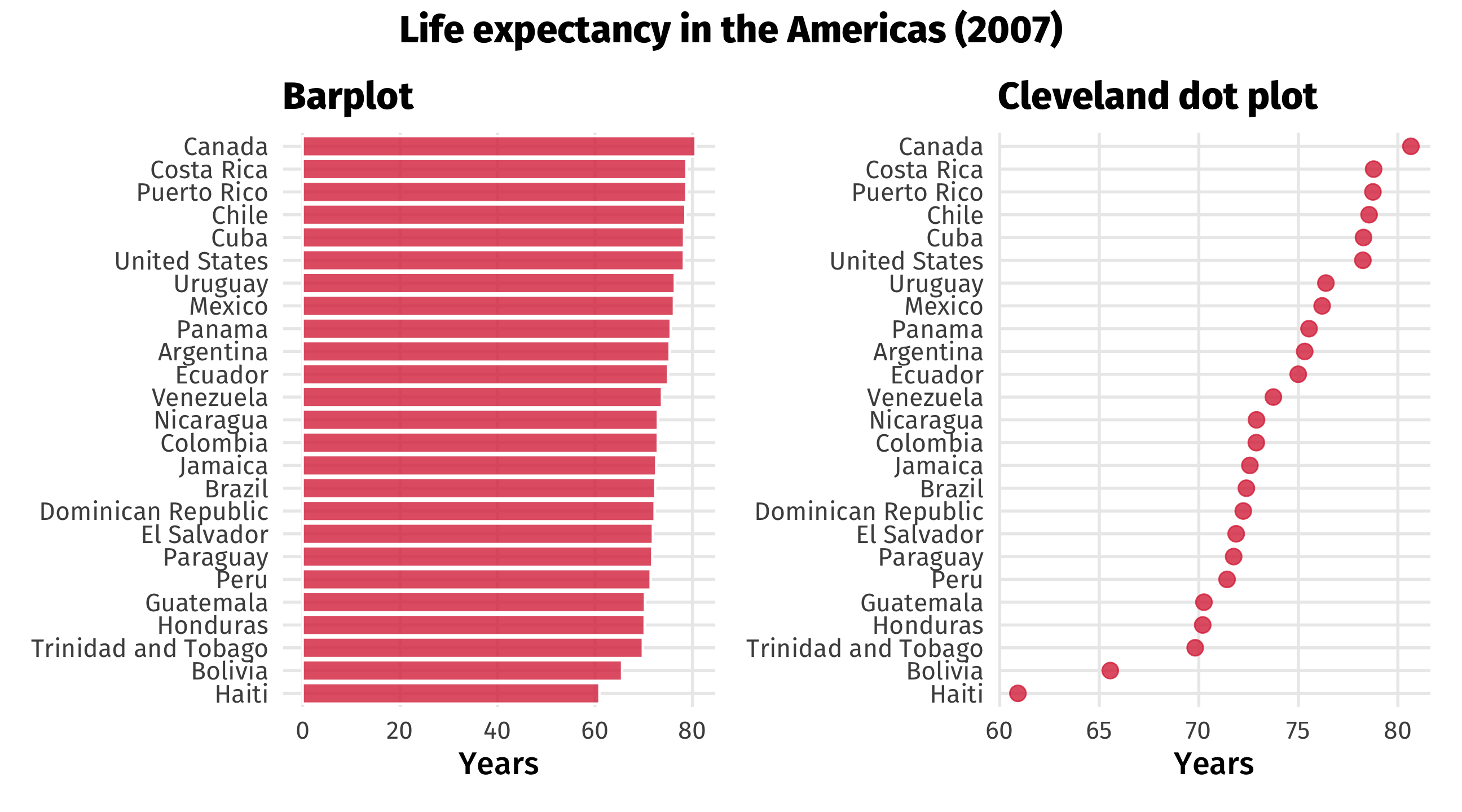
- Case for right: an average life expectancy of zero is not plausible
Should the y-axis always start at zero?
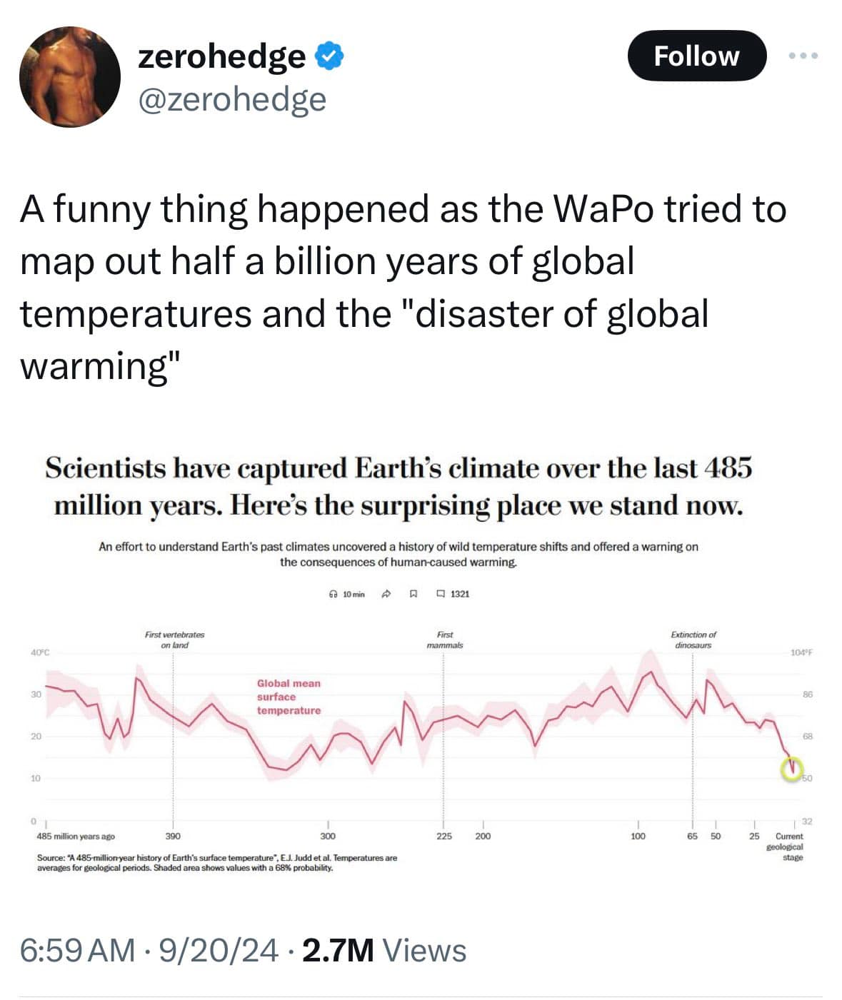
- Critics argue that in context, recent warming is not so dramatic
Should the y-axis always start at zero?

But is zooming out useful here? Is “temperature at which dinosaurs went extinct” valid context for us now?
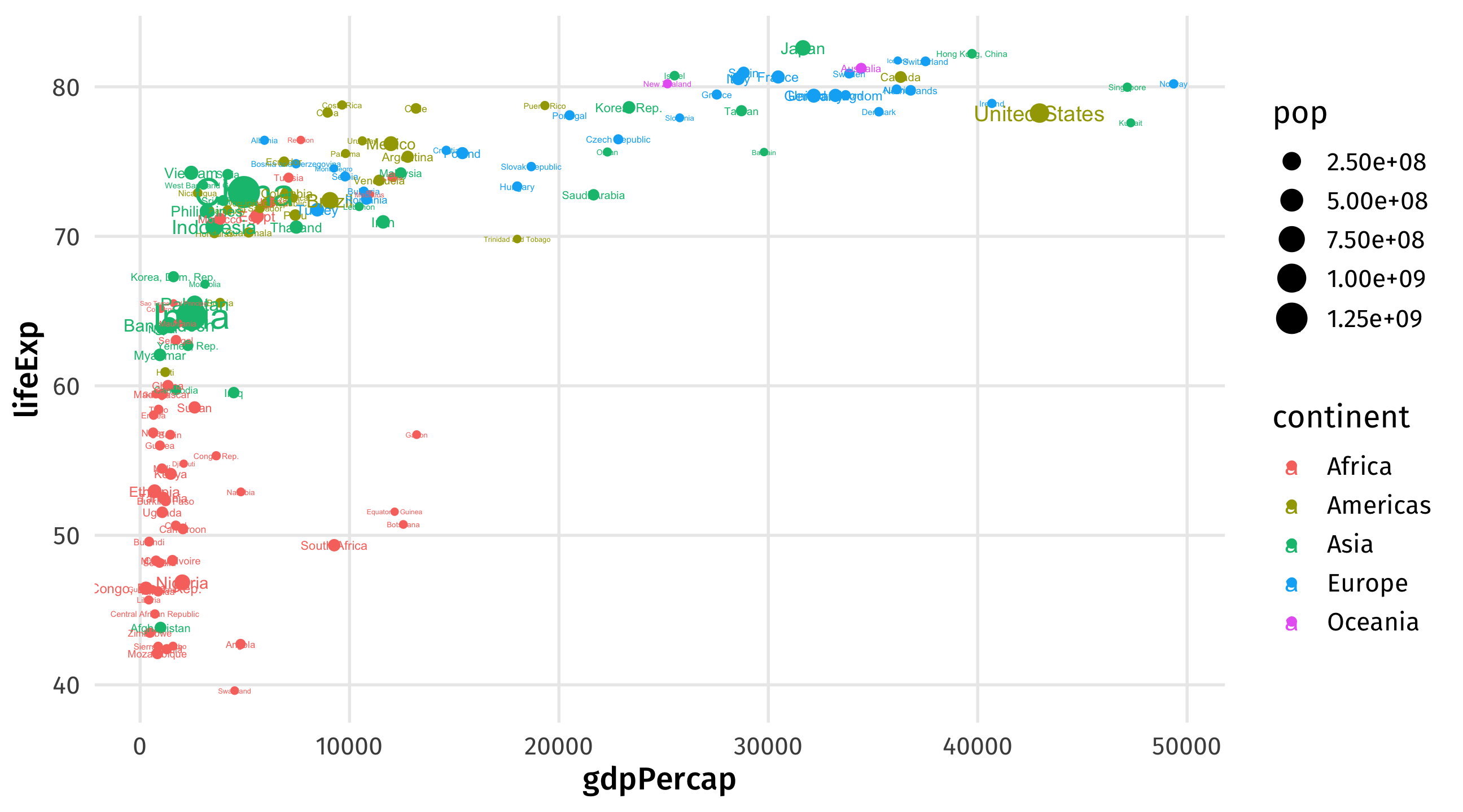
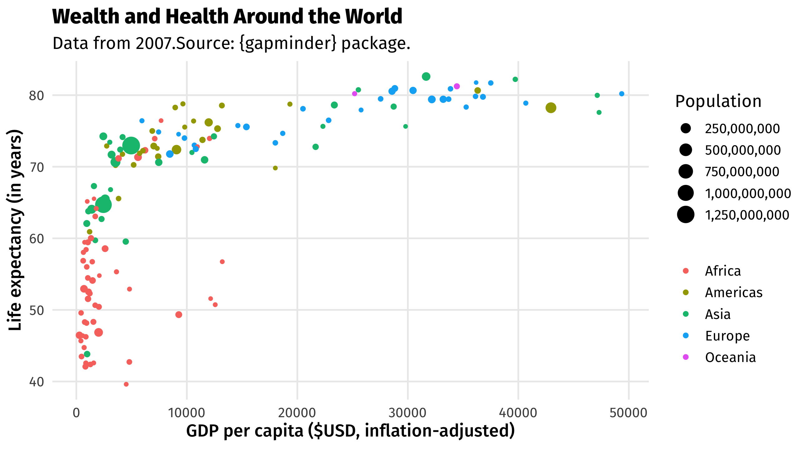
The final graph
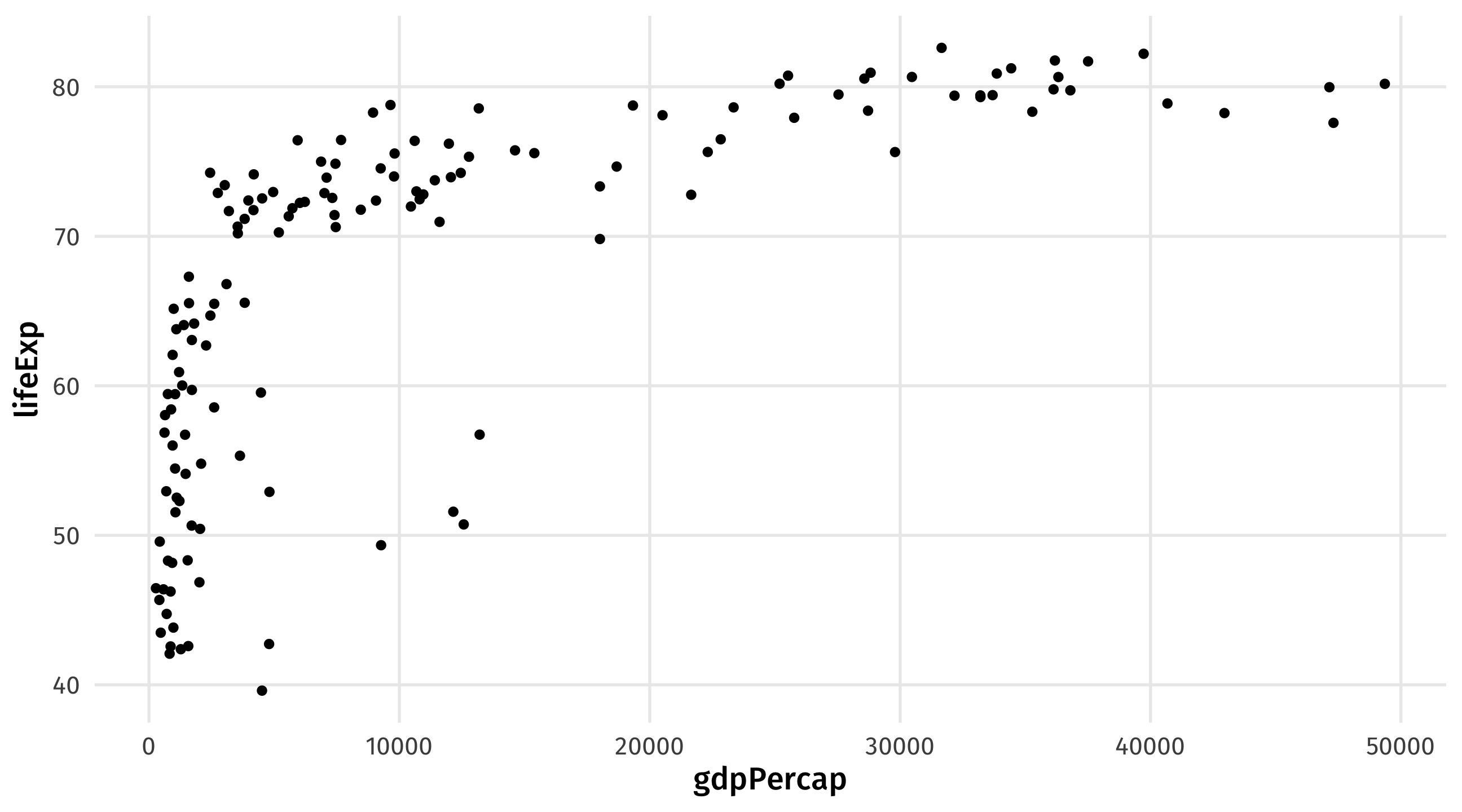
ggplot(): our first function 😢

ggplot: specify the data

Our data is named gap_07 (The Gapminder dataset for the year 2007)
Use aes() to map variables to aesthetics

Note
aes() goes within ggplot()
Map GDP to the x-axis
Map Life expectancy to the y-axis
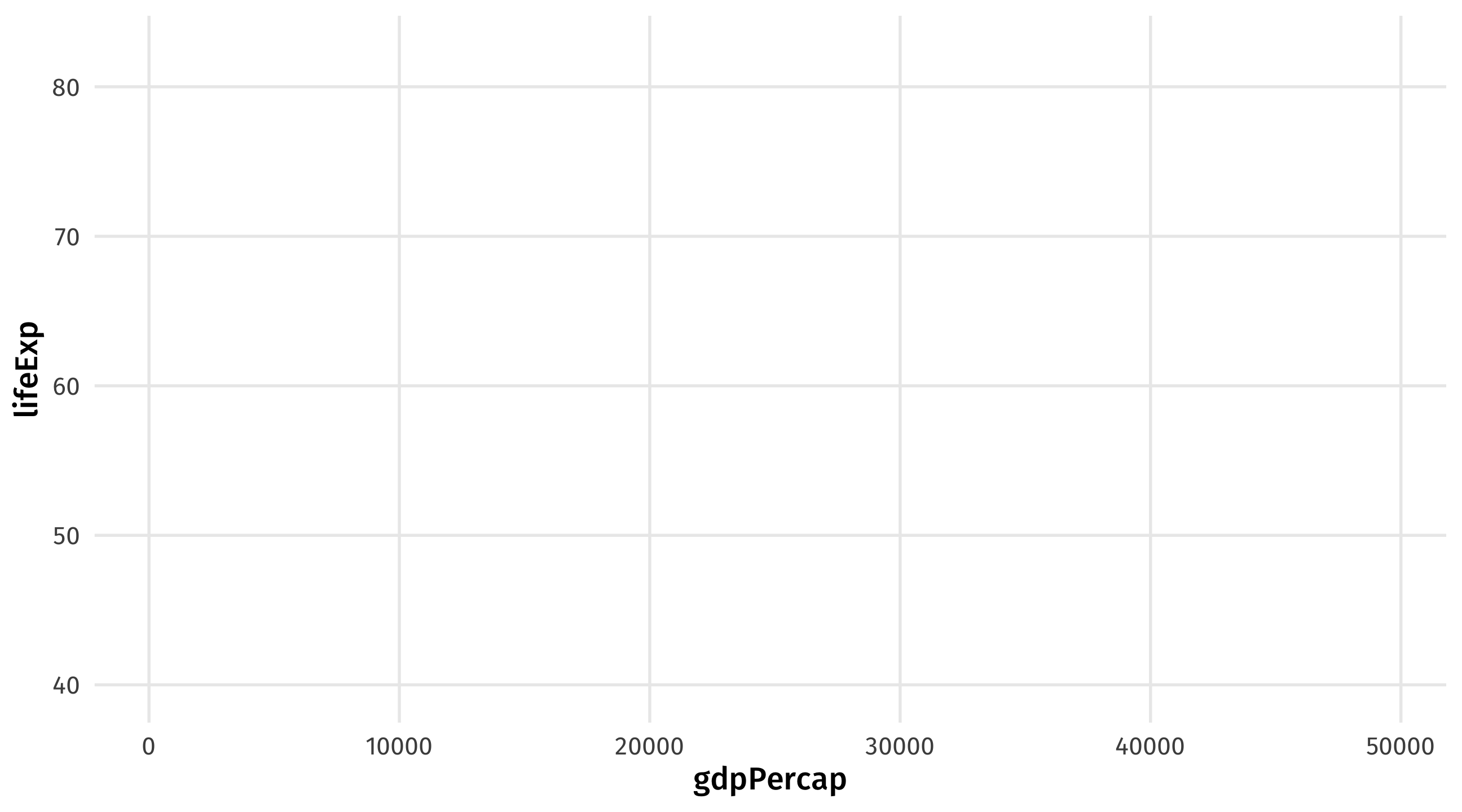
add (point) geometries using +
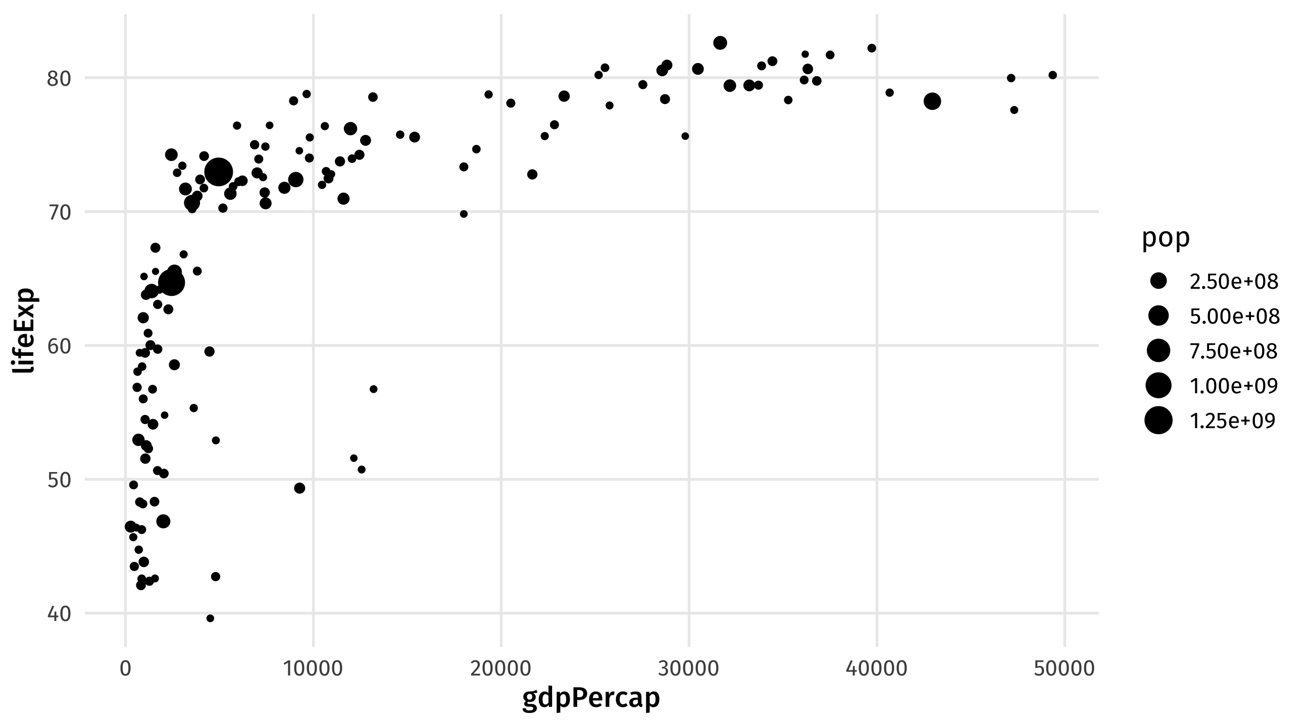
mapping population to size in aes()
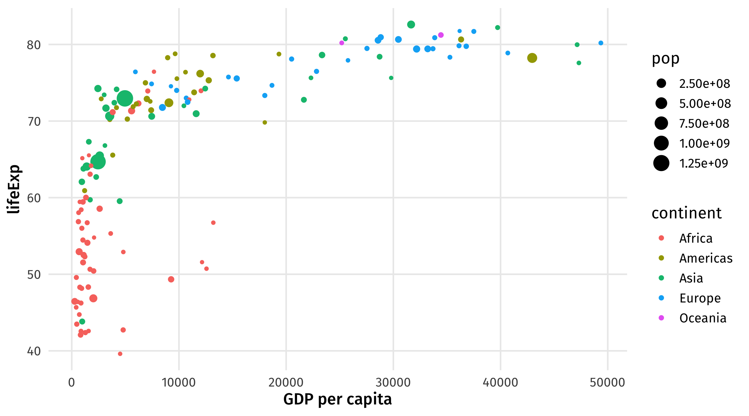
mapping continent to color in aes()

Other layers: replace the default titles with labs()
Notice that text is placed within quotation marks!
Other layers: replace the default titles with labs()
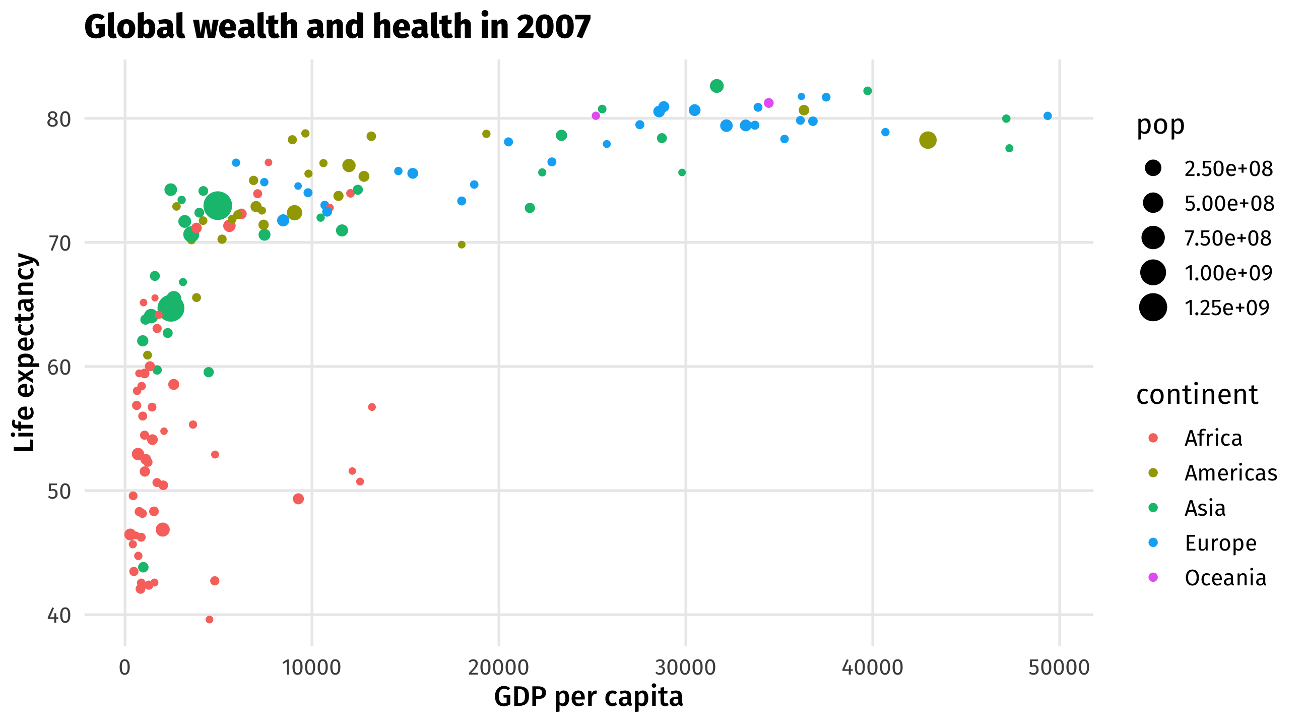
Notice that text is placed within quotation marks!
What’s that country way out on the bottom right?
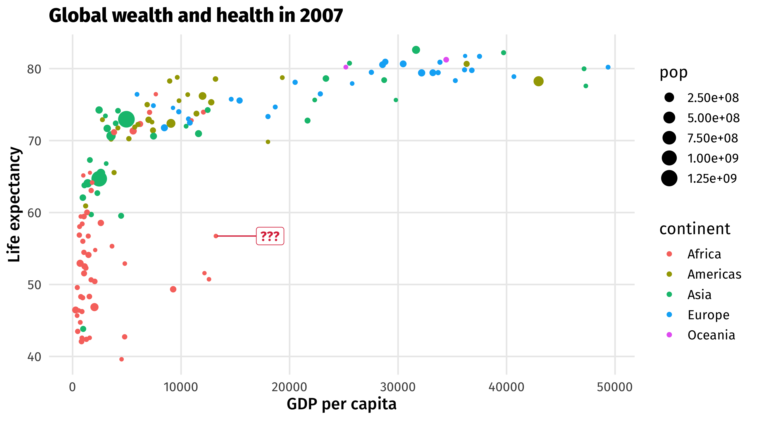
The basic plot

Map country names to label aesthetic

Plot the labels