Last class
We want to know if X causes Y, using data
We can use models to capture the effect of X on Y, if in fact X does affect Y
Problem is some correlations are causal, others aren’t
Causal diagram
We need a causal model
The model is our idea of how the data came to be (the data-generating process )
The model tells us how to identify a causal effect (if it’s possible!)
Directed Acyclical Graphs (DAGs)
A popular modeling tool for thinking about causality is the DAG
Nodes (points) = variables; Edges (arrows) = direction of causality
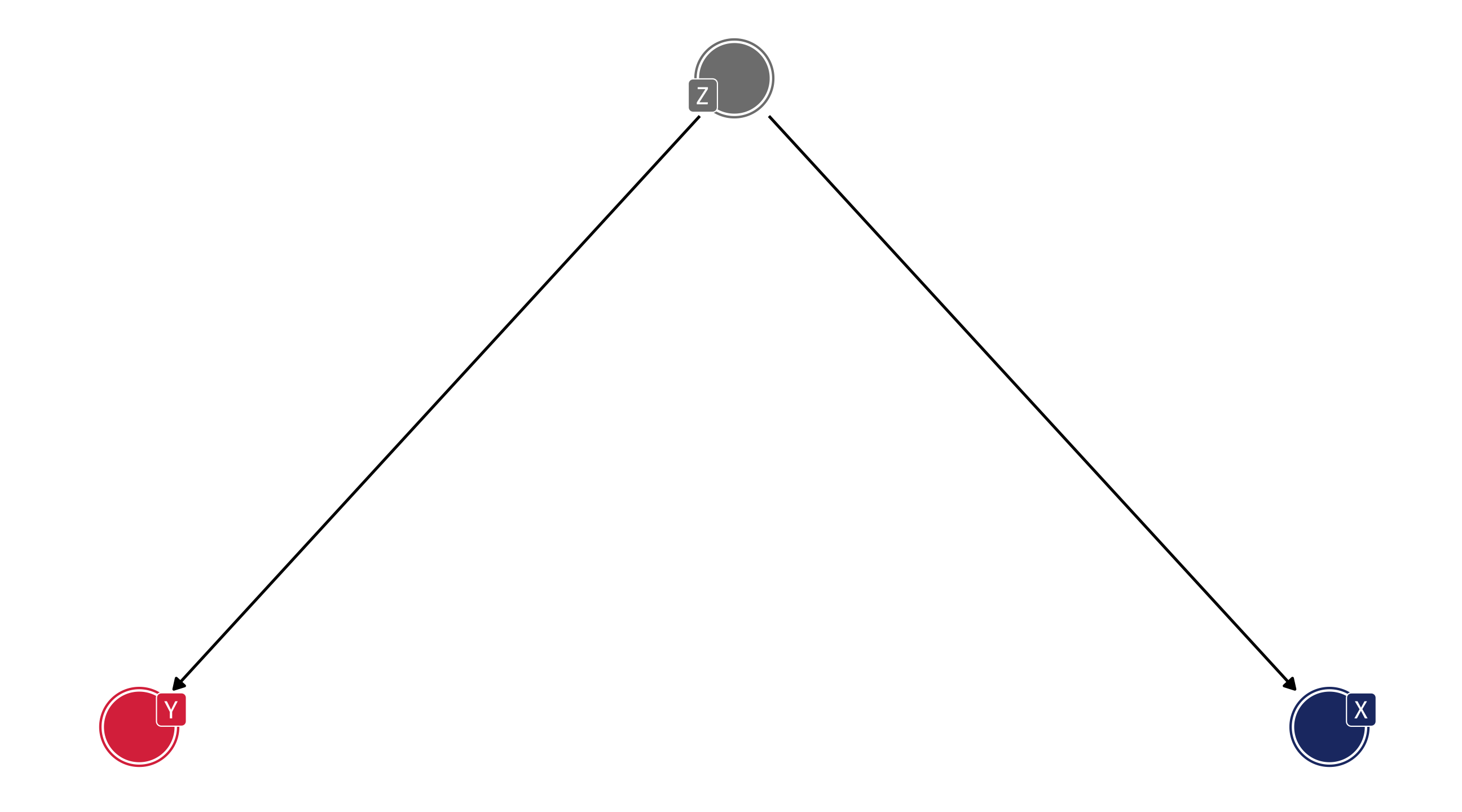
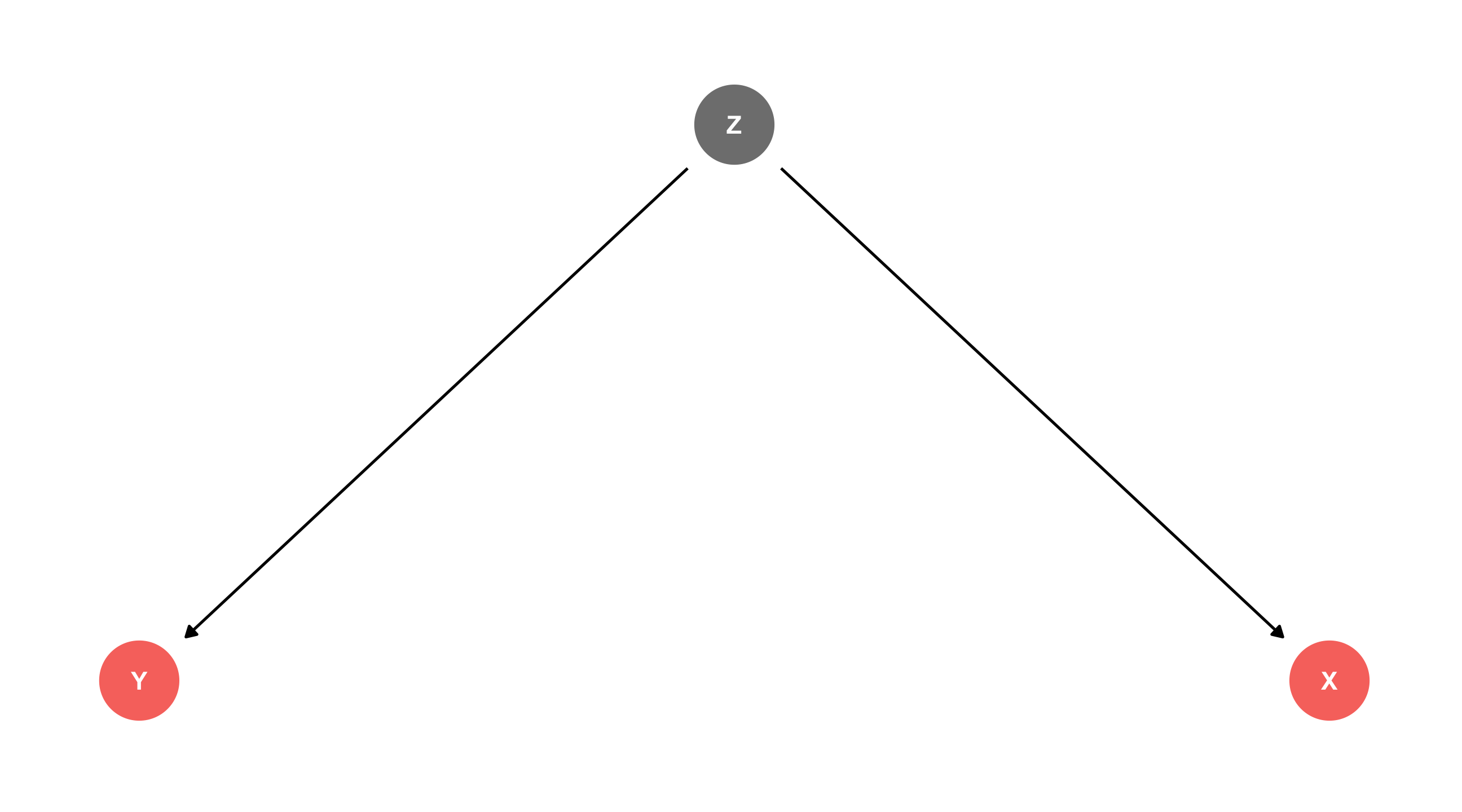
DAGs
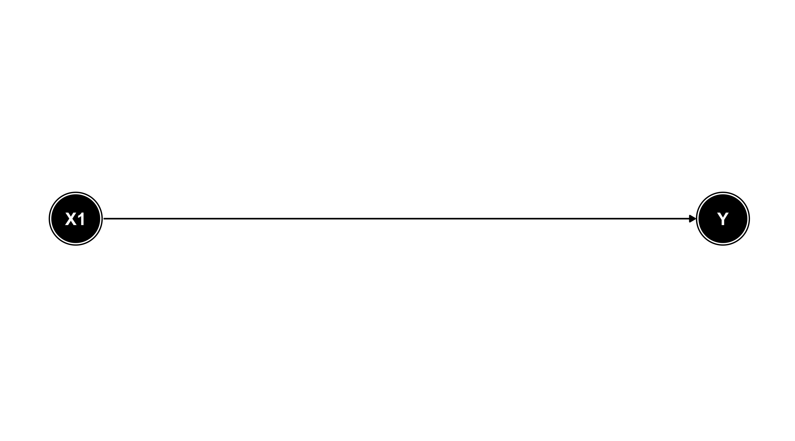
Nodes = variables; Arrows = direction of causality
Read: X1 has an effect on Y
DAGs
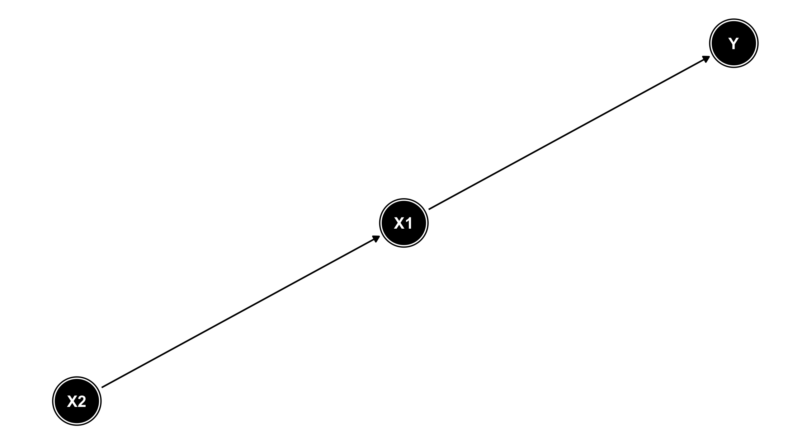
X1 has an effect on Y; X2 has an effect on X1; X2 affects Y only through X1
Missing arrows matter!
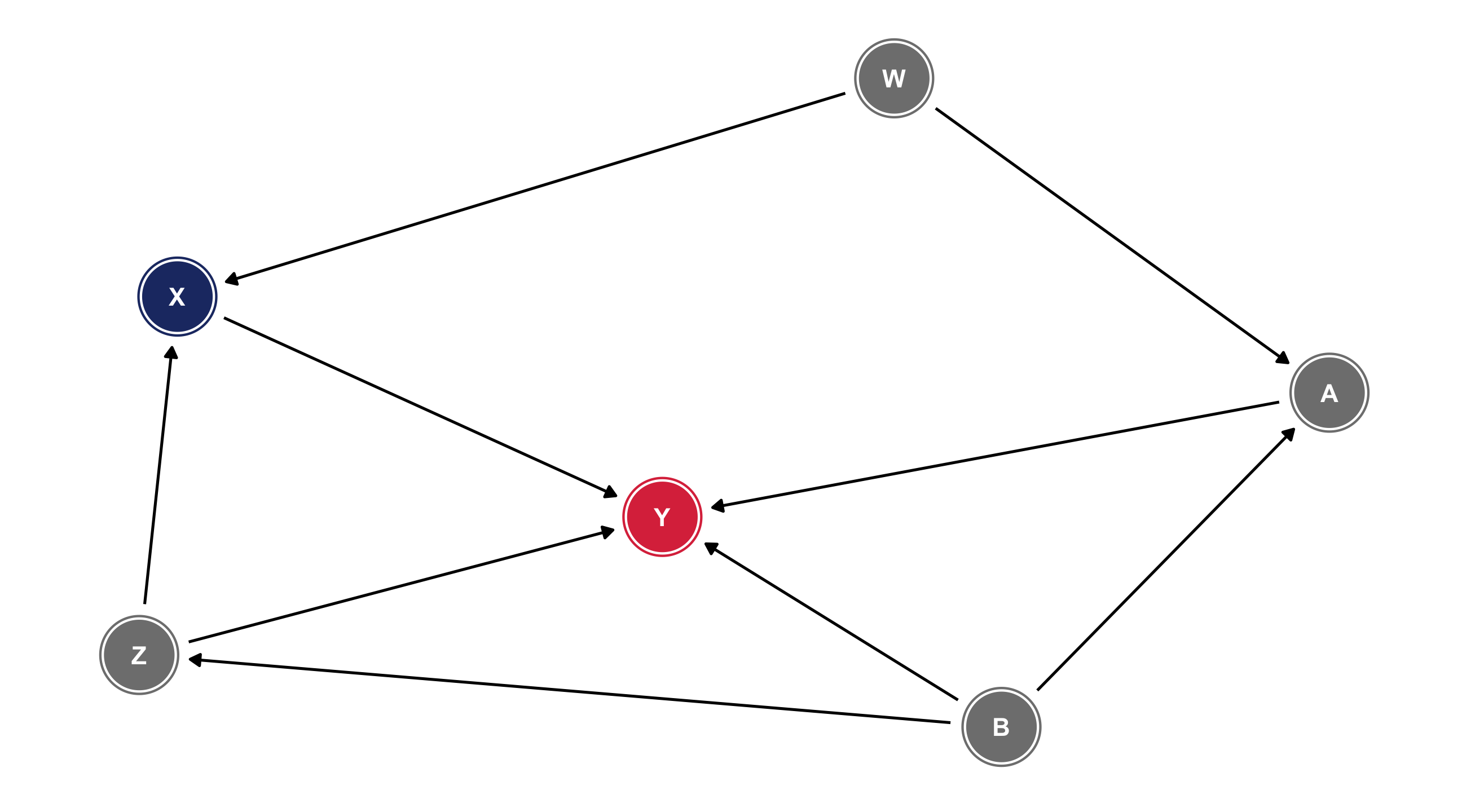
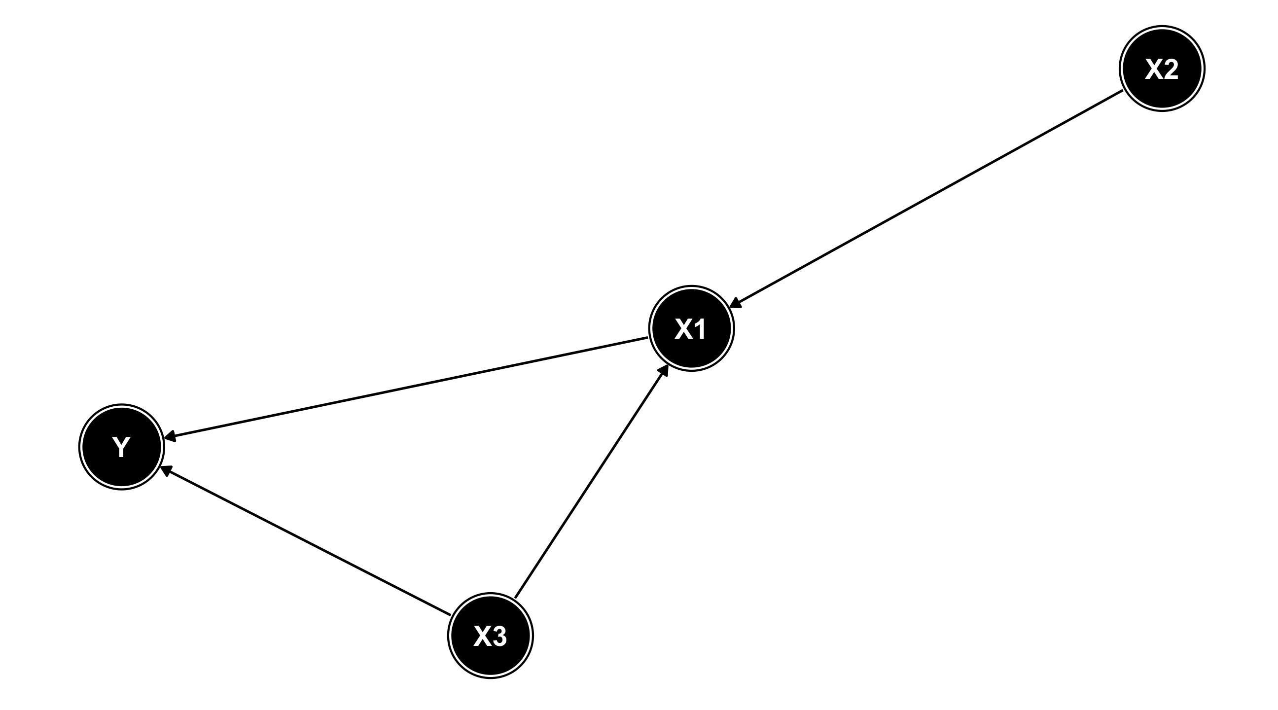
DAGs
X1 has an effect on Y; X2 has an effect on X1 and Y (via X1); X3 has an effect on X1 and Y
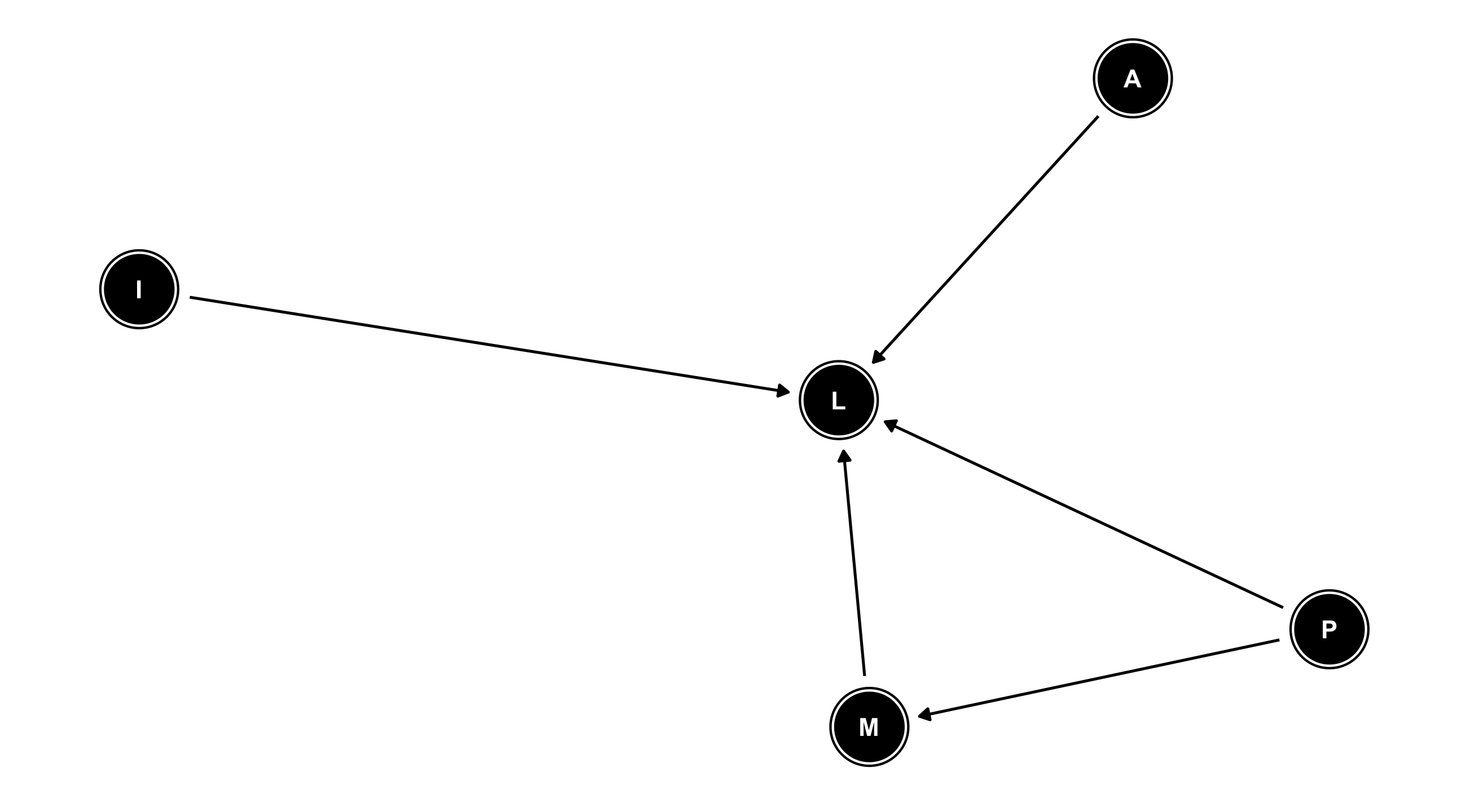
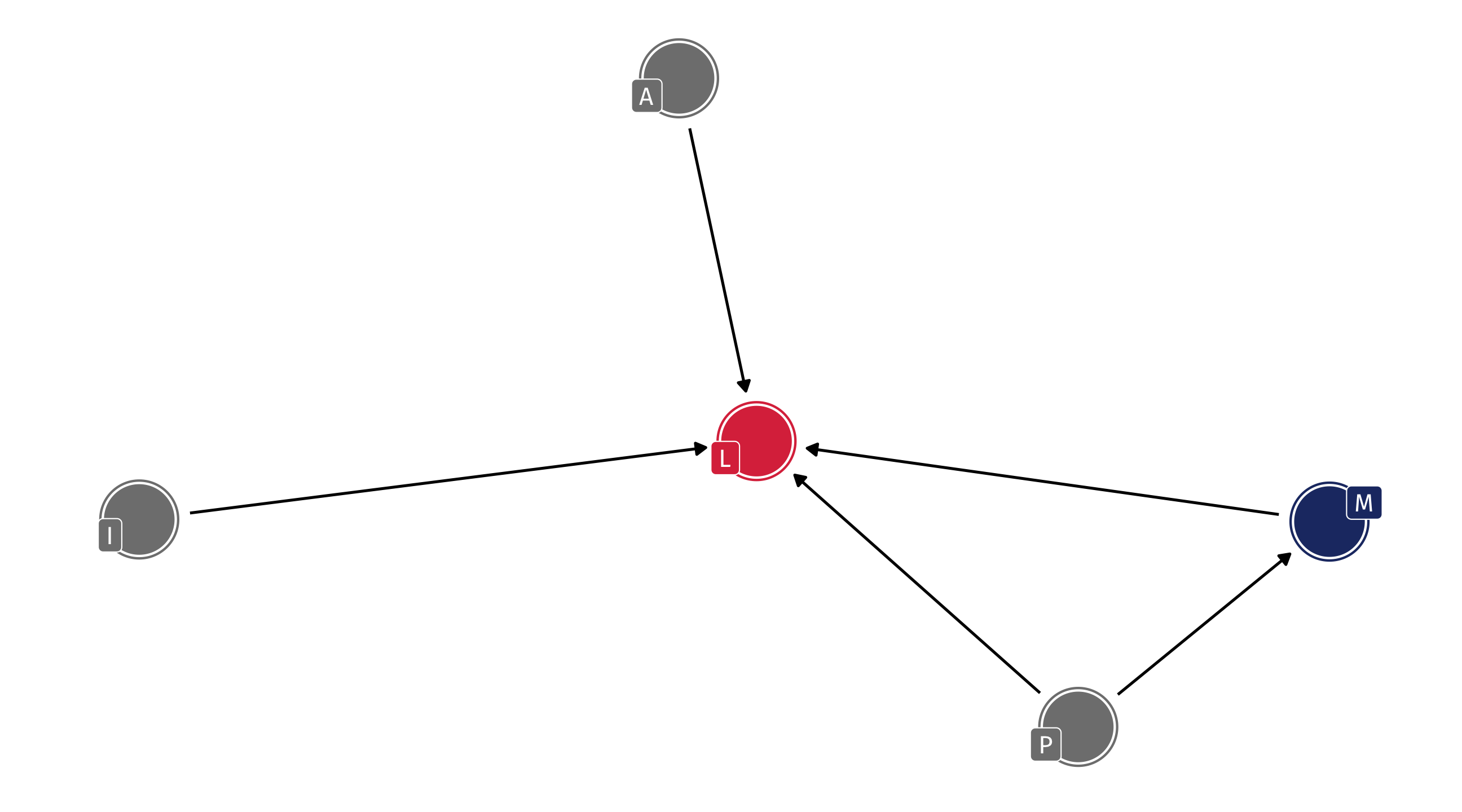
Example: ideology
Where does (liberal) ideology come from?
Variables in the literature: Income (I), Liberal (L), Age (A), Media (M), Parents (P)
DAGs
DAGs encode everything we know about some process
We can see all of our assumptions and how they fit together
For example: the effect of Parents on how Liberal someone is happens directly and indirectly (through Media)
Missing arrows also matter: we are assuming that Age has no effect on Media diet
🚨 Our turn: let’s make our own DAG 🚨
On daggity.net about why people choose to vote (or not)
Identification
Why do this?
Later: DAGs help us figure out how to estimate the effect of one variable on another
While at the same time being mindful of all the other variables that we need to adjust , or control for
For instance, we might want to estimate the effect of Media consumption (M) on how Liberal (L) someone is
This process is called “identification” \(\rightarrow\) to identify the effect of X on Y
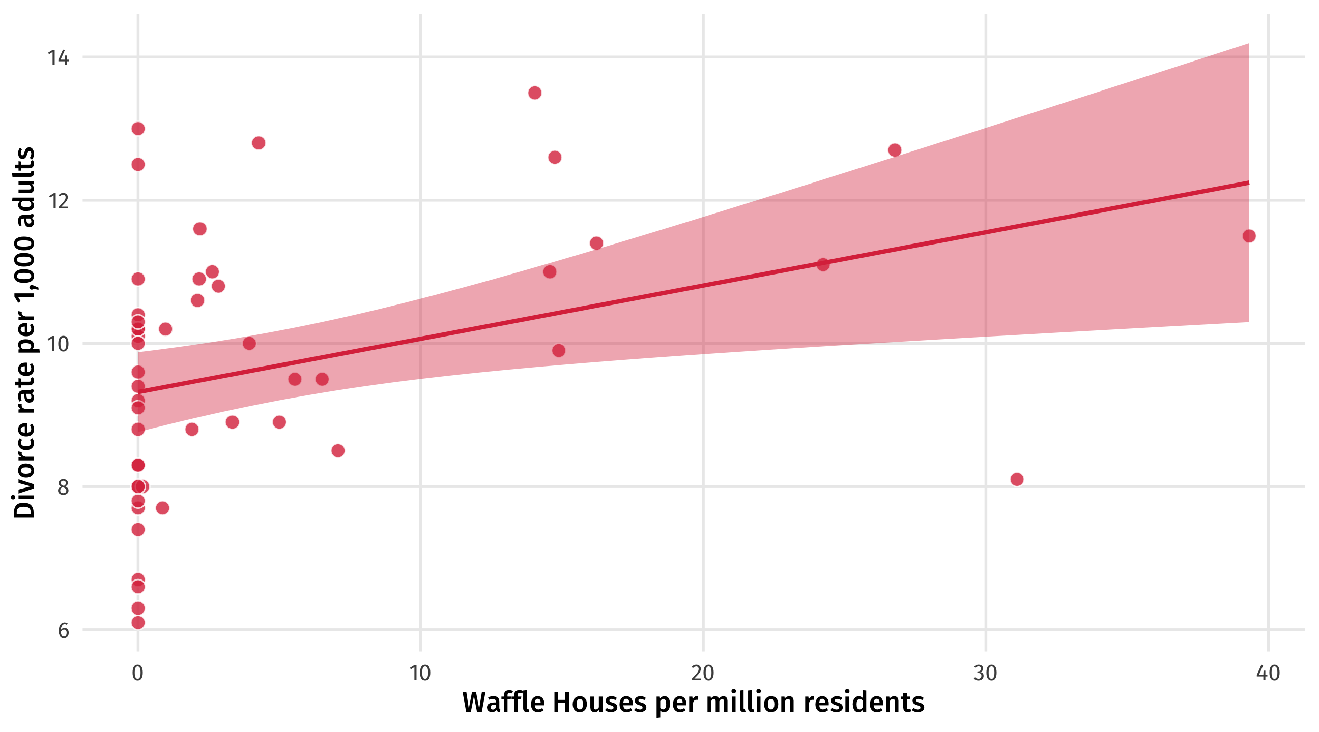
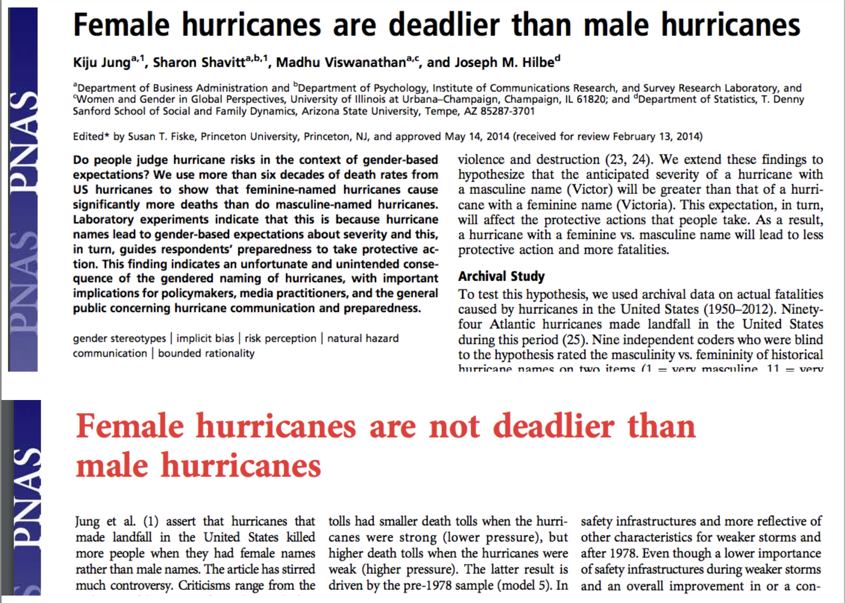
Waffles and Divorce
Does Waffle House cause divorce?
States with more waffle houses tend to have more divorce
Indiana
19.8
11.0
2.62
Rhode Island
15.0
9.4
0.00
Kansas
22.1
10.6
2.11
North Dakota
26.7
8.0
0.00
Texas
21.5
10.0
3.94
Alaska
26.0
12.5
0.00
Maine
13.5
13.0
0.00
Does Waffle House cause divorce?
Do cheap, delicious waffles put marriages at risk?
Does Waffle House cause divorce?
No one thinks there is a plausible way in which Waffle House causes divorce
When we see a correlation of this kind we wonder about other variables that are actually driving the relationship
You’ve likely thought about this before: a “lurking” variable, “other factors”, that “matter”
But what might that variable be? And how exactly does it lead us astray?
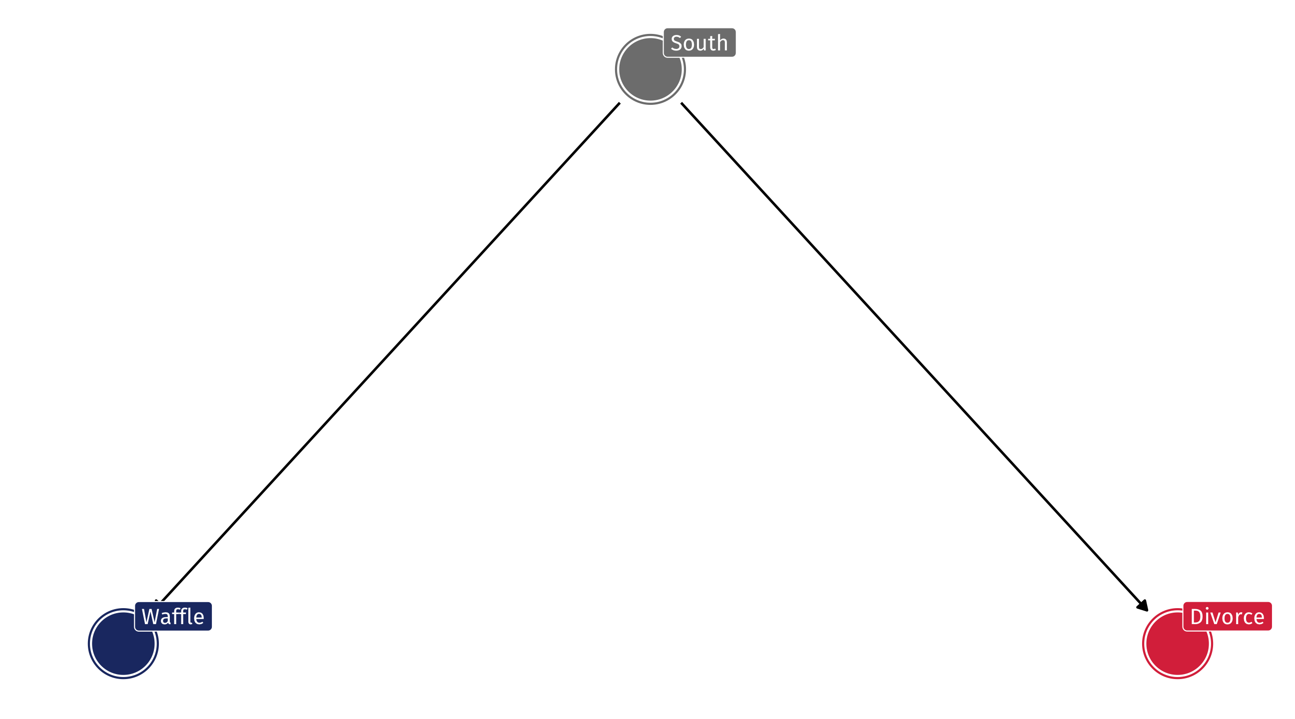
The lurking variable
It turns out that Waffle Houses originated in the South (Georgia), and most of them are still there
The South also happens to have some of the highest divorce rates in the country
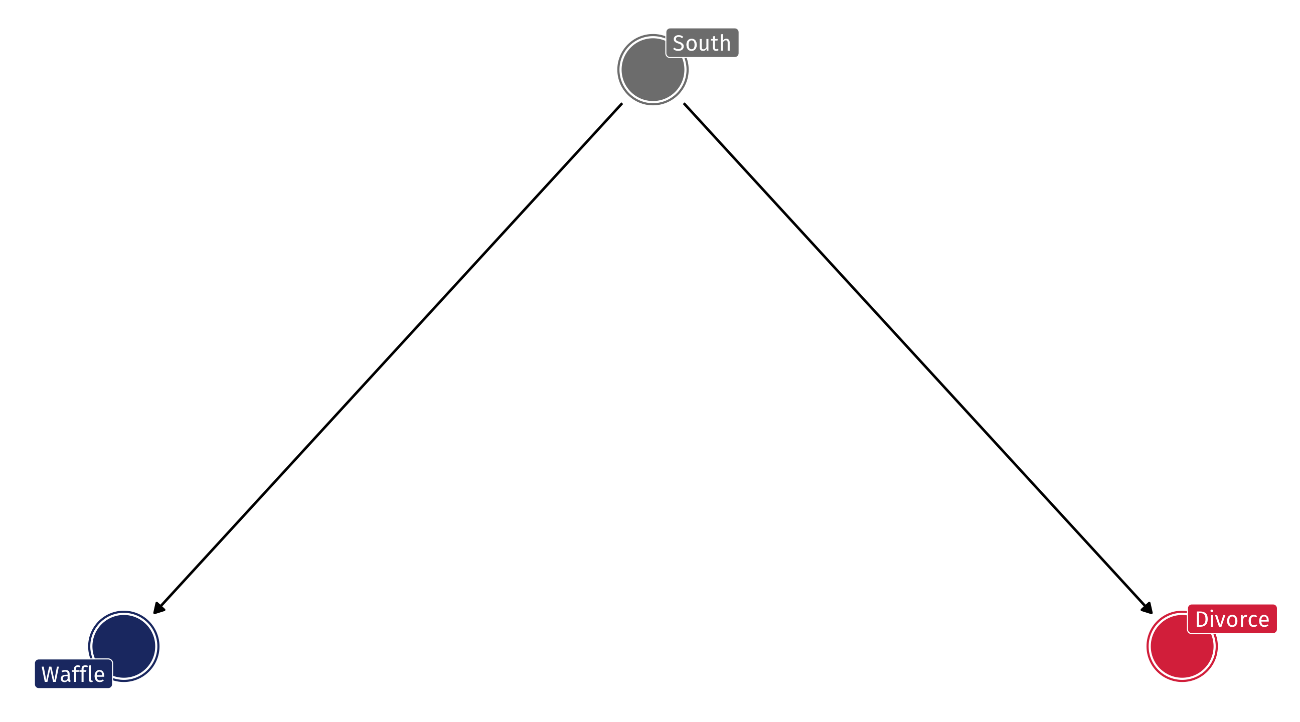
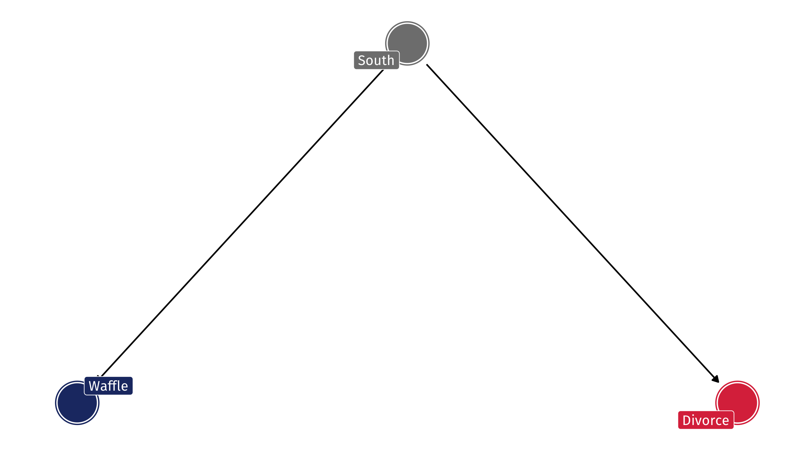
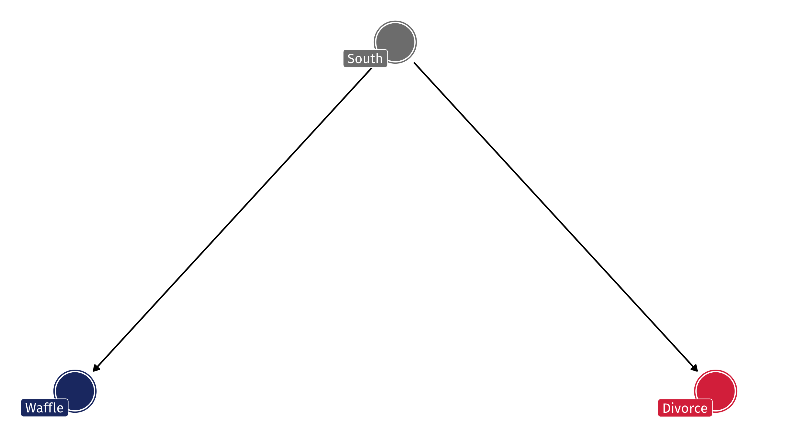
The DAG
So the DAG might look something like this: South has an effect on Waffle Houses and Divorce, but Waffles do not cause Divorce
The problem
A DAG like this will produce a correlation between Waffles and Divorce, even when there is no causal relationship
This is called confounding : the South is confounding the relationship between Waffles and Divorce
How does this happen?
Let’s make up data to convince ourselves this is true
fifty states, about half of them are in the South
tibble (south = sample (c (0 , 1 ), size = 50 , replace = TRUE ))
# A tibble: 50 × 1
   south
   <dbl>
 1     0
 2     1
 3     0
 4     0
 5     1
 6     0
 7     0
 8     1
 9     1
10     0
# ℹ 40 more rows
sample() is choosing at random between 0 and 1, 50 times, with replacement
Simulate the treatment
Step 2: make Waffle houses, let’s say about 20 per million residents, +/- 4
tibble (south = sample (c (0 , 1 ), size = 50 , replace = TRUE ), waffle = rnorm (n = 50 , mean = 20 , sd = 4 ))
# A tibble: 50 × 2
   south waffle
   <dbl>  <dbl>
 1     0  21.1
 2     0  21.2
 3     1  18.4
 4     1  24.0
 5     0  14.5
 6     1   9.86
 7     1  13.3
 8     0  28.3
 9     0  17.7
10     1  17.2
# ℹ 40 more rows
Make Waffles more common in the South
Step 3: The arrow from South to Waffles, let’s say Southern states have about 10 more Waffles, on average
tibble (south = sample (c (0 , 1 ), size = 50 , replace = TRUE ), waffle = rnorm (n = 50 , mean = 20 , sd = 4 ) + 10 * south)
# A tibble: 50 × 2
   south waffle
   <dbl>  <dbl>
 1     0   14.5
 2     1   27.9
 3     1   30.6
 4     1   34.9
 5     0   26.8
 6     1   35.6
 7     1   28.4
 8     0   21.0
 9     0   26.1
10     1   33.4
# ℹ 40 more rows
Simulate the outcome
Step 4: make a divorce rate, let’s say about 20 divorces per 1,000 adults
= tibble (south = sample (c (0 , 1 ), size = 50 , replace = TRUE ), waffle = rnorm (n = 50 , mean = 20 , sd = 4 ) + 10 * south,divorce = rnorm (n = 50 , mean = 20 , sd = 2 ))
Make the South have more divorce
Step 5: the arrow from South to divorce, let’s say southern states have about 8 more divorces per 1,000 residents
= tibble (south = sample (c (0 , 1 ), size = 50 , replace = TRUE ), waffle = rnorm (n = 50 , mean = 20 , sd = 4 ) + 10 * south,divorce = rnorm (n = 50 , mean = 20 , sd = 2 ) + 8 * south)
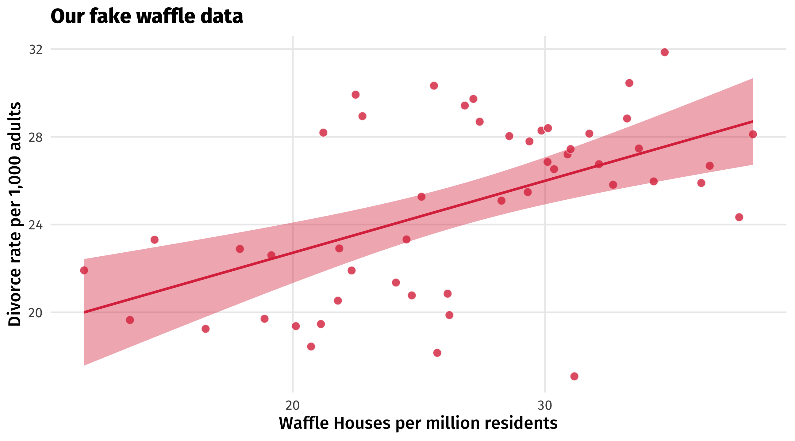
NOTICE! Waffles have no effect on divorce in our fake data
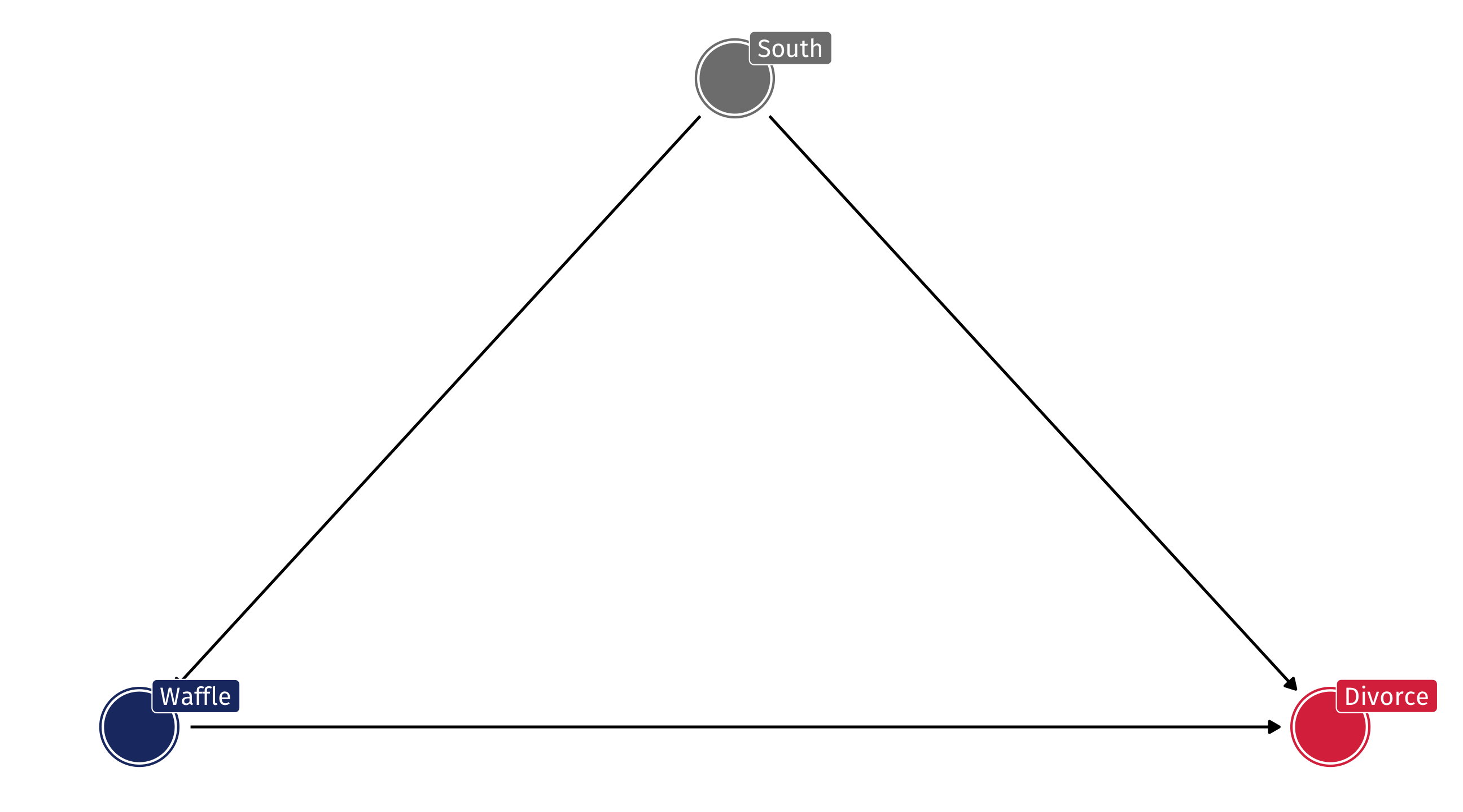
A totally confounded relationship
The South’s effect on Waffle House and on Divorce creates a confounded correlation between the two
A totally confounded relationship
The DAG on the left will produce an association like the one on the right
Even if Waffles and Divorce are causally unrelated
🧇 Your turn: confounded waffles 🧇
Make up data where a lurking variable creates a confounded relationship between two other variables that isn’t truly causal:
Change the confound , treatment and outcome variables in the code to ones of your choosing
Alter the parameters in rnorm() so the values make sense for your variables
Make a scatterplot with a trend line – use labs() to help us make sense of the plot axes and tell us what the confound is with the title = argument in labs()
Post in the Slack, winner (creativity + accuracy) wins small extra credit
What’s going on here?
Think of causality as water flowing in the direction of the arrows
We want look at water flowing directly from a treatment to an outcome
But account for the fact that there is often indirect flow that contaminates our estimates
Source: the mighty Andrew Heiss
What’s going on here?
To identify the effect of Waffles on Divorce we need to account , or control for , the influence of the South
Otherwise we will be confounded
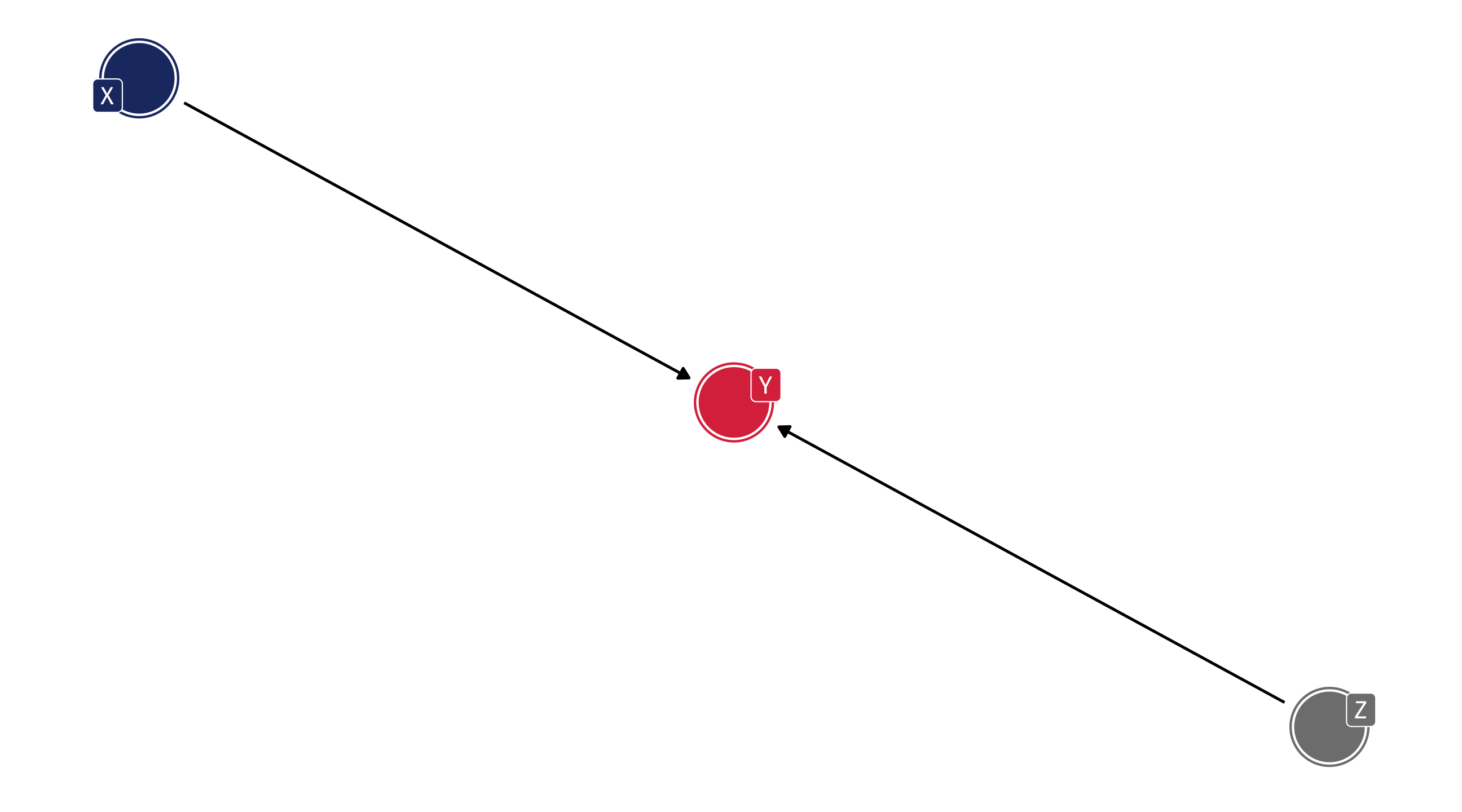
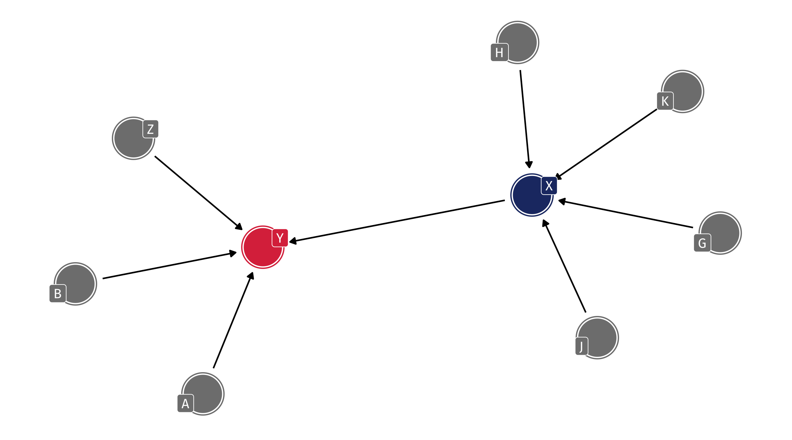
What do we need to control?
What do we need to control?
Nothing! No indirect flow to X
What do we need to control?
Nothing! No indirect flow to X!
What do we need to control to identify…
Media consumption (M) \(\rightarrow\) Liberal (L)
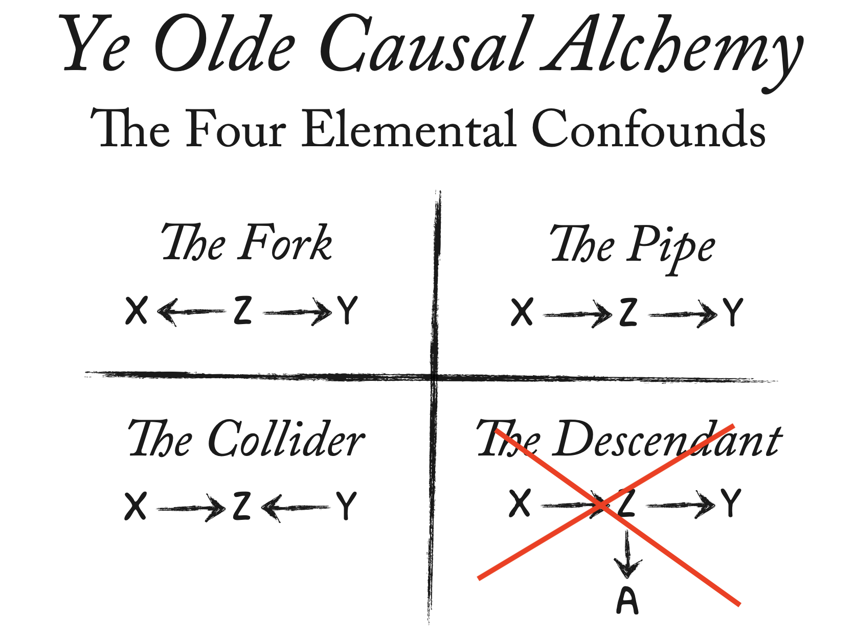
The elemental confounds
The confounding fork 🍴
Y \(\leftarrow\) Z \(\rightarrow\) X
There is a third variable, Z, that is a common cause of X and Y
The confounding fork
We’ve already seen this!
Creates an association between X and Y that isn’t causal
Distorts the true causal relation between X and Y
Note that both of these fork scenarios will confound
The second scenario
Say that Waffles do cause Divorce, but the effect is tiny
= tibble (south = sample (c (0 , 1 ), size = 50 , replace = TRUE ), waffle = rnorm (n = 50 , mean = 20 , sd = 4 ) + 10 * south,divorce = rnorm (n = 50 , mean = 20 , sd = 2 ) + 8 * south + .0001 * waffle)
Same code as before, I’ve just added a tiny effect of waffle houses on divorce = .0001 more divorces per waffle house
The second scenario
The effect of Z (South) on X (Waffles) and Y (Divorce) will distort our estimates:
= lm (divorce ~ waffle, data = fake) tidy (mod)
# A tibble: 2 × 5
  term        estimate std.error statistic      p.value
  <chr>          <dbl>     <dbl>     <dbl>        <dbl>
1 (Intercept)   10.1      2.07        4.89 0.0000118
2 waffle         0.555    0.0857      6.48 0.0000000464
Estimate is \(\frac{estimated}{true}\) = 5553.256633 times larger than the true effect!
Dealing with forks
We need to figure out what Z is, measure it, and adjust for it in our analysis
The perplexing pipe 🚰
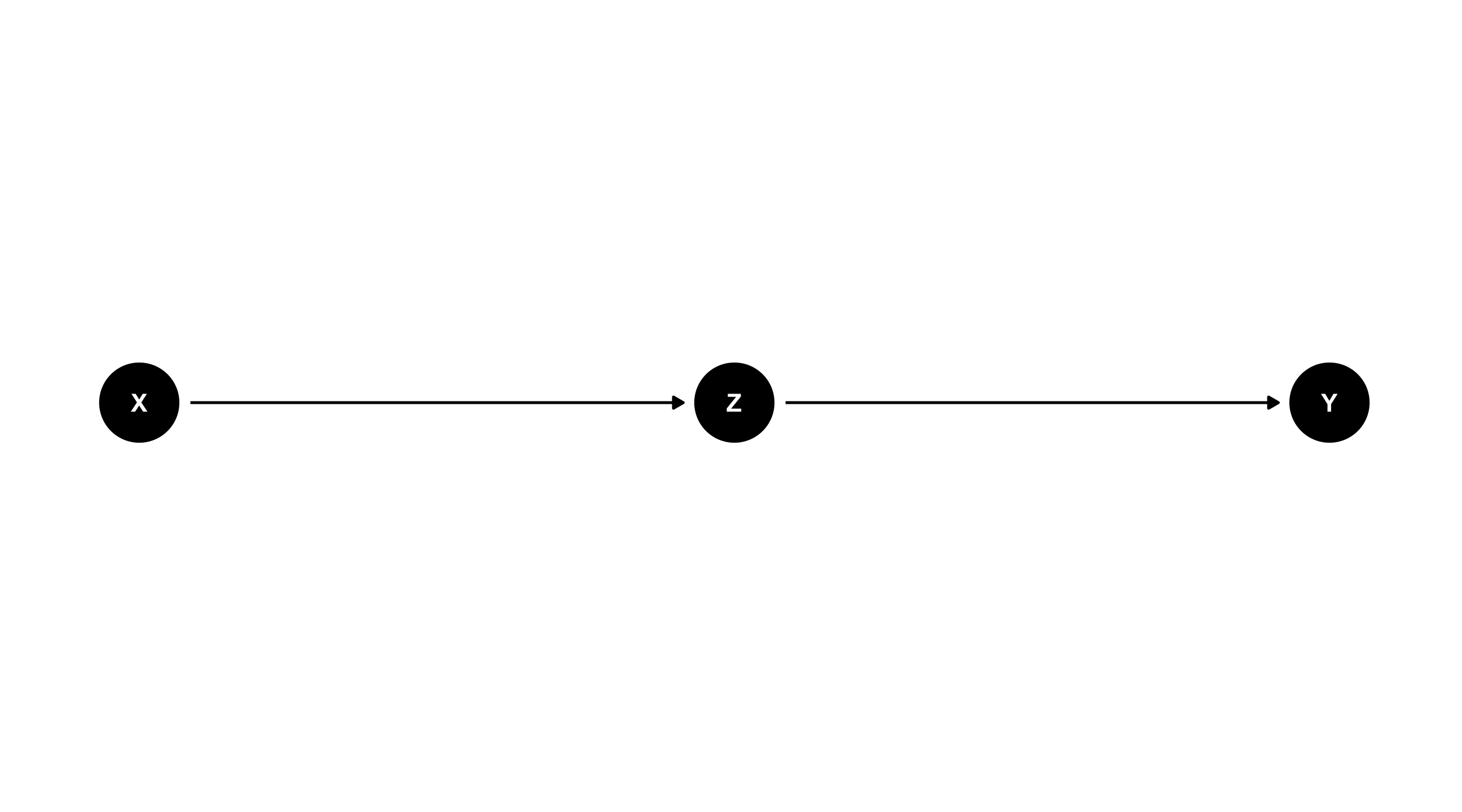
X \(\rightarrow\) Z \(\rightarrow\) Y
X causes Z, which causes Y (or: Z mediates the effect of X on Y)
What happens if we adjust for Z ? We block the effect of X on Y
An example: foreign intervention
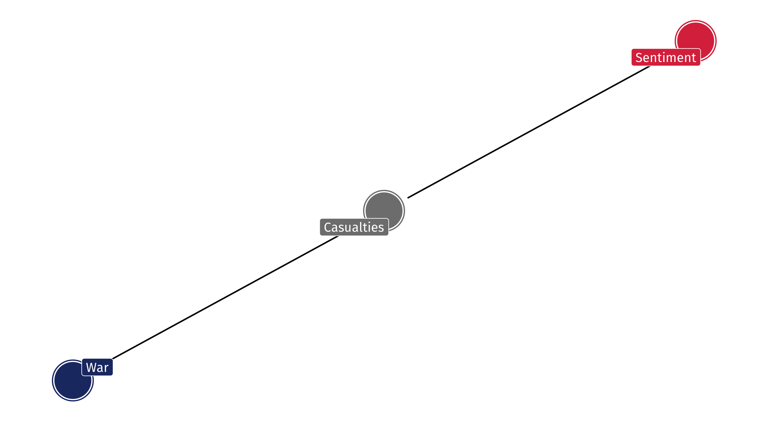
What effect does US foreign wars have on US support abroad ?
Say the DAG looks like this:
If we control for casualties we are blocking the effect of intervention on support
An example: foreign intervention
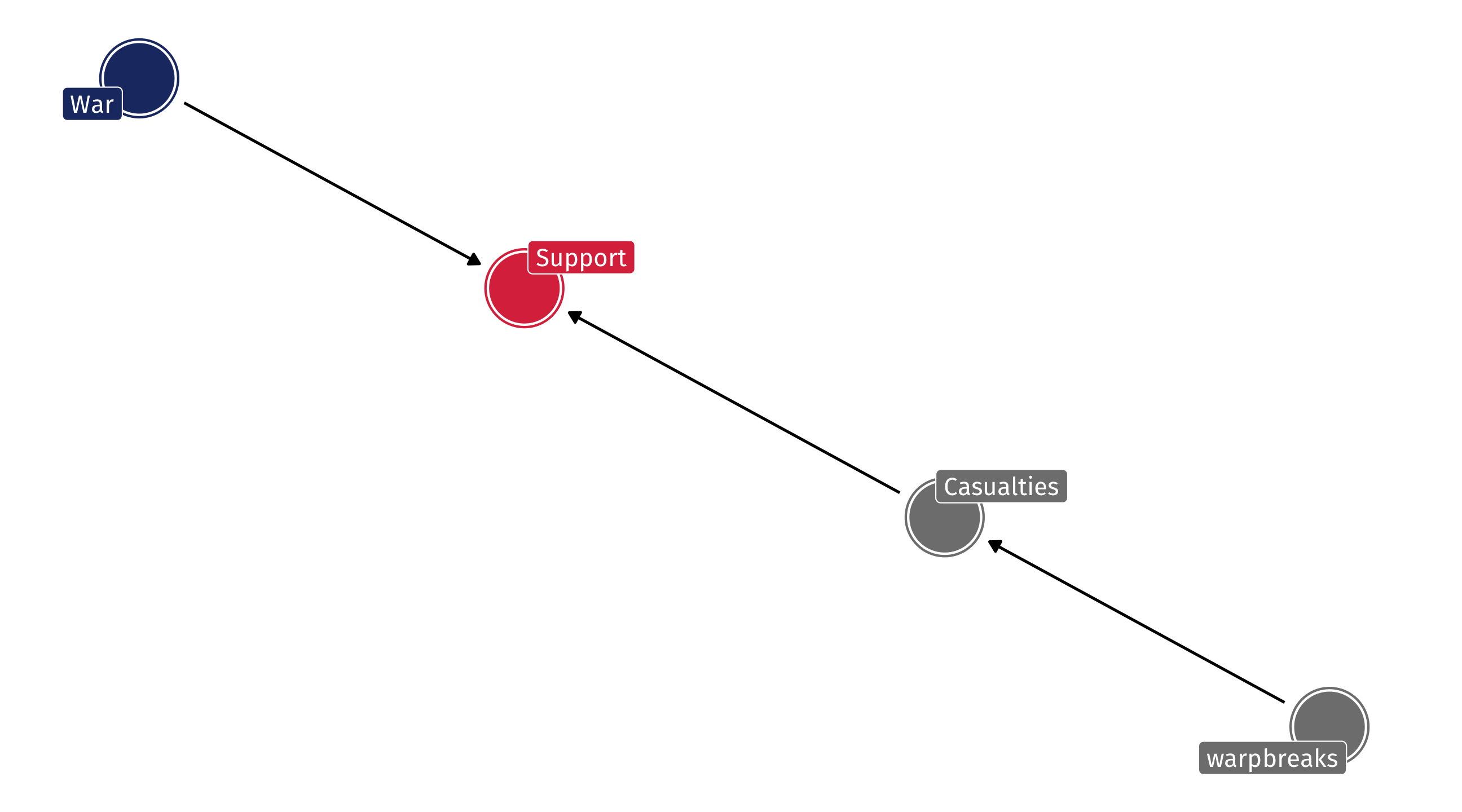
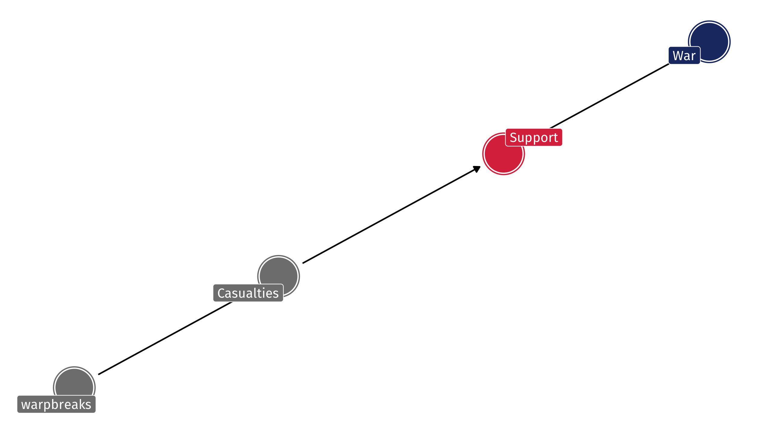
What if the DAG instead looked like this:
An example: foreign intervention
Two ways that War affects US sentiment: directly and indirectly
Adjusting for casualties blocks the indirect effect; if that’s what we want, fine – But if we want the full effect then we’ll be wrong!
Pipes: why are they even a problem?
Just leave pipes alone! It’s a problem of “over-adjusting”
Bad social science: sometimes we are so afraid of forks that we control for everything we have data on
Especially when a process seems very complicated
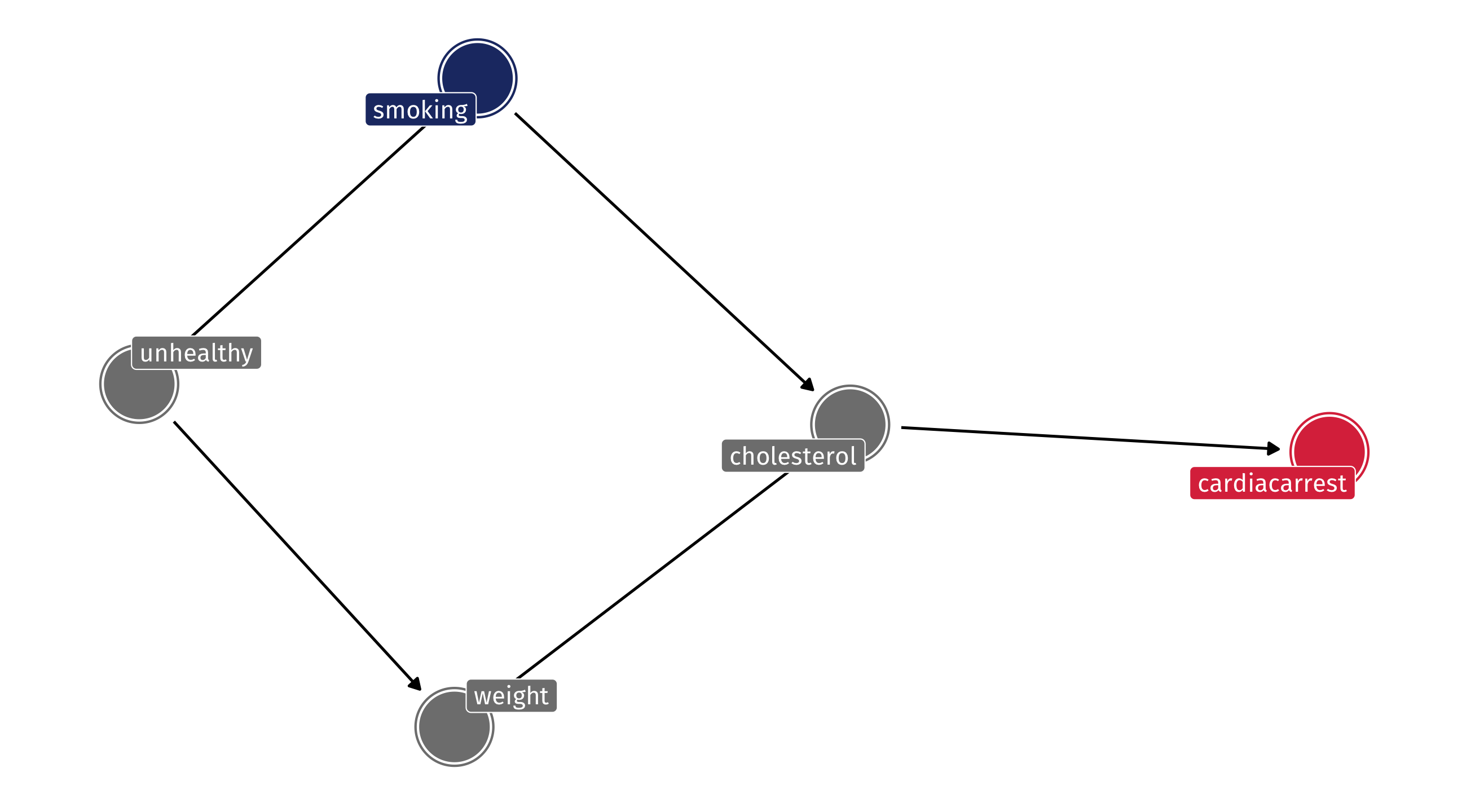
Example: where pipes go wrong
The effects of smoking on heart problems might be complex; lots of potential confounds to worry about
Researcher might think they need to control for a study subject’s cholesterol because cholesterol affects heart health
“We should compare people who smoke but have similar levels of cholesterol, because cholesterol affects heart health”
Example: where pipes go wrong
If the DAG looks like this, cholesterol is a pipe and controlling is bad!
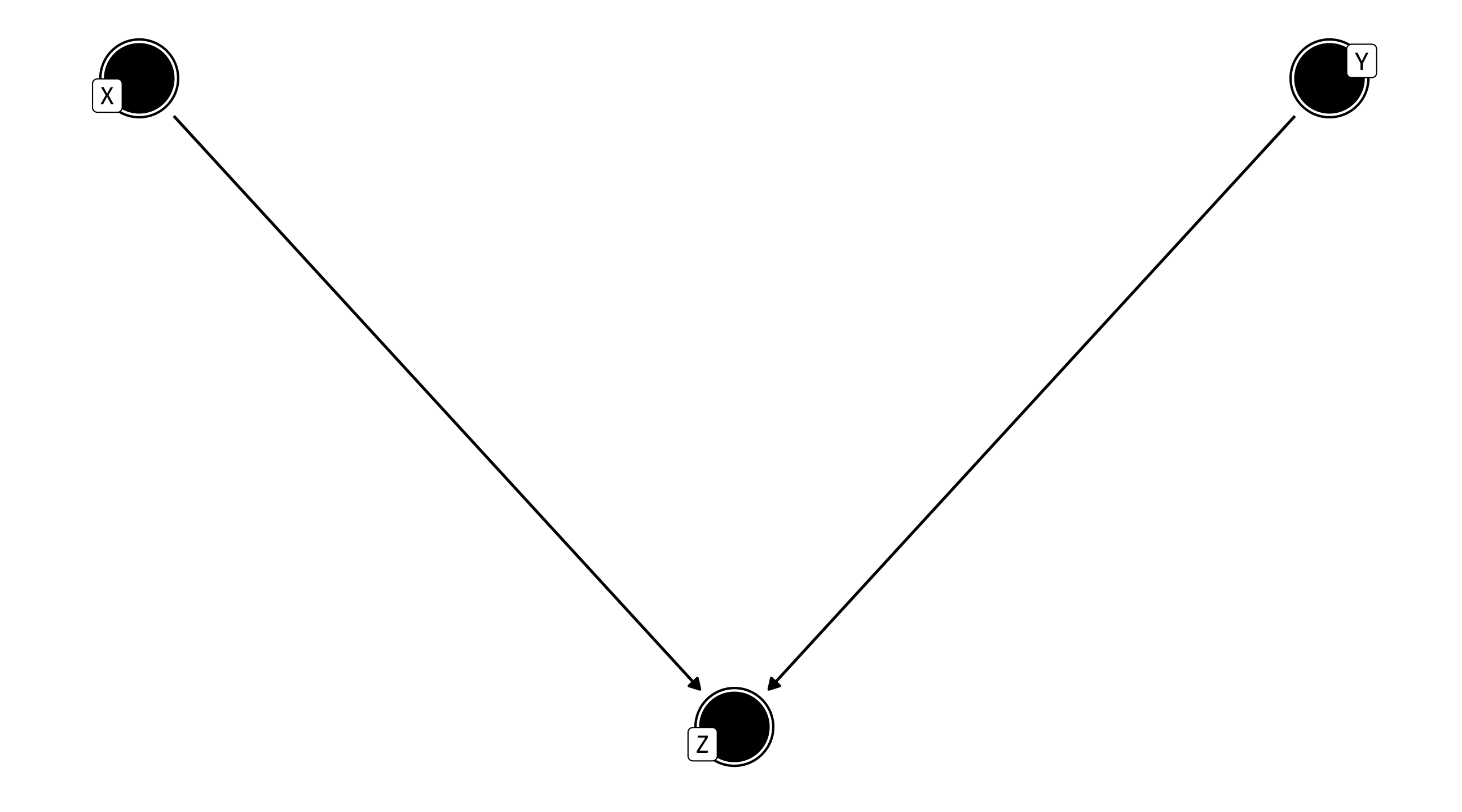
The explosive collider 💥
\(X \rightarrow Z \leftarrow Y\)
X and Y have a common effect
Left alone, it’s no problem; but controlling for Z creates strange patterns
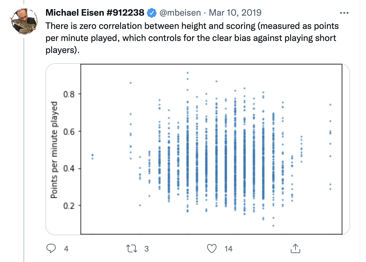
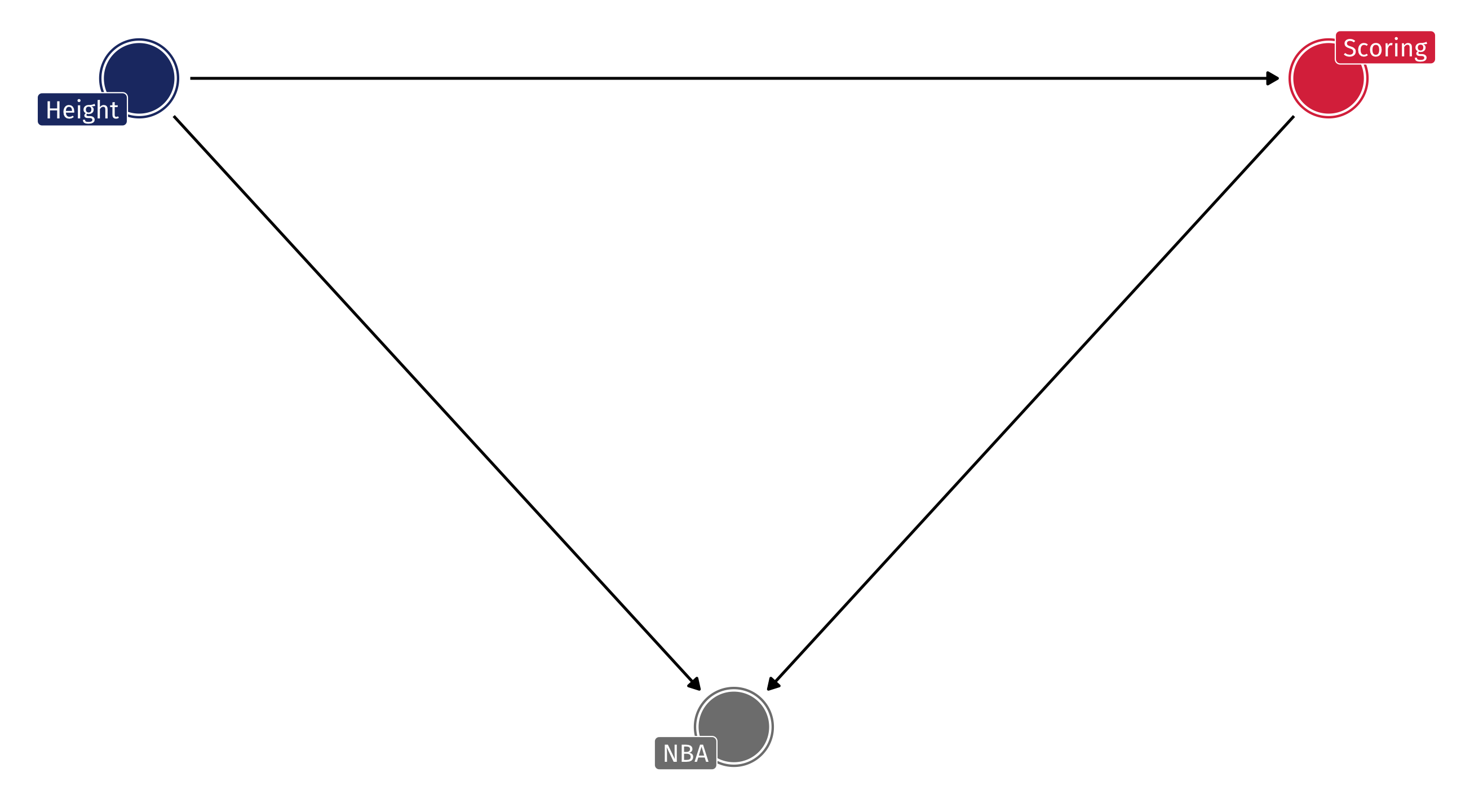
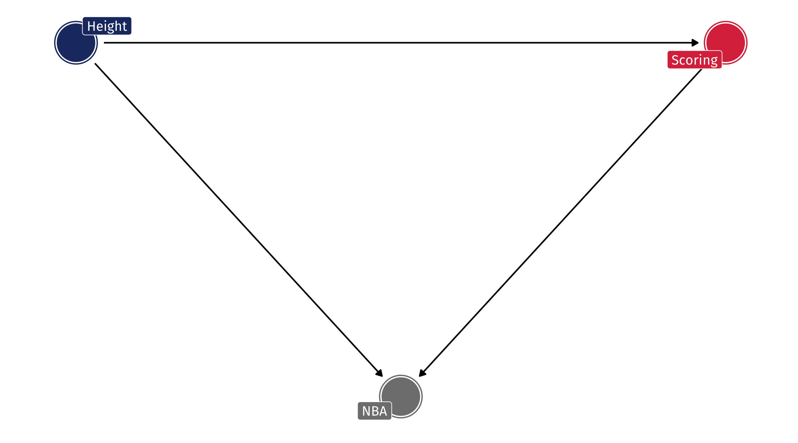
Example: the NBA
Should the NBA stop worrying about height when drafting players?
No!
Obviously, height helps in basketball
But among NBA players there might be no relationship between height and scoring, because…
The shorter players who are drafted have other advantages
Among NBA players = adjusting, or controlling for, being in the NBA
Another example: bad findings
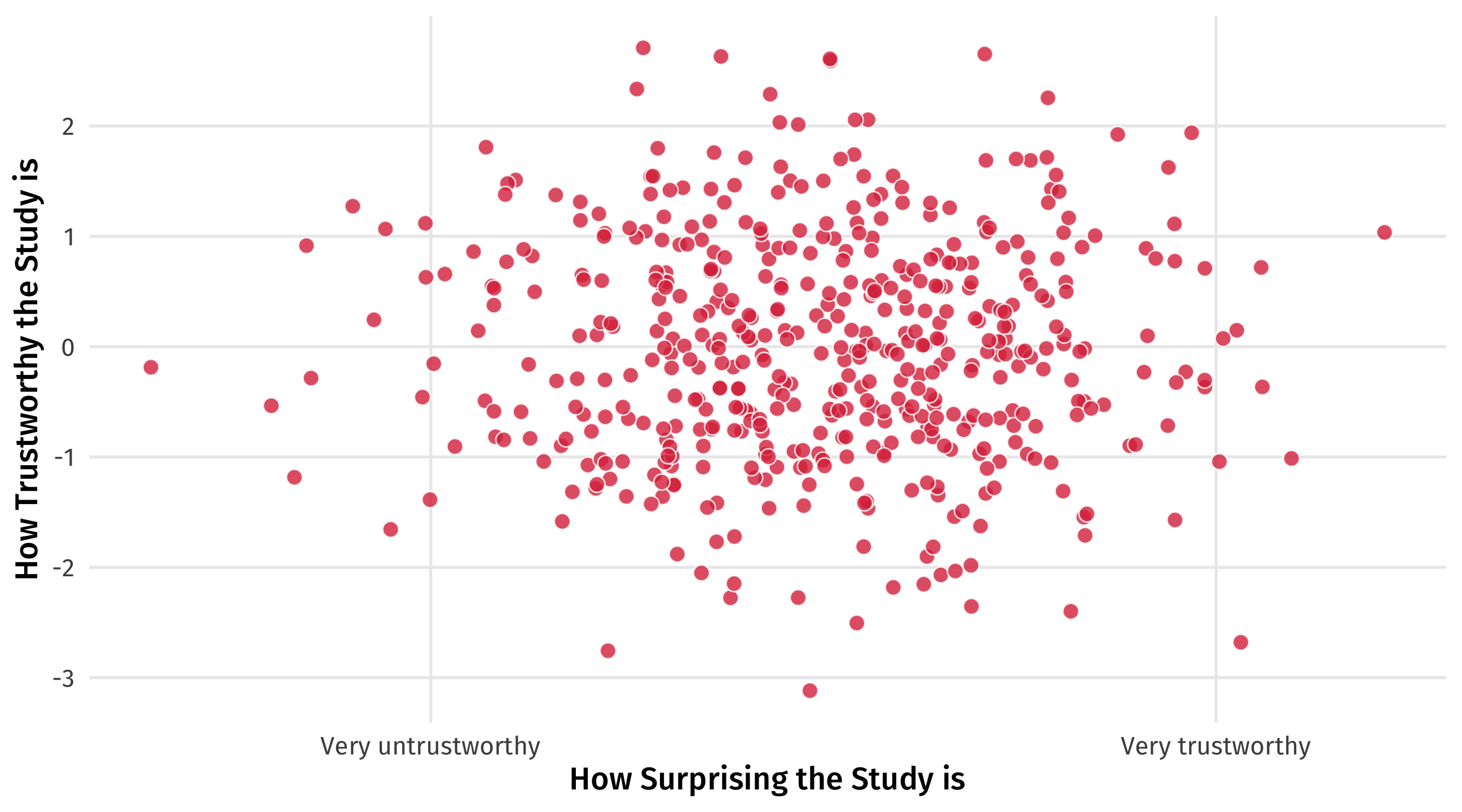
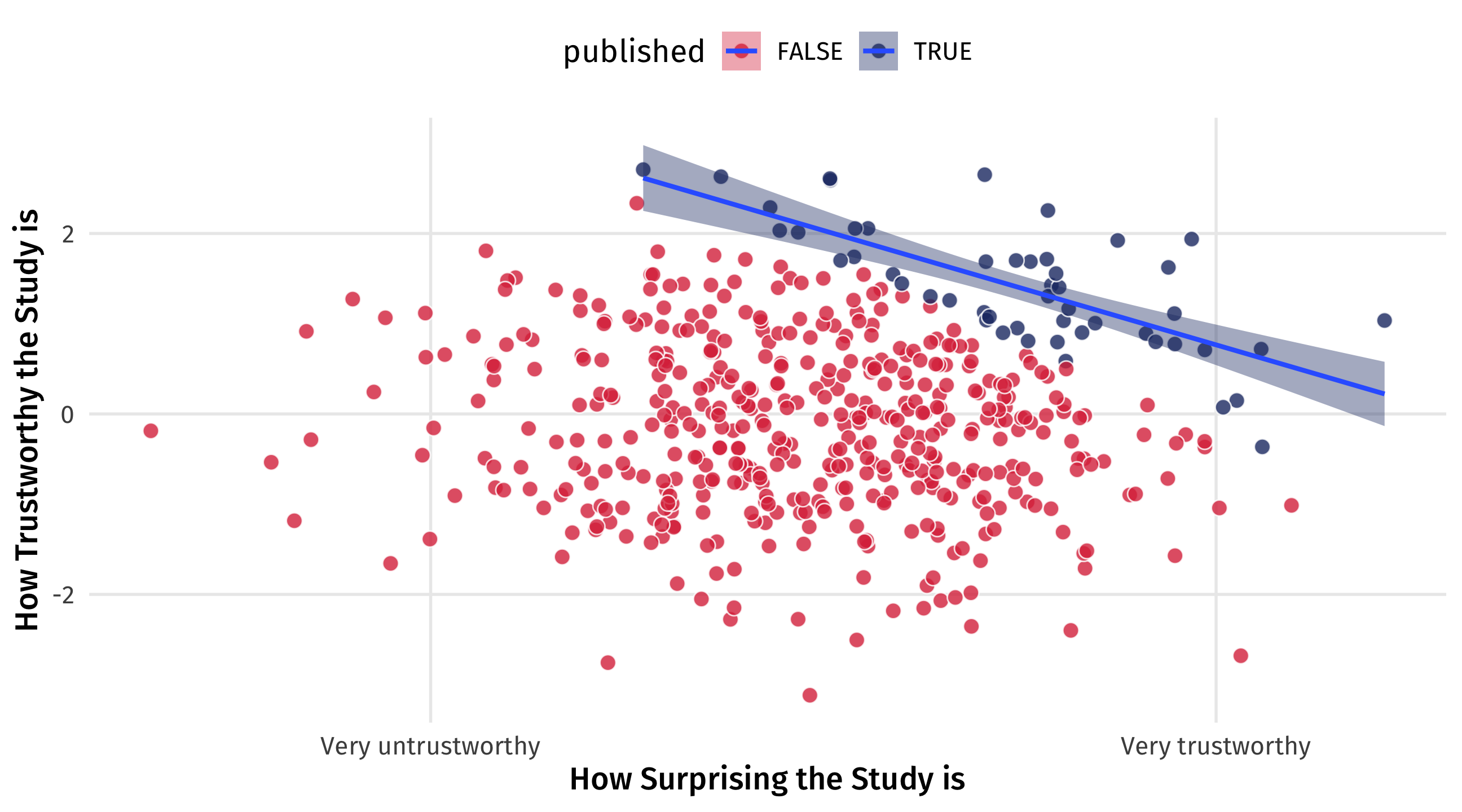
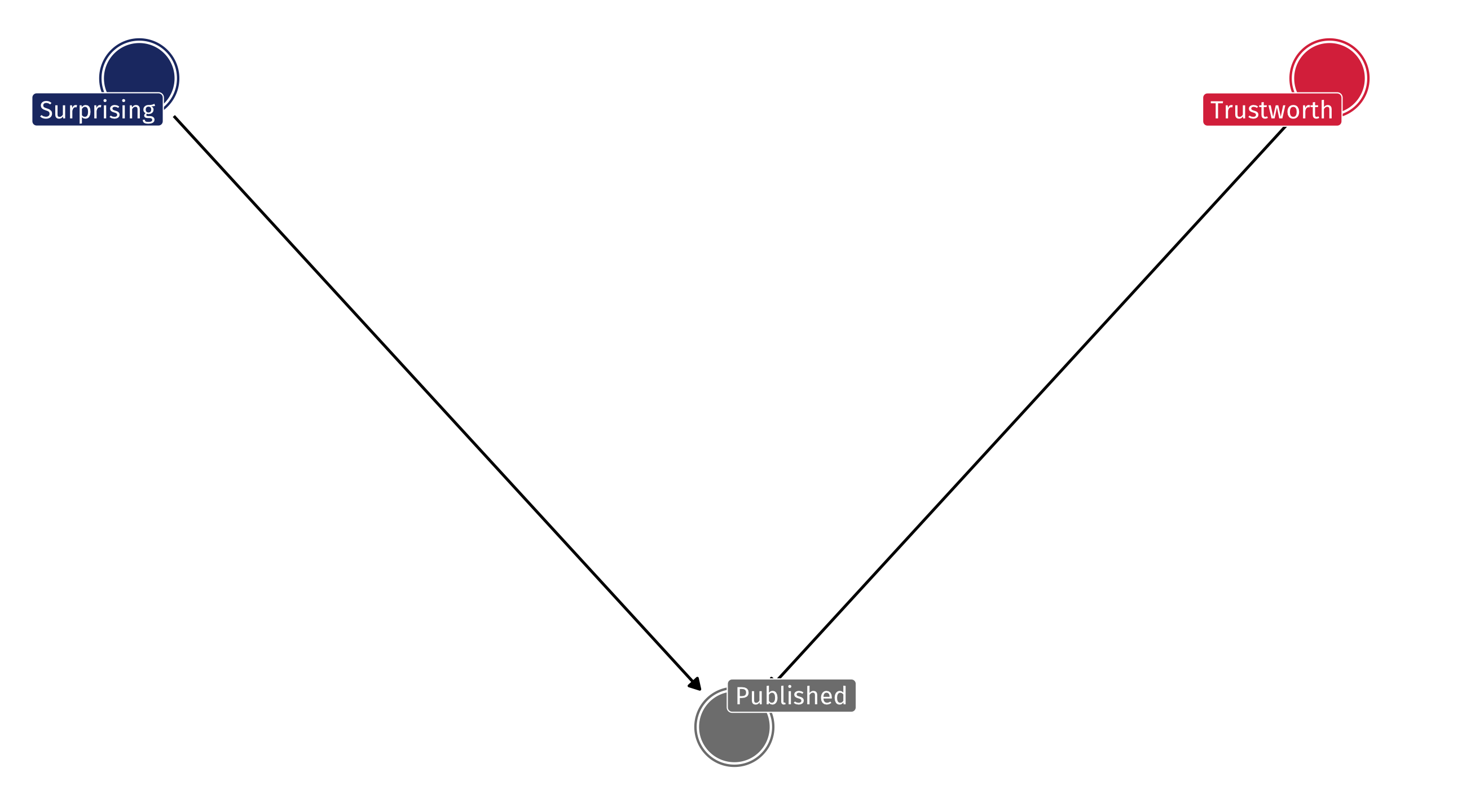
Richard McElreath asks: why are surprising findings so often untrustworthy?
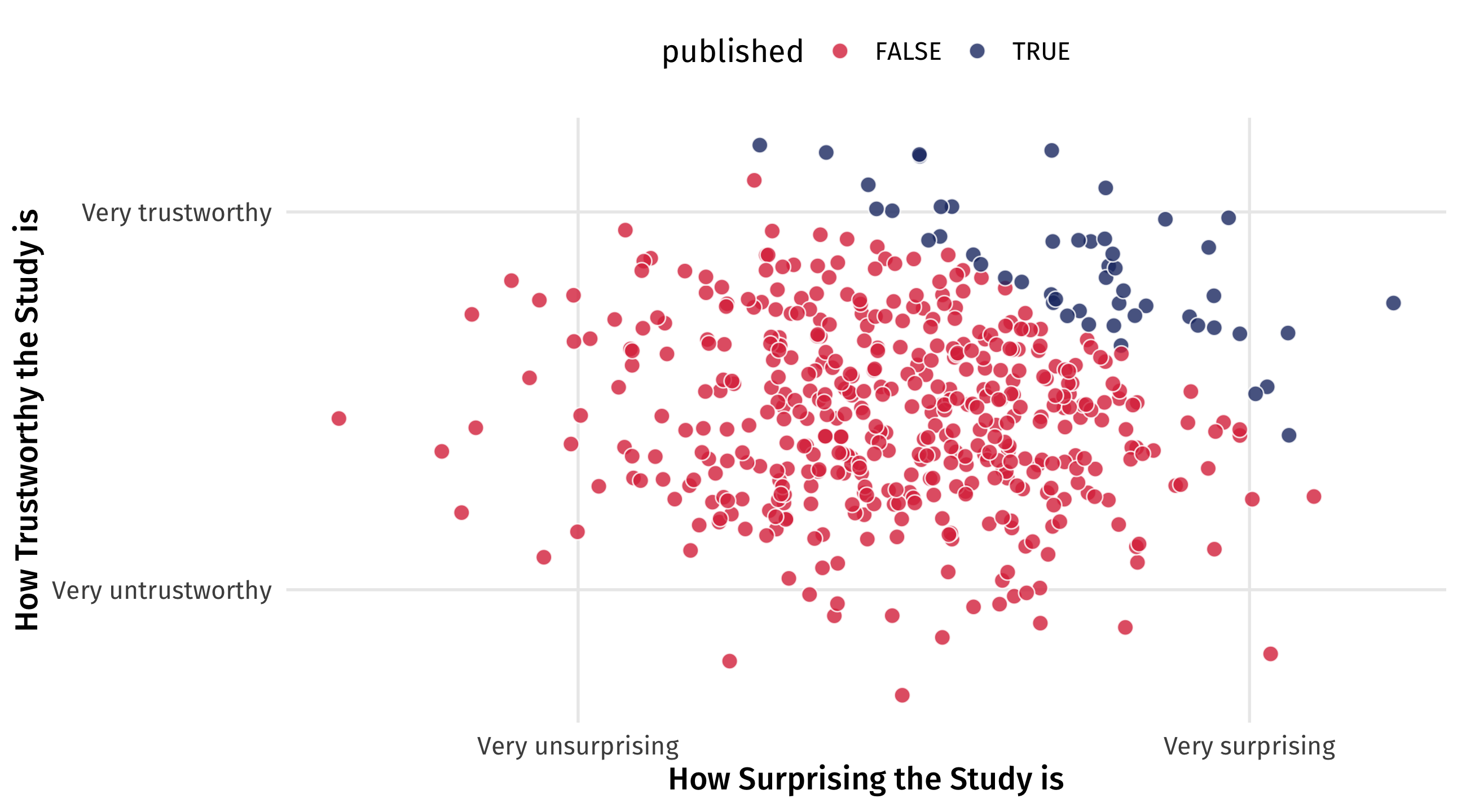
Another example: bad findings
It’s a collider
Imagine that in reality there is no relationship between how surprising a finding is and how trustworthy it is
It’s a collider
But now imagine that studies are only published either if they’re very trustworthy OR very surprising
It’s a collider
By only looking at published papers (e.g., controlling for publication ), we create a negative relationship that doesn’t exist
Exploding colliders
Like pipes, colliders are a problem of controlling for the wrong thing
They are often the result of a sample selection problem
They can obscure actual relationships or fabricate non-existent ones
We need to avoid controlling for colliders; but they are everywhere!
💥 Your turn: colliders 💥
How are the following examples of colliders?
Among employees at Google, there is a strong negative correlation between technical skills and social skills.
A study of people who tested for COVID finds that people who smoke regularly are less likely to develop COVID-19. A real study!
we are conditioning on testing, these are the only people we observe anything that’s correlated with likelihood of testing here becomes a problem who gets tested? imagine that healthcare workers get tested a lot, and that people who actually have COVID 19 are tested a lot so smokers with no symptoms are very unlikely to be in the data so of those tested, non-smokers are more likely to have COVID19 than smokers