| id | age | degree | race | num_kids |
|---|---|---|---|---|
| 1 | 47 | Bachelor | White | 3 |
| 2 | 61 | High School | White | 0 |
| 3 | 72 | Bachelor | White | 2 |
| 4 | 43 | High School | White | 4 |
| 5 | 55 | Graduate | White | 2 |
Data visualization II
POL51
September 30, 2024
Graph 1 - the scatterplot
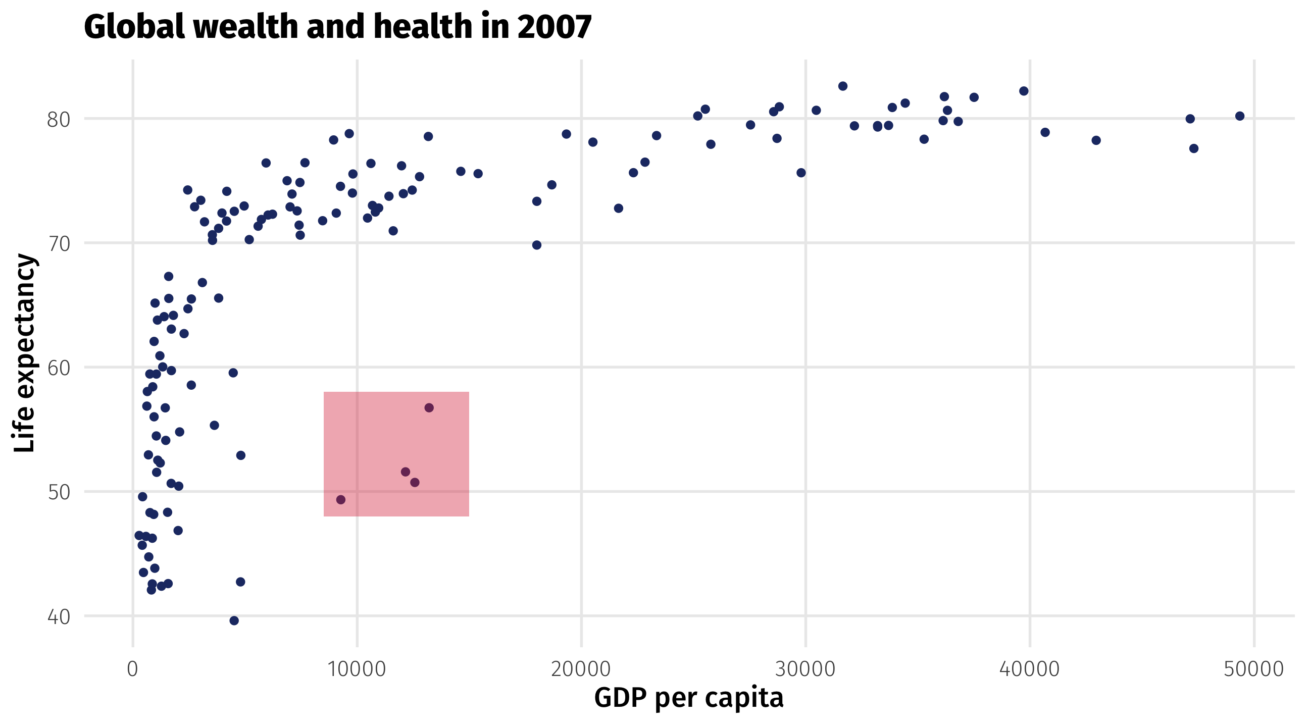
The scatterplot visualizes the relationship between two continuous variables
Shows every point in the data, reveals trends and outliers
Scatterplots are for continuous variables
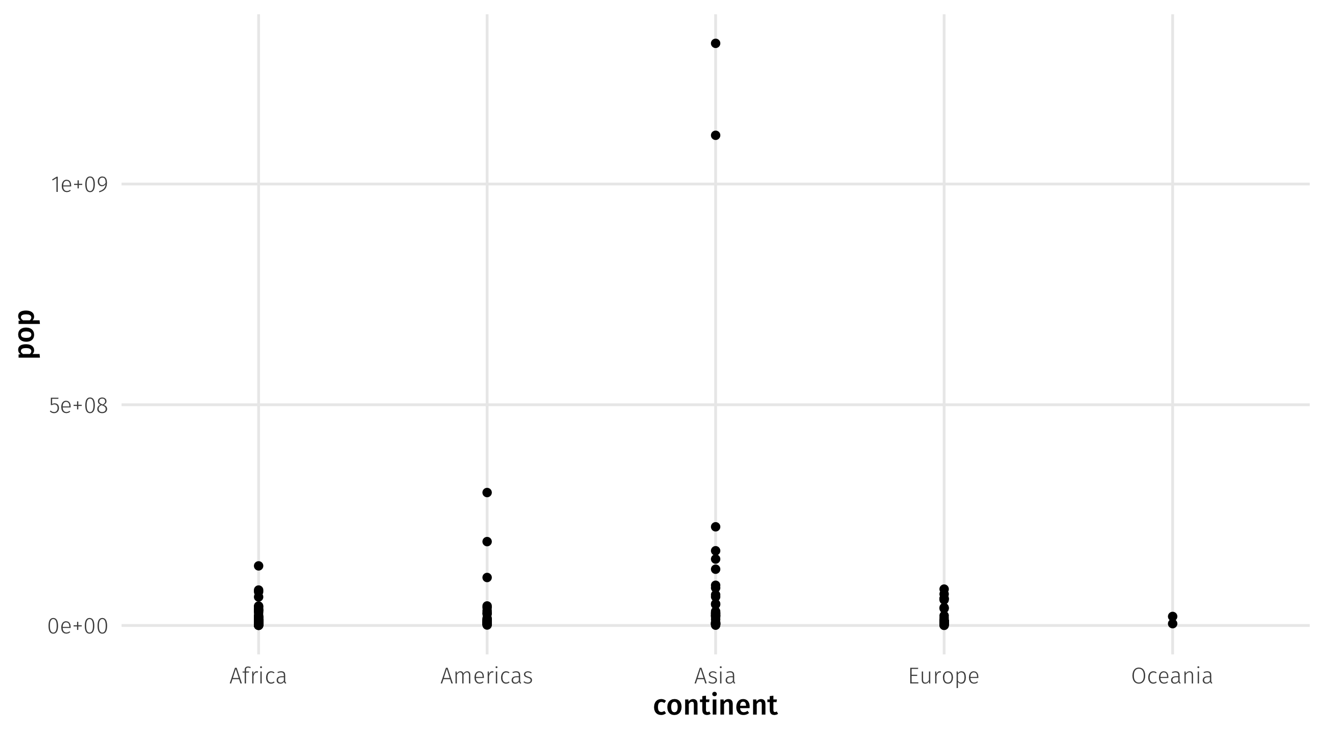
Plot is uninformative because continent is discrete (i.e., a category)
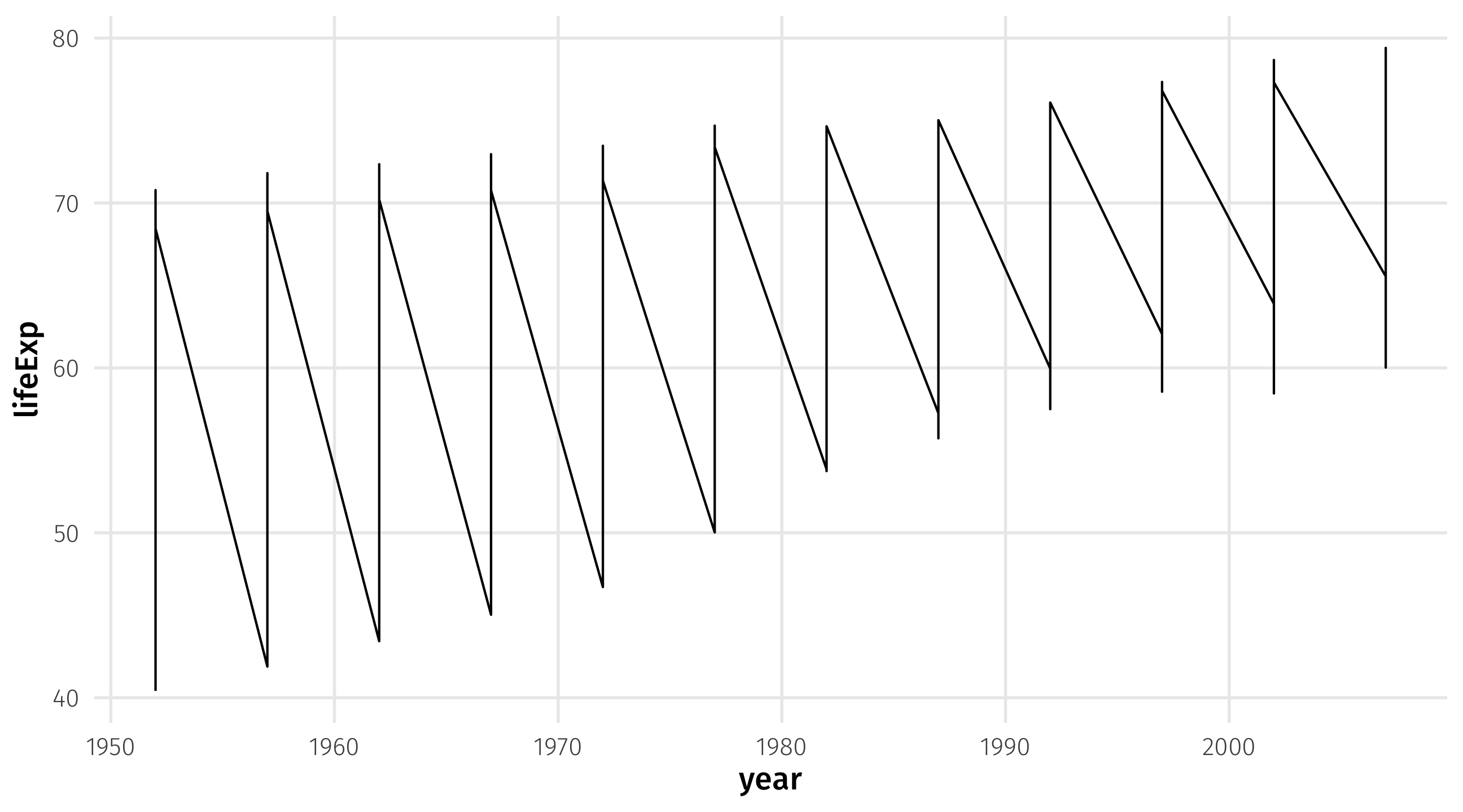
Graph 2: the time series
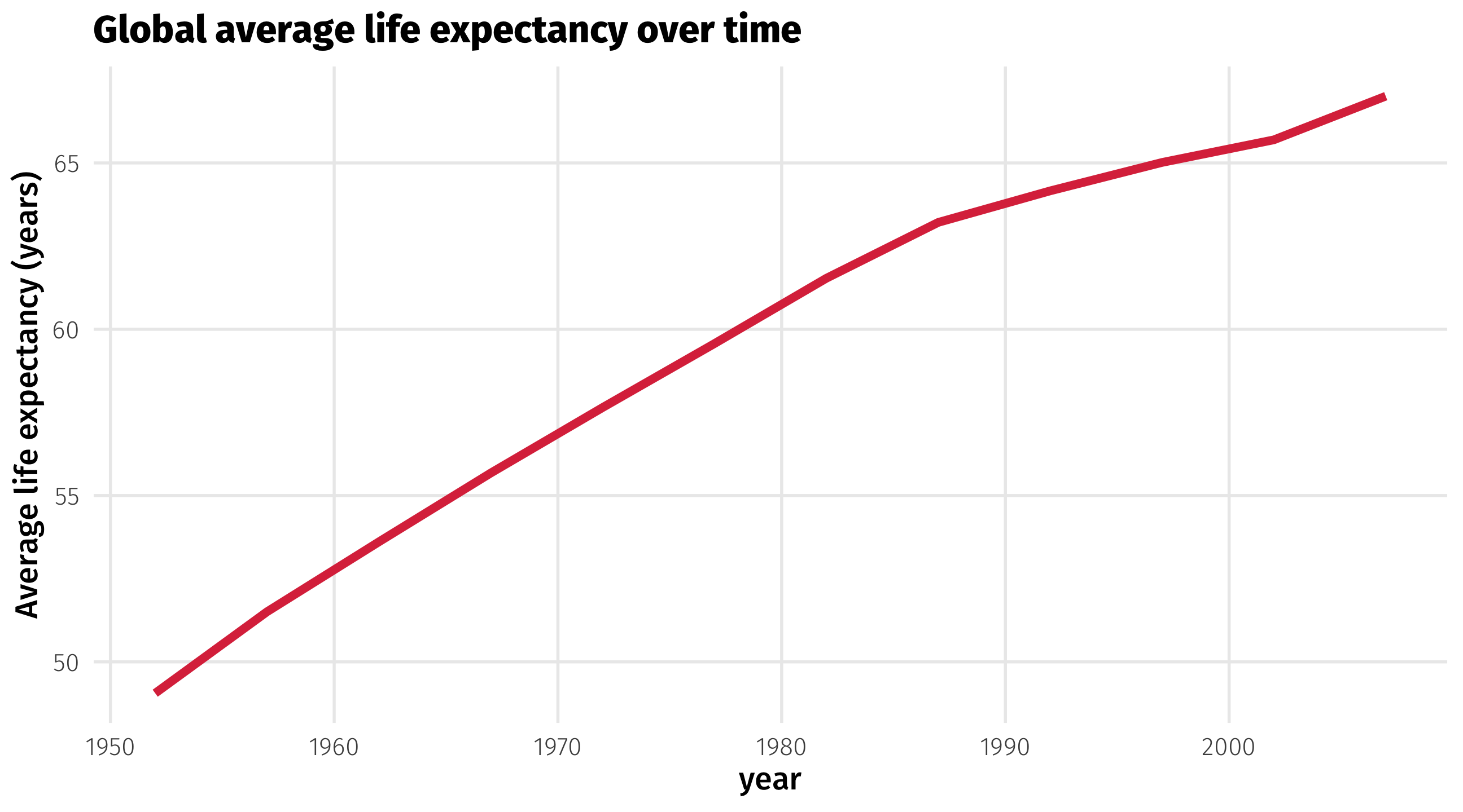
The time series uses a line to show you how a variable (y-axis) moves over time (x-axis)
The time series
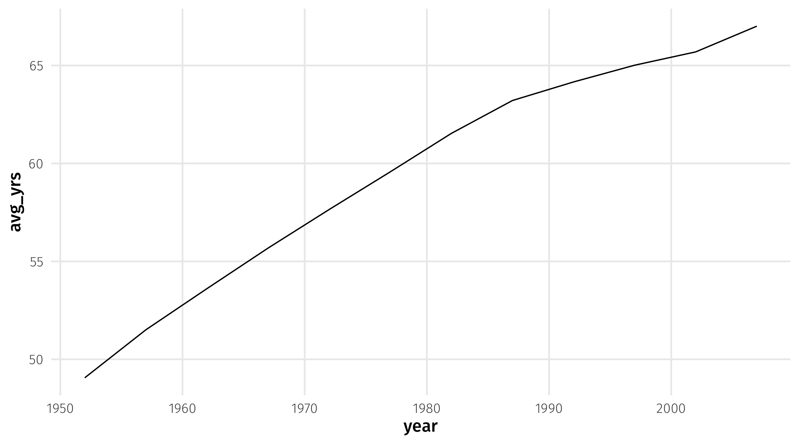
Start from scratch

Add aesthetics
Add geometry: 🤢
using color to separate lines
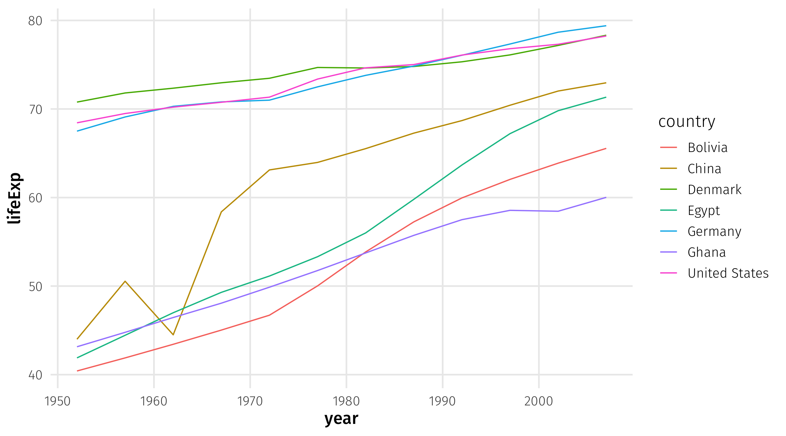
Multiple time series

These are useful for comparing trends across units (countries, places, people, etc)
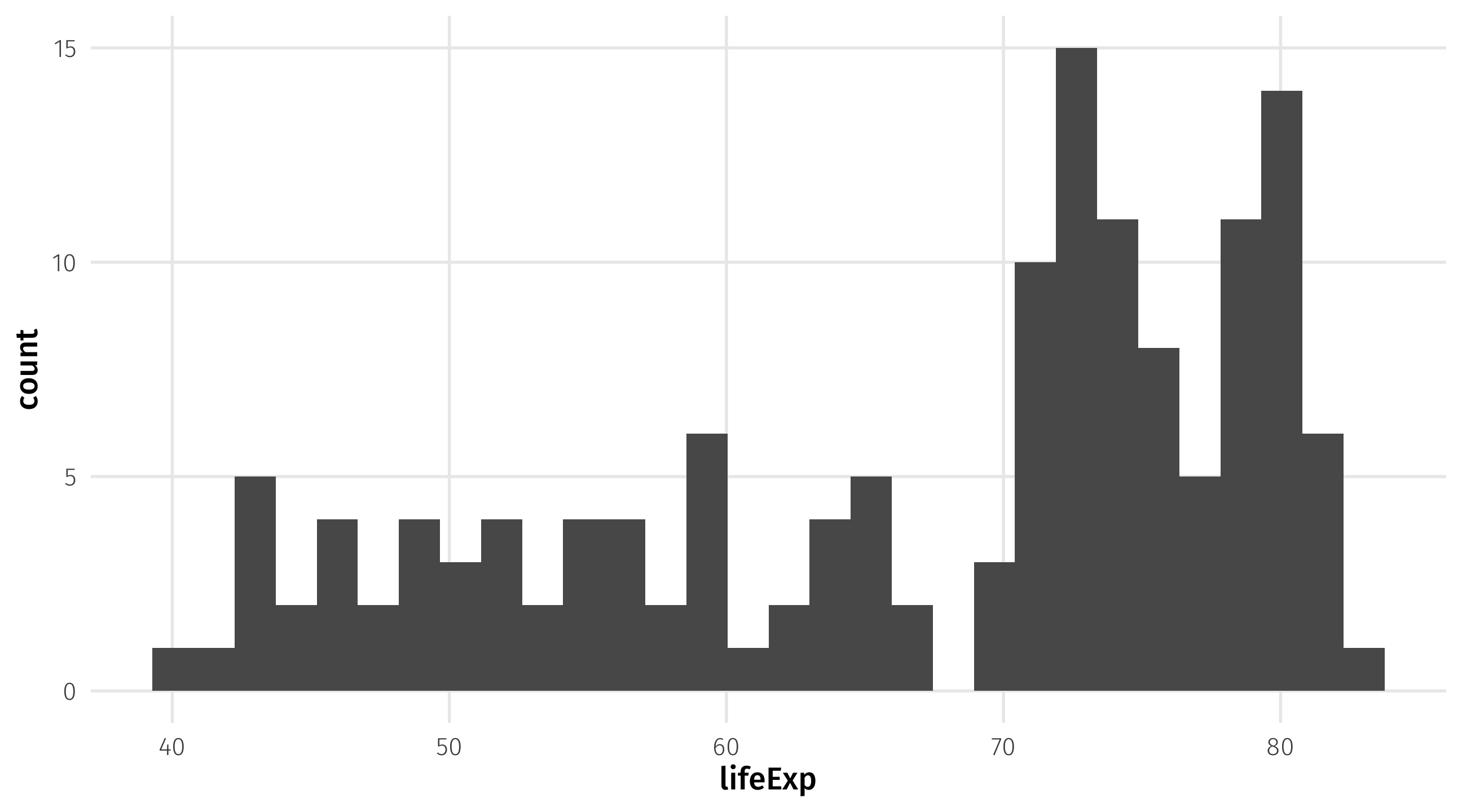
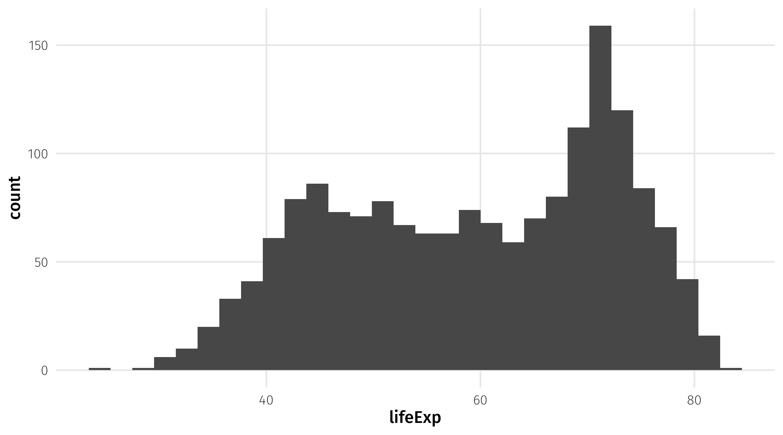
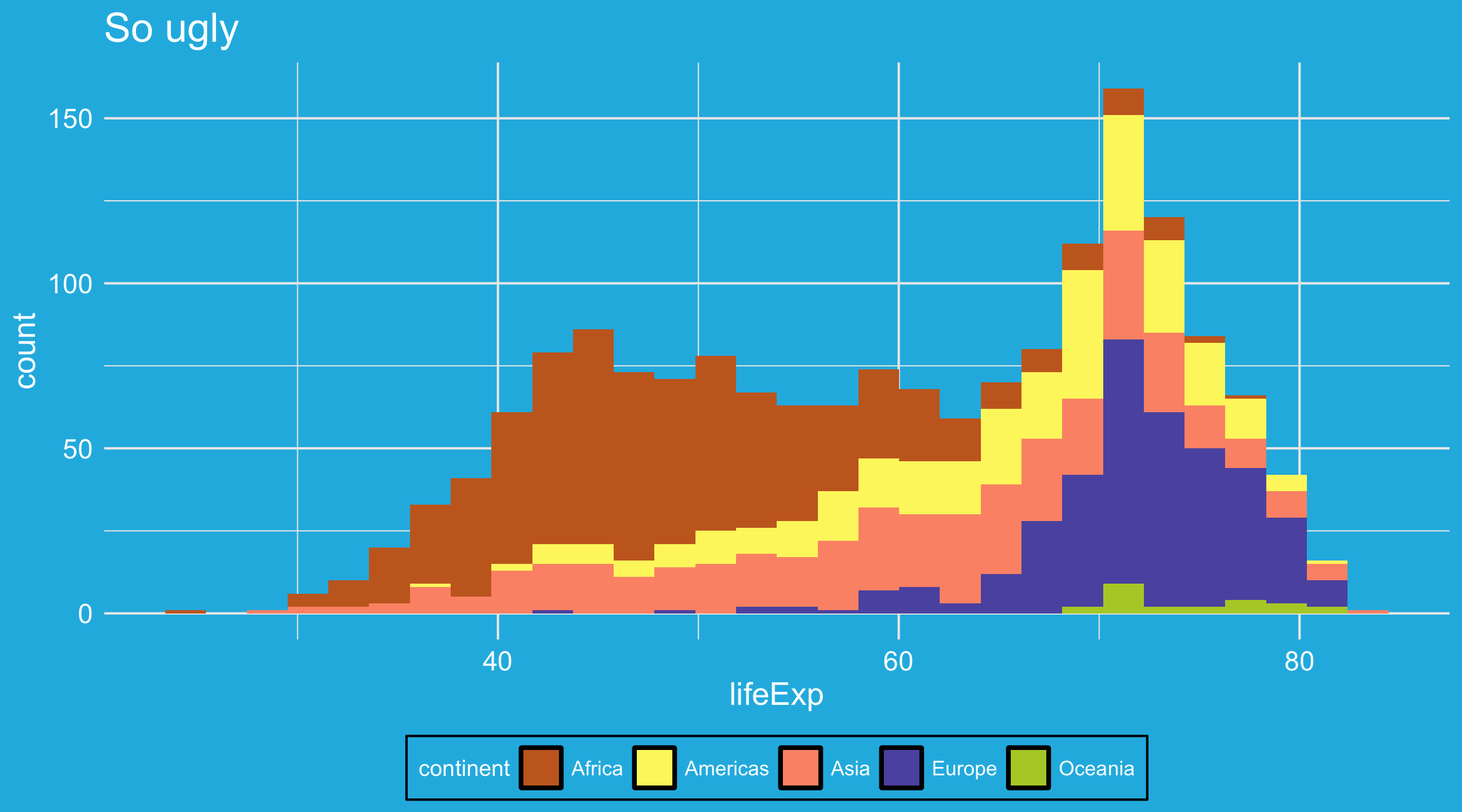
Graph 3: the histogram
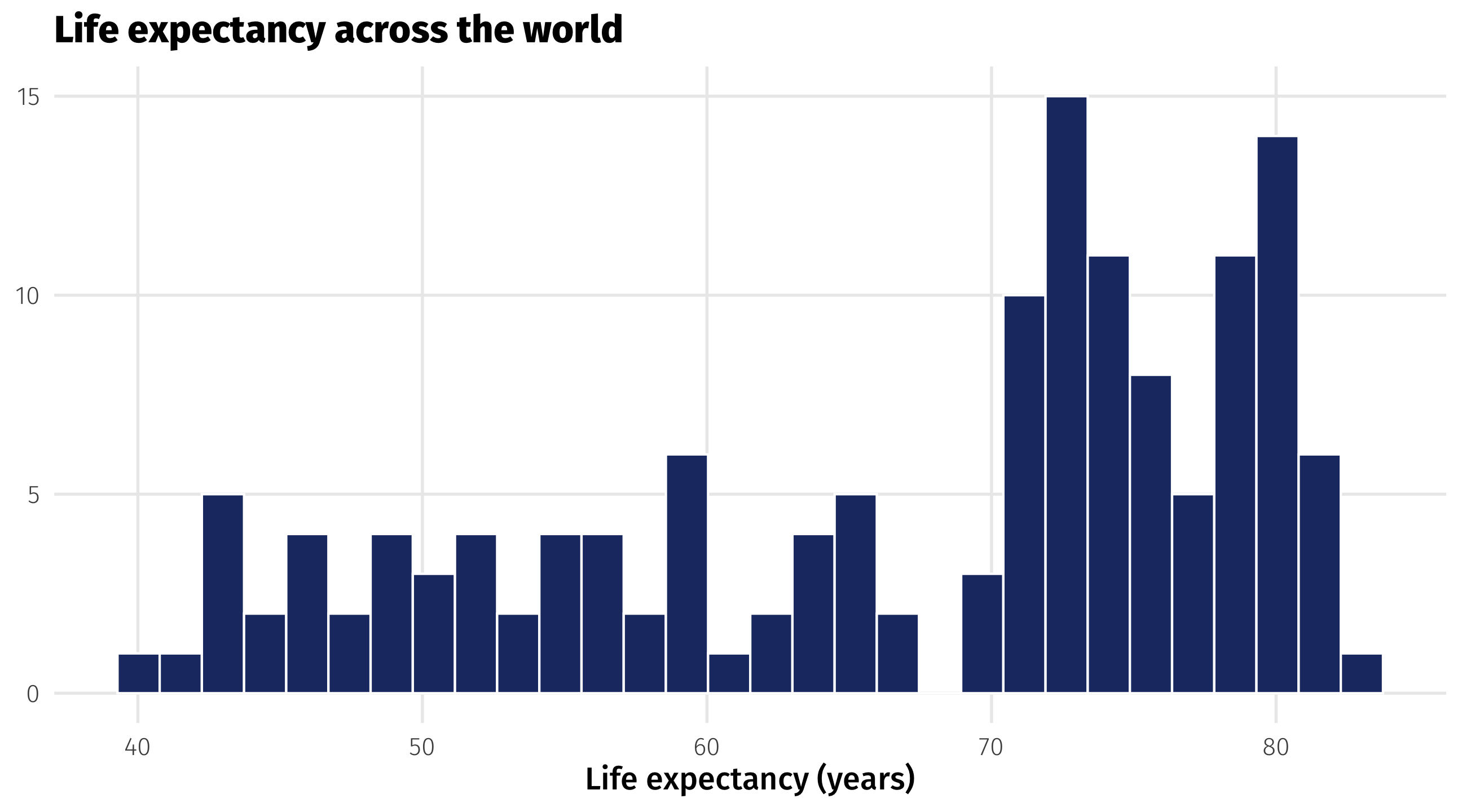
A histogram shows you how a continuous variable is distributed
Interpreting histograms

The histogram
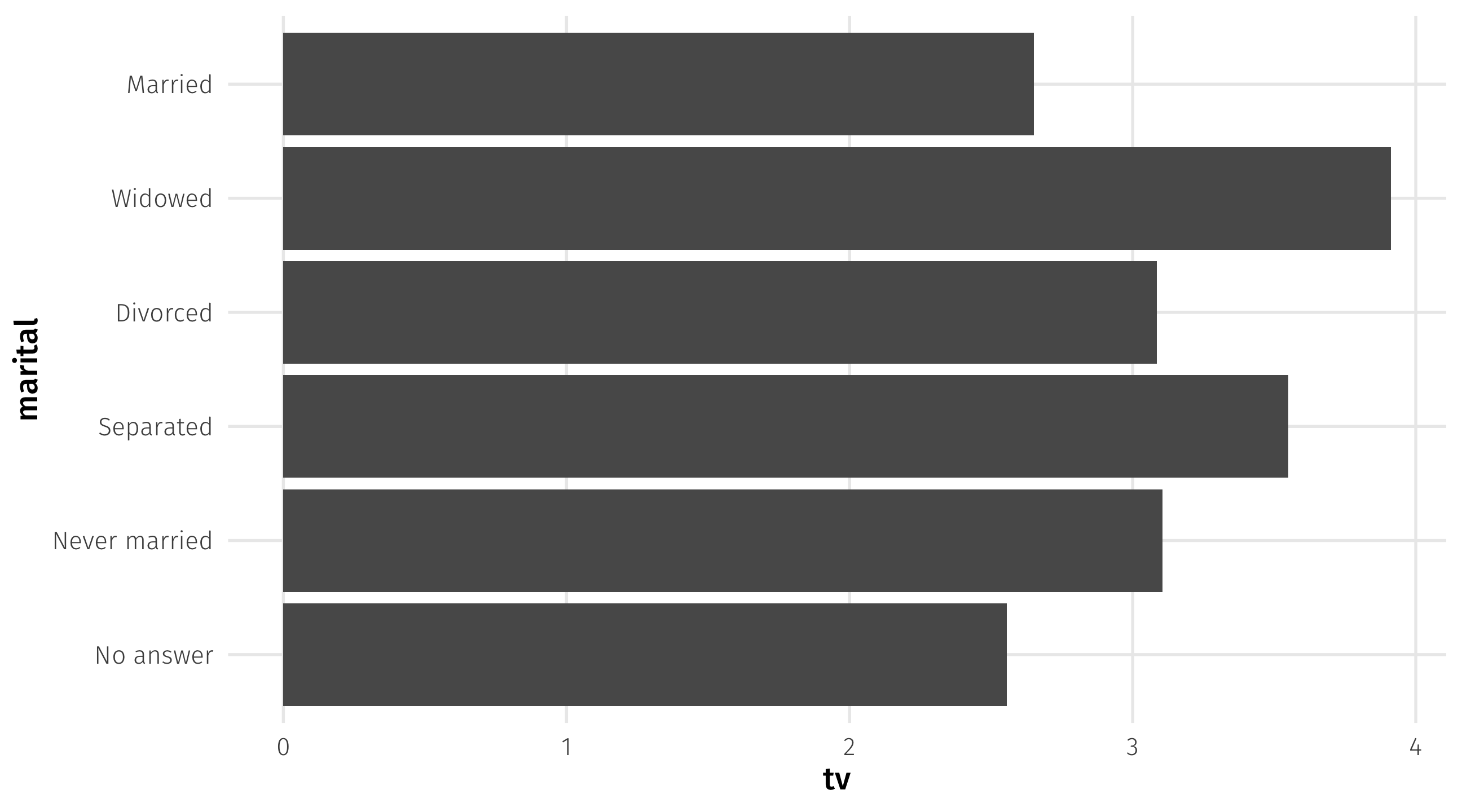
Graph 4: the barplot
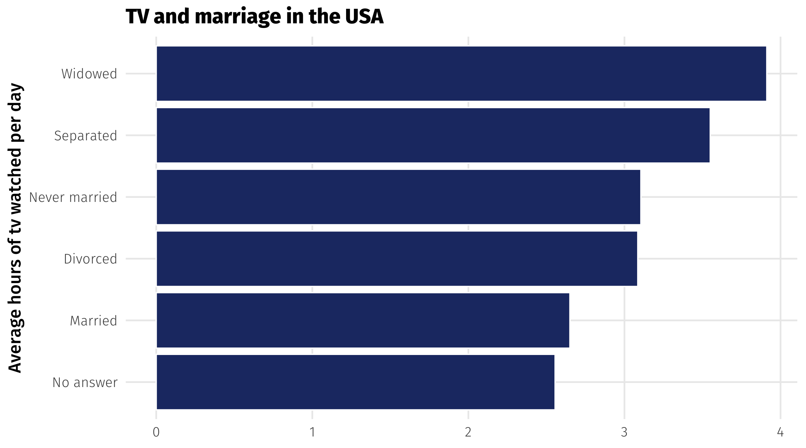
Barplots place a category (place, country, person, etc) on one axis and a quantity (amount, average, median, etc.) on another
Useful for making comparisons, highlighting differences
The barplot
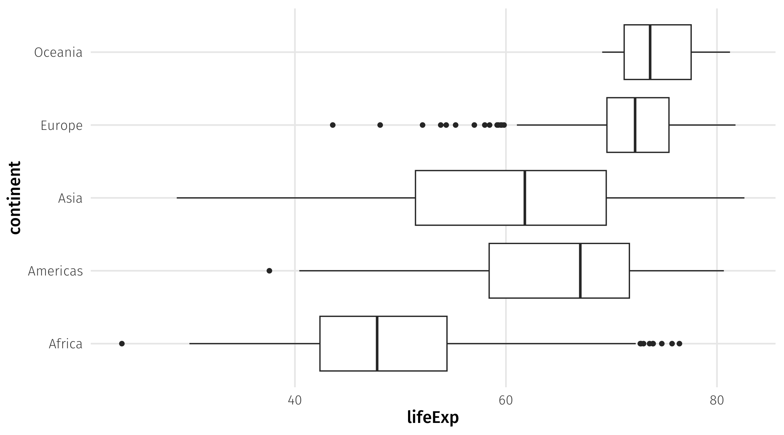
Graph 5: the boxplot
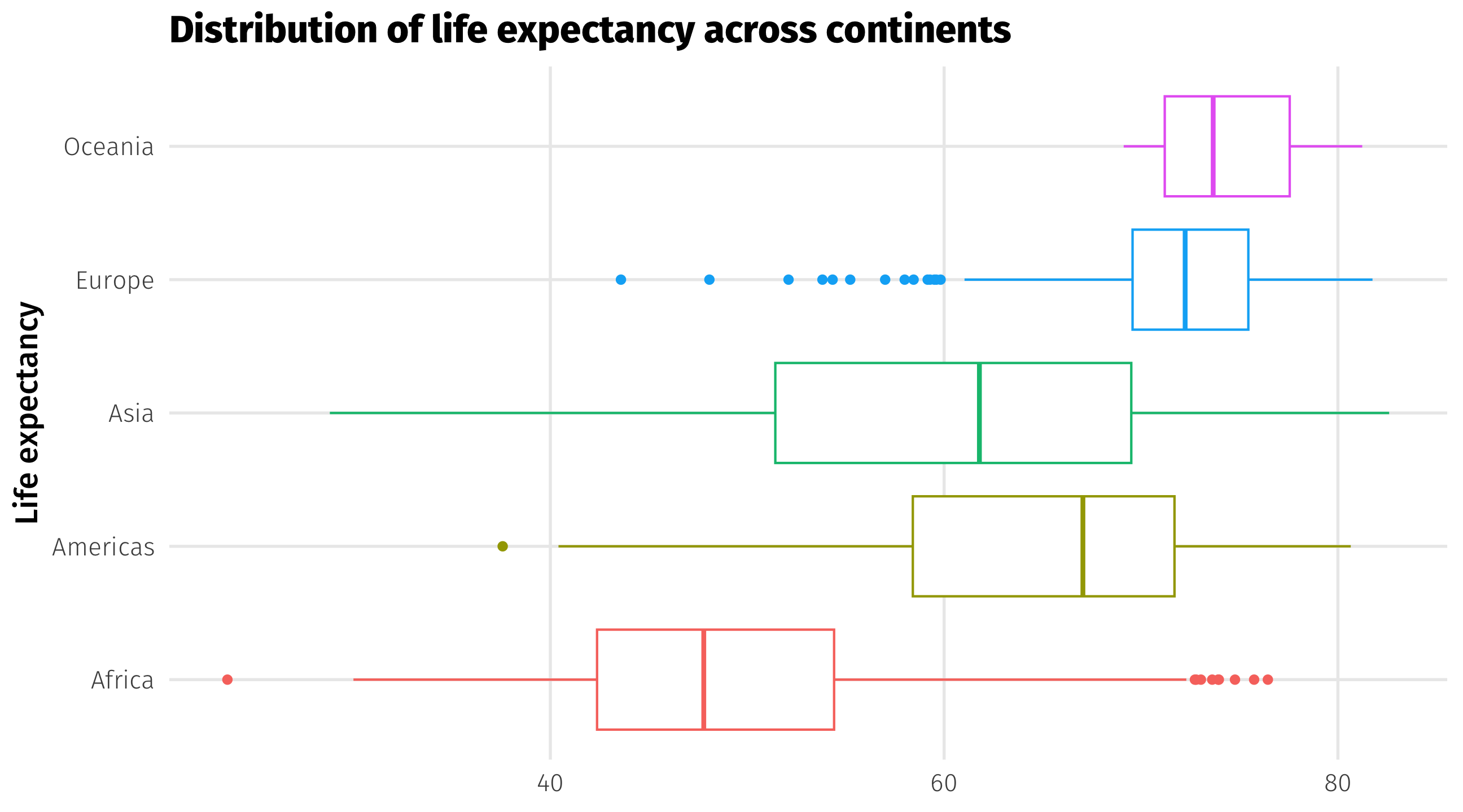
Boxplots compare distributions of continuous variables across groups
Compare distributions: the boxplot
Boxplots contain a lot of info 🥵:
- bold line is the median observation
- box is the middle 50% of observations
- thin lines show you min and max value, except…
- the dots, which are outlier observations

The boxplot
Showing “movement” using panels
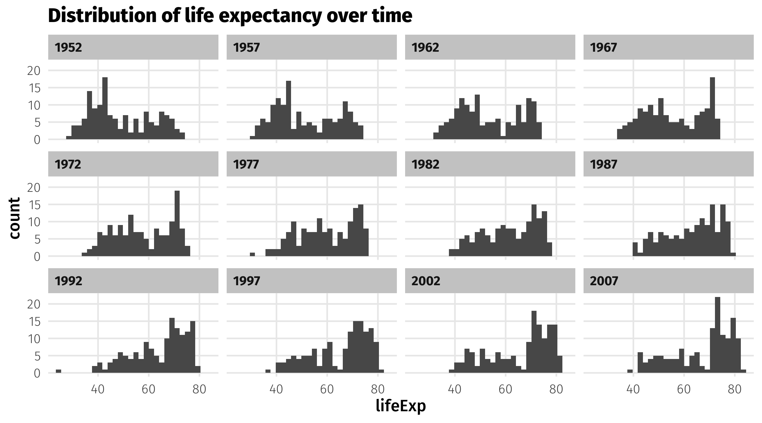
We can use panels to show movement of a variable across time, space, etc.
Using facet_wrap
Using facet_wrap
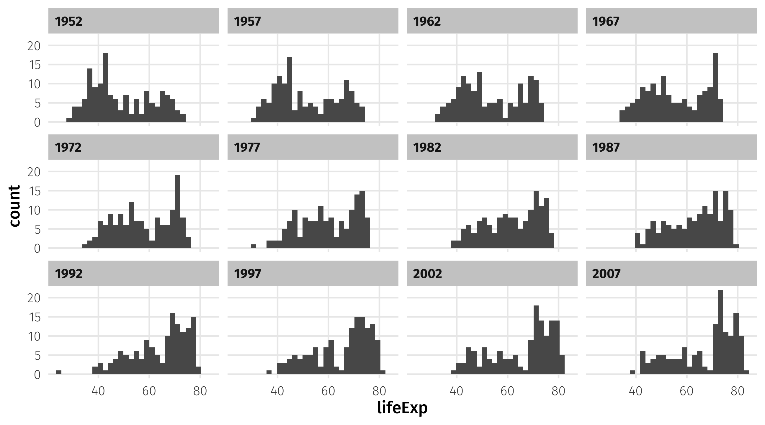
Note
Make sure the facetting variable is wrapped in vars()!
Make aesthetics static

Take your aesthetics out of aes() and into geom() to make them static
Ridge plots (better than grouped histograms)
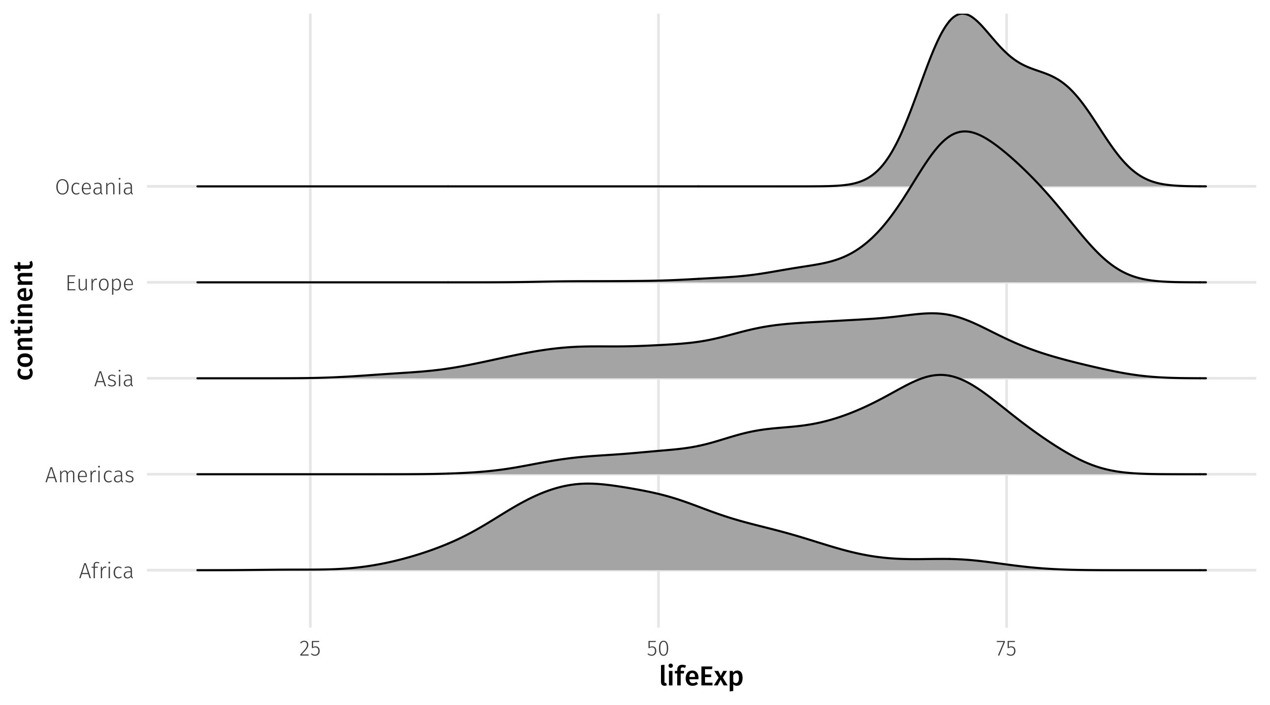
Ease visual comparison + kinda looks like the Joy Division album
Beeswarm plots (alternative boxplots)
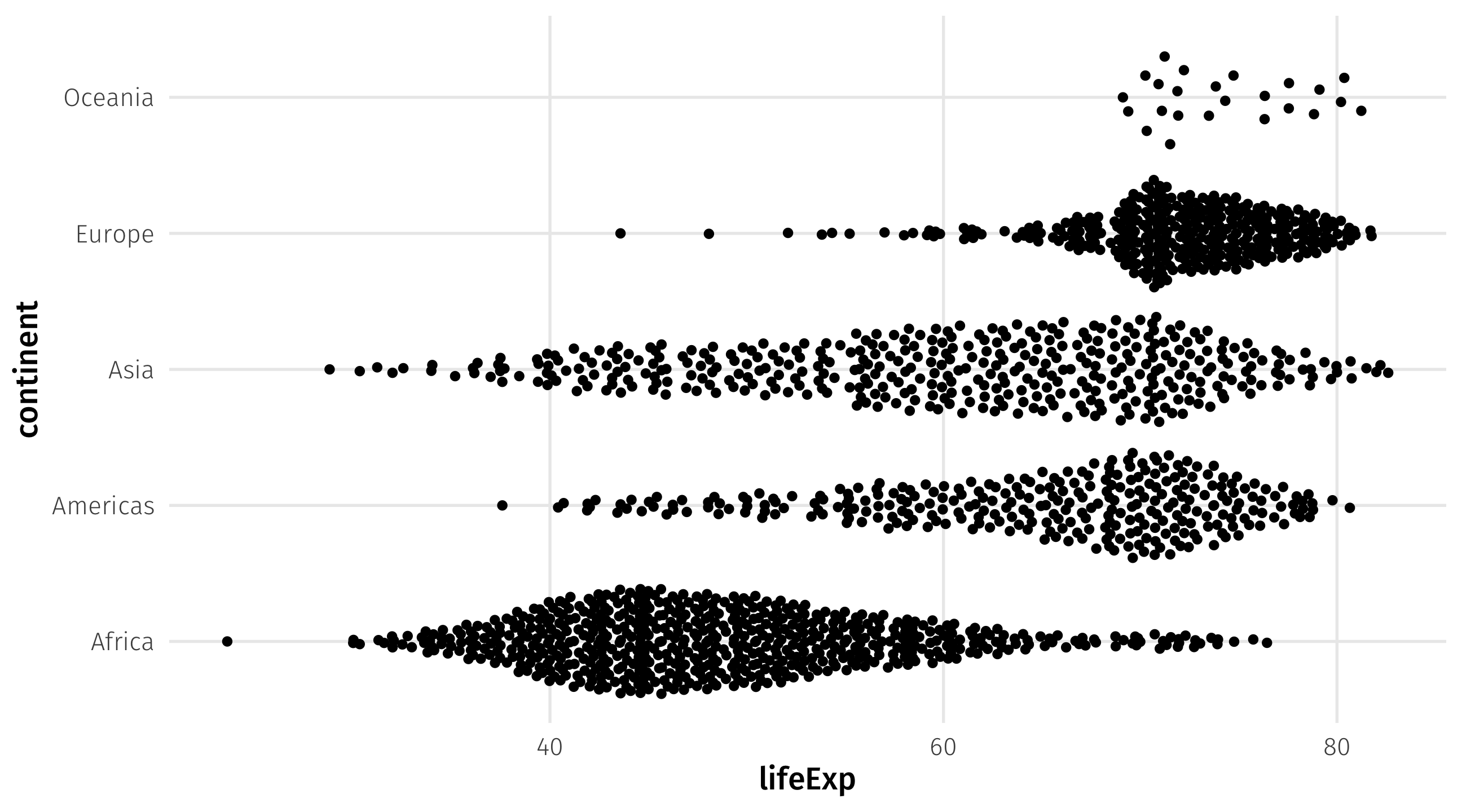
Beeswarm plots tell us something boxplots don’t: the number observations by group; used recently by the NYT
Use different color and fill scales
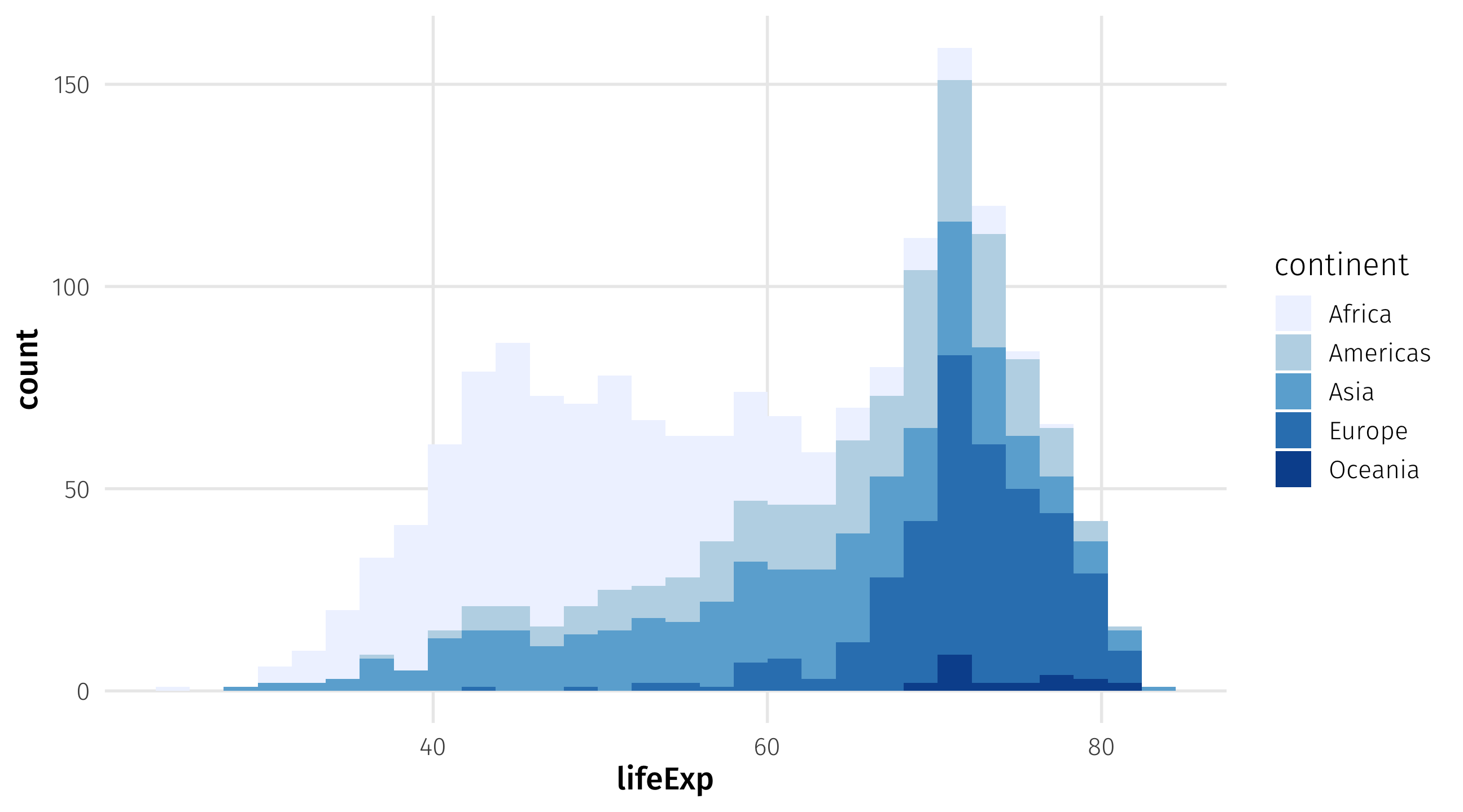
scale_fill_brewer() for fill, scale_color_brewer for color
My favorite scale (right now)
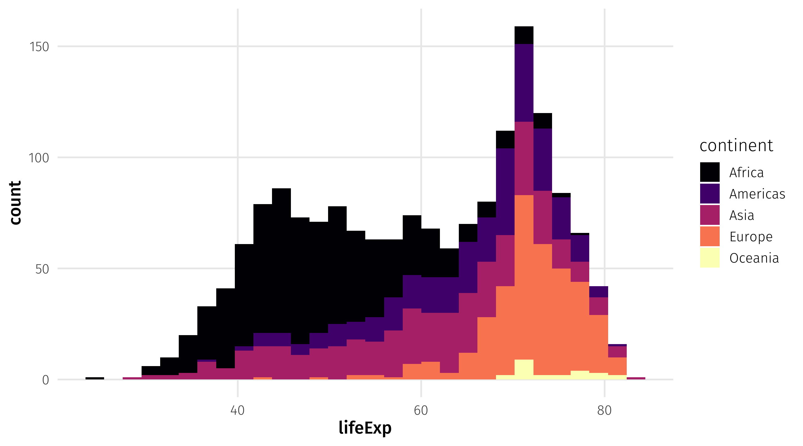
scale_fill_viridis_d for discrete variables, scale_fill_viridis_d for continuous
Many other themes
theme_spongeBob() from tvthemes package, many more online