Data visualization I
POL51
September 30, 2024
Tortured metaphor 1: R as a car
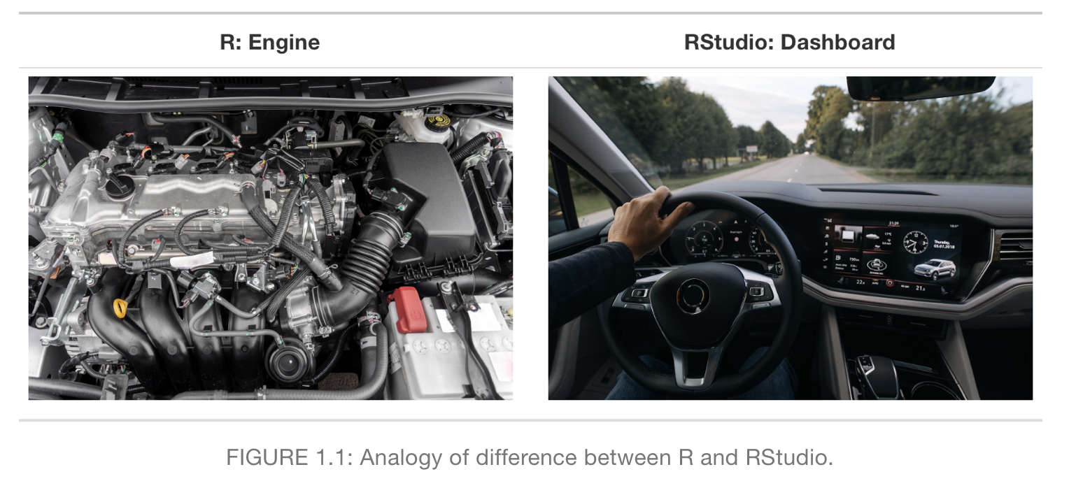
Tortured metaphor 1: R as a car
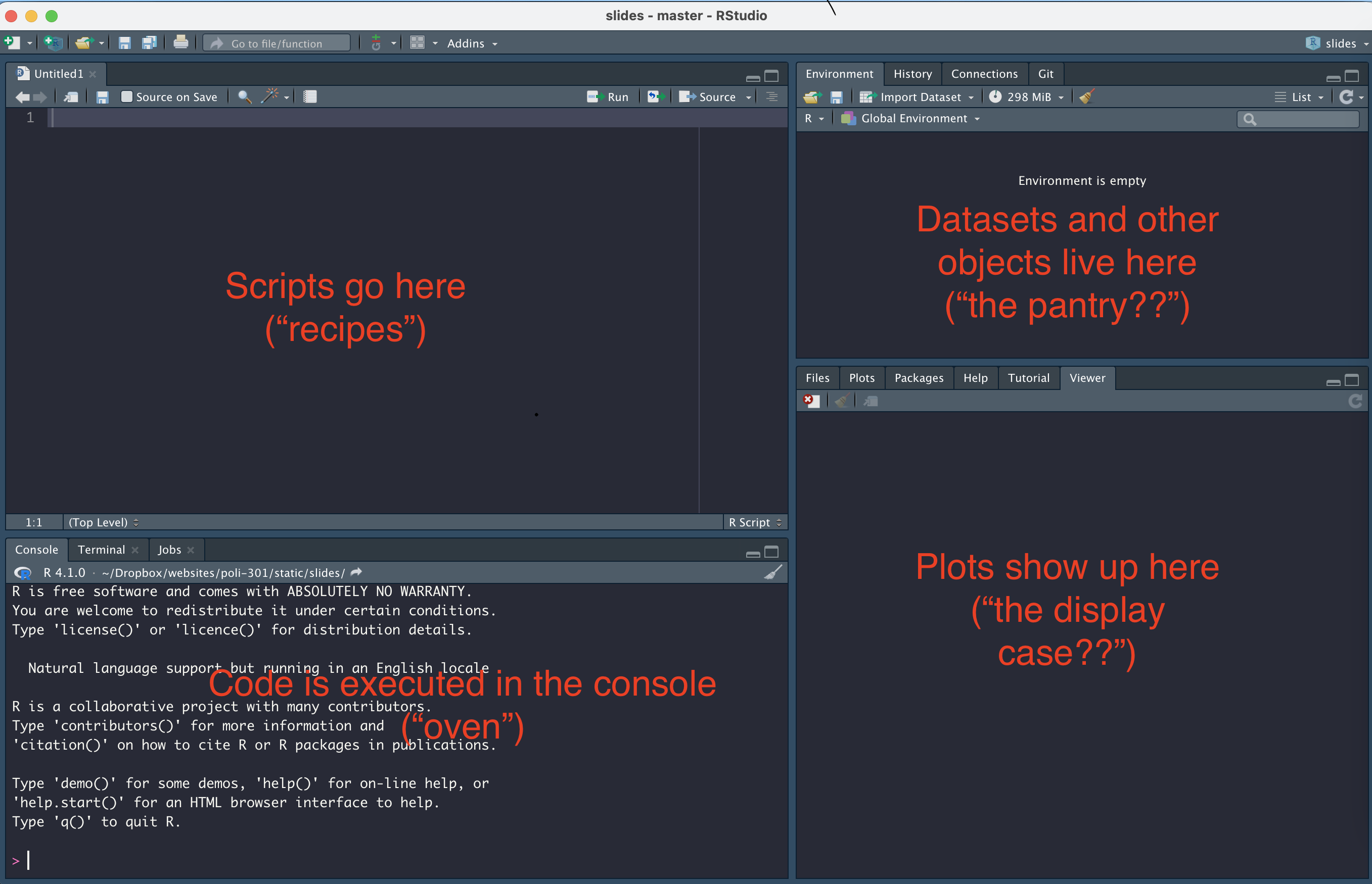
Tortured metaphor 2: RStudio as a kitchen

Tortured metaphor 2: RStudio as a kitchen
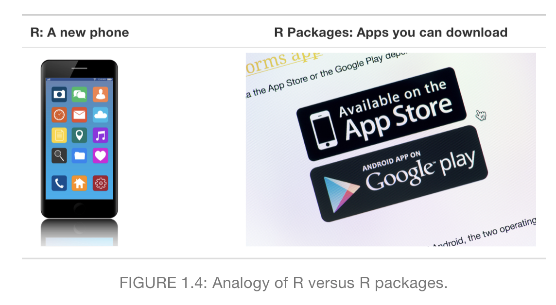
Tortured metaphor 3: RStudio as a phone
Packages are where most of our functions and data live
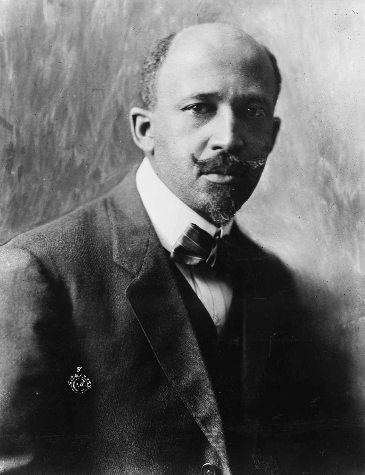
WEB Dubois
(1868 - 1963)
American sociologist
historian
civil rights advocate
Data visualization specialist?
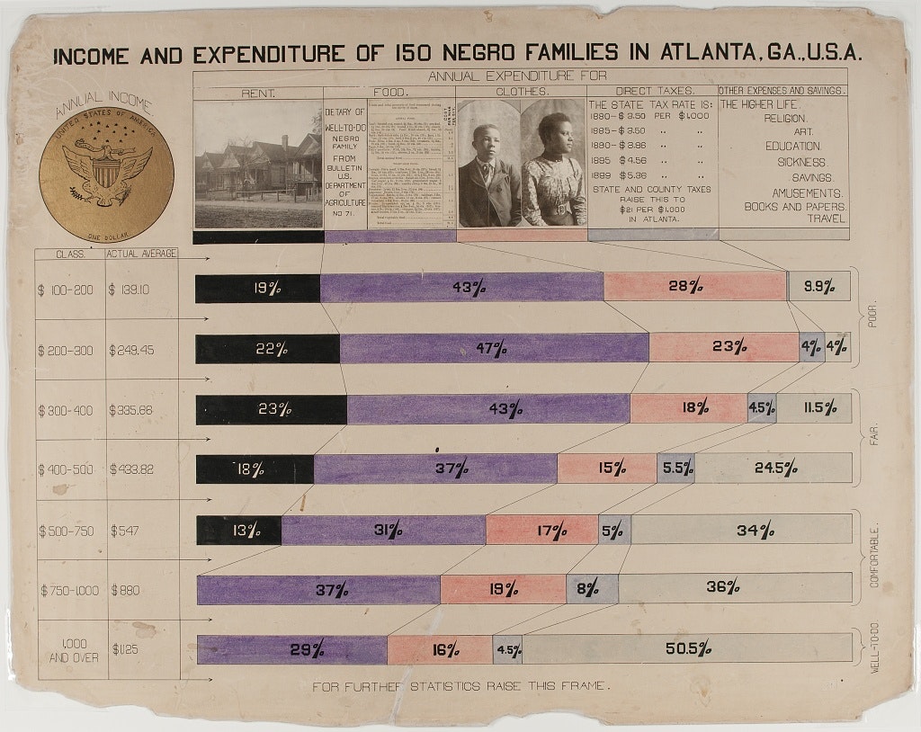
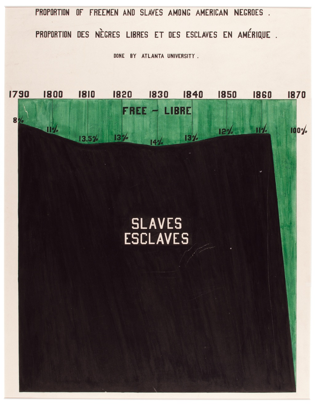
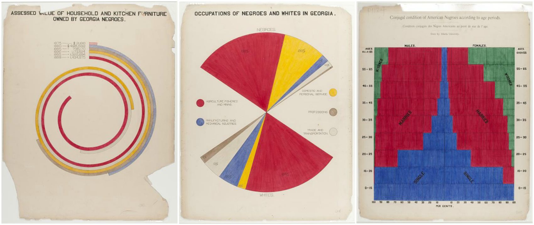
Dataviz to inform
Dataviz to mislead
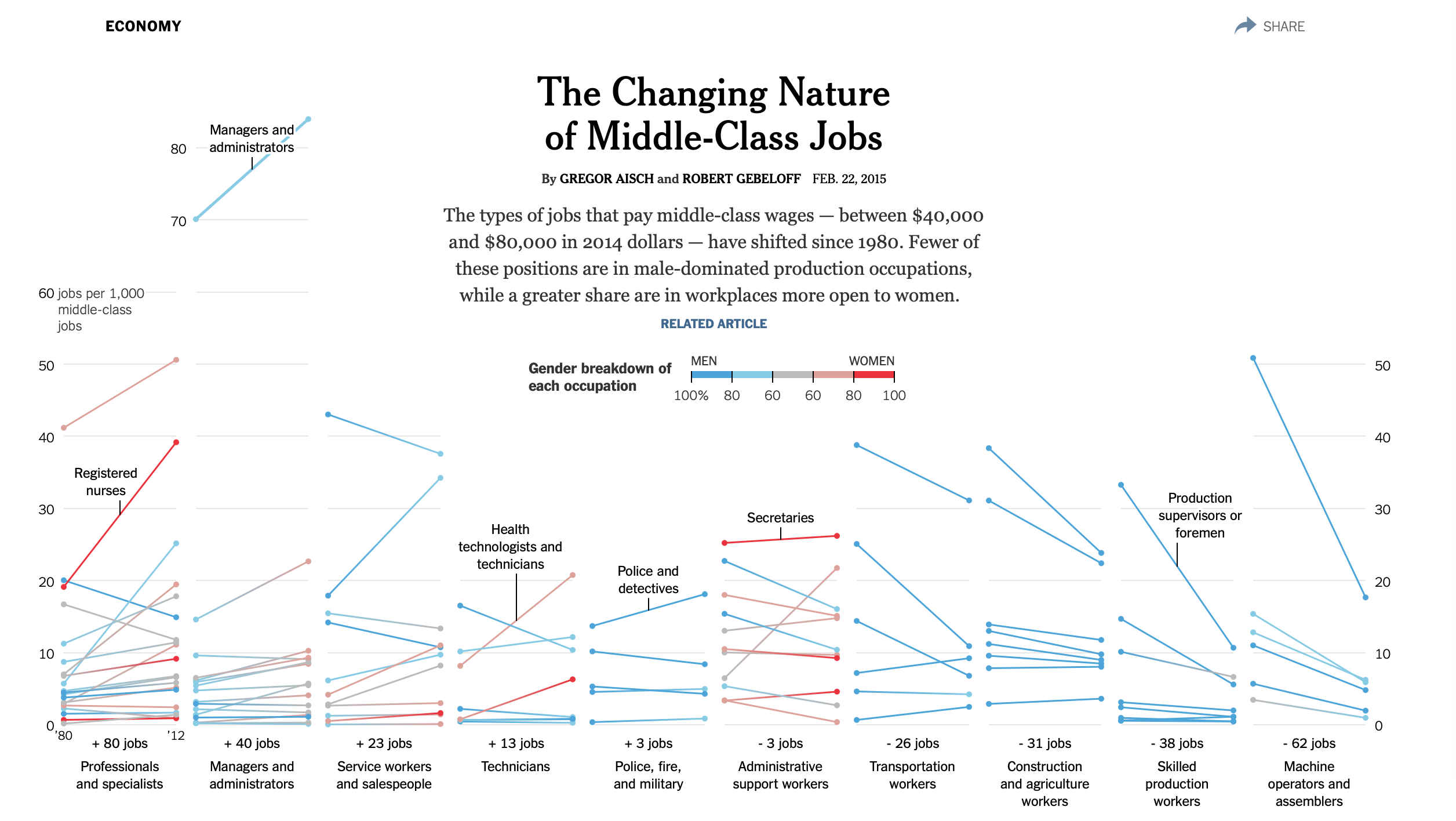
Inform? or mislead?
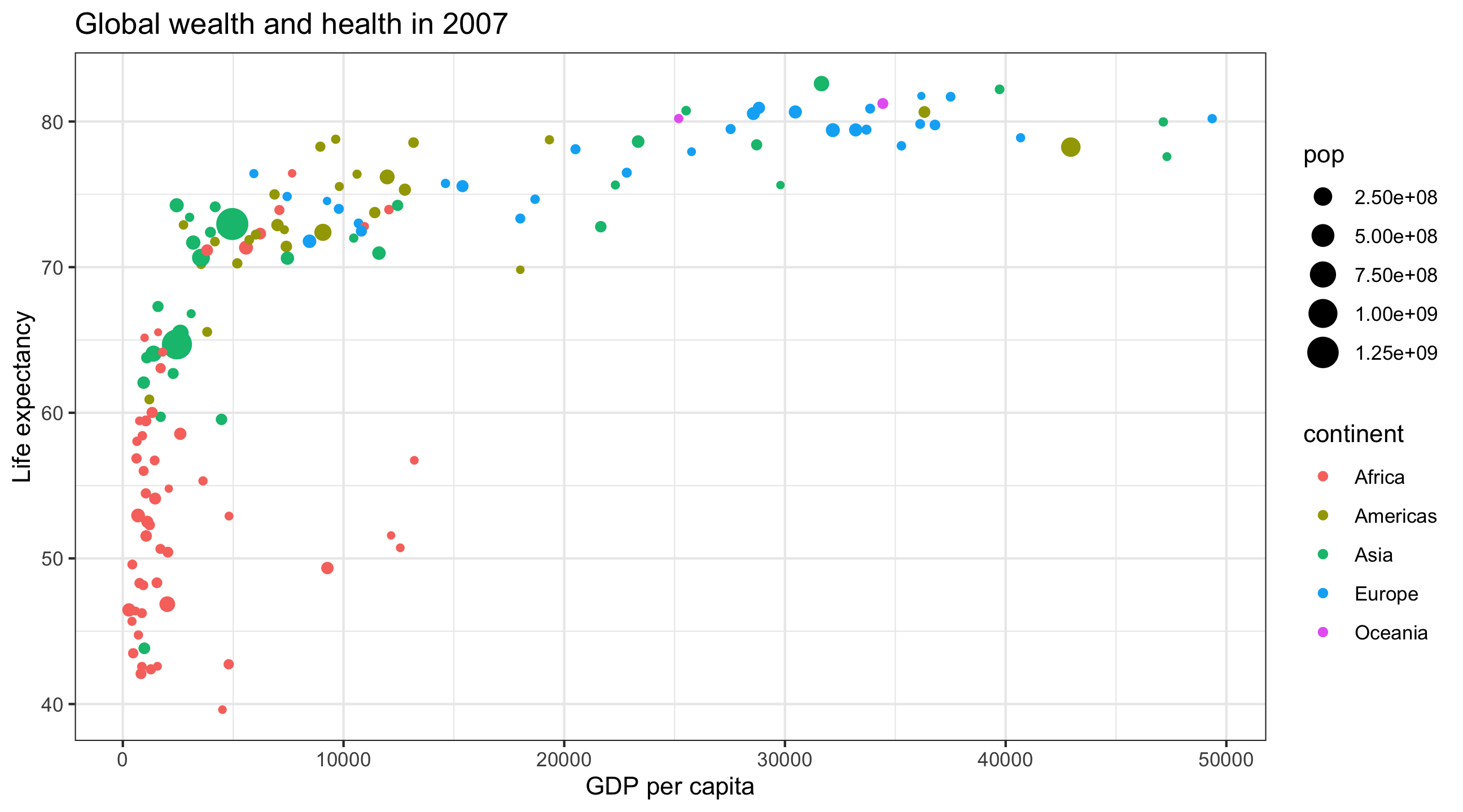
The final graph
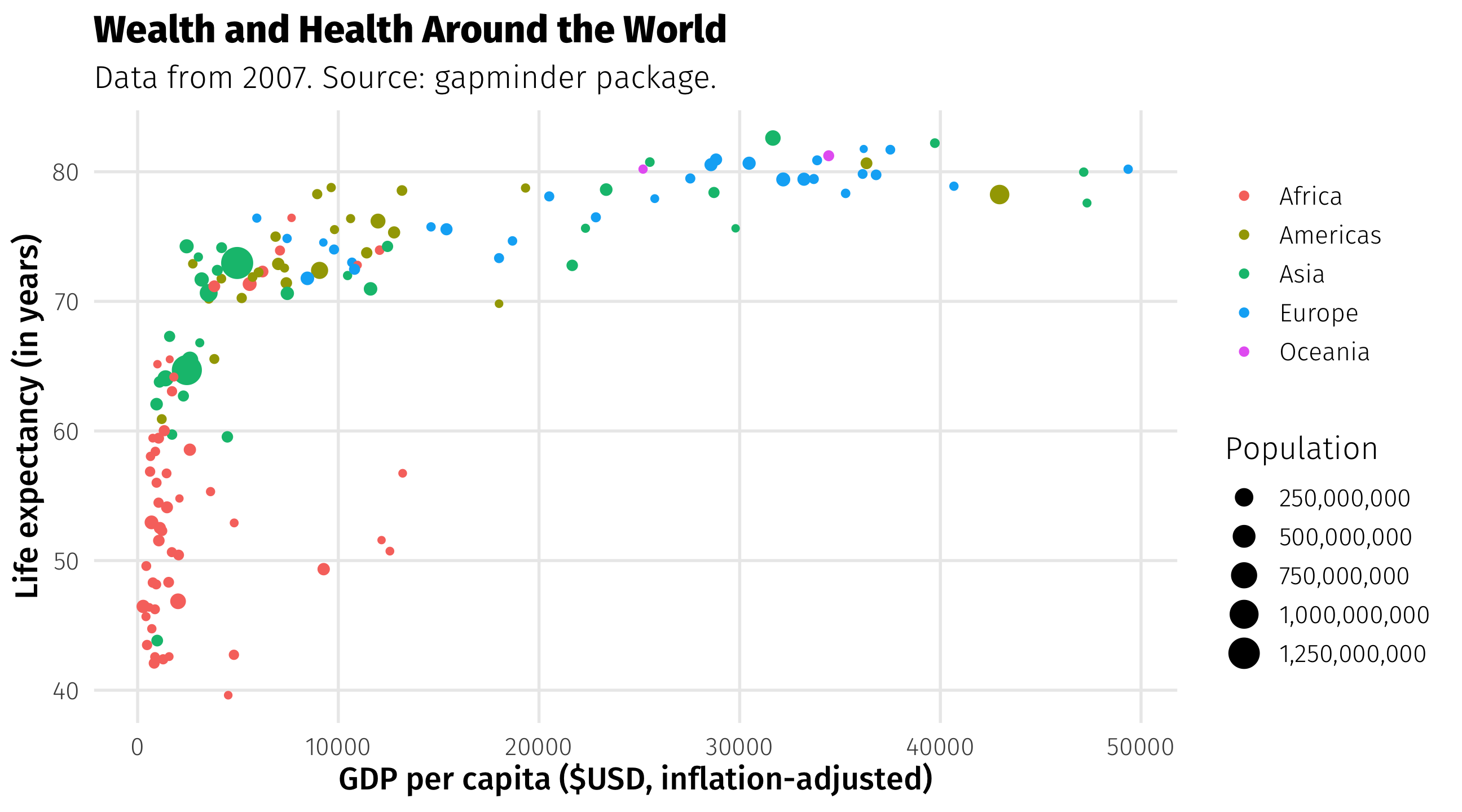
ggplot(): our first function 😢

ggplot: specify the data

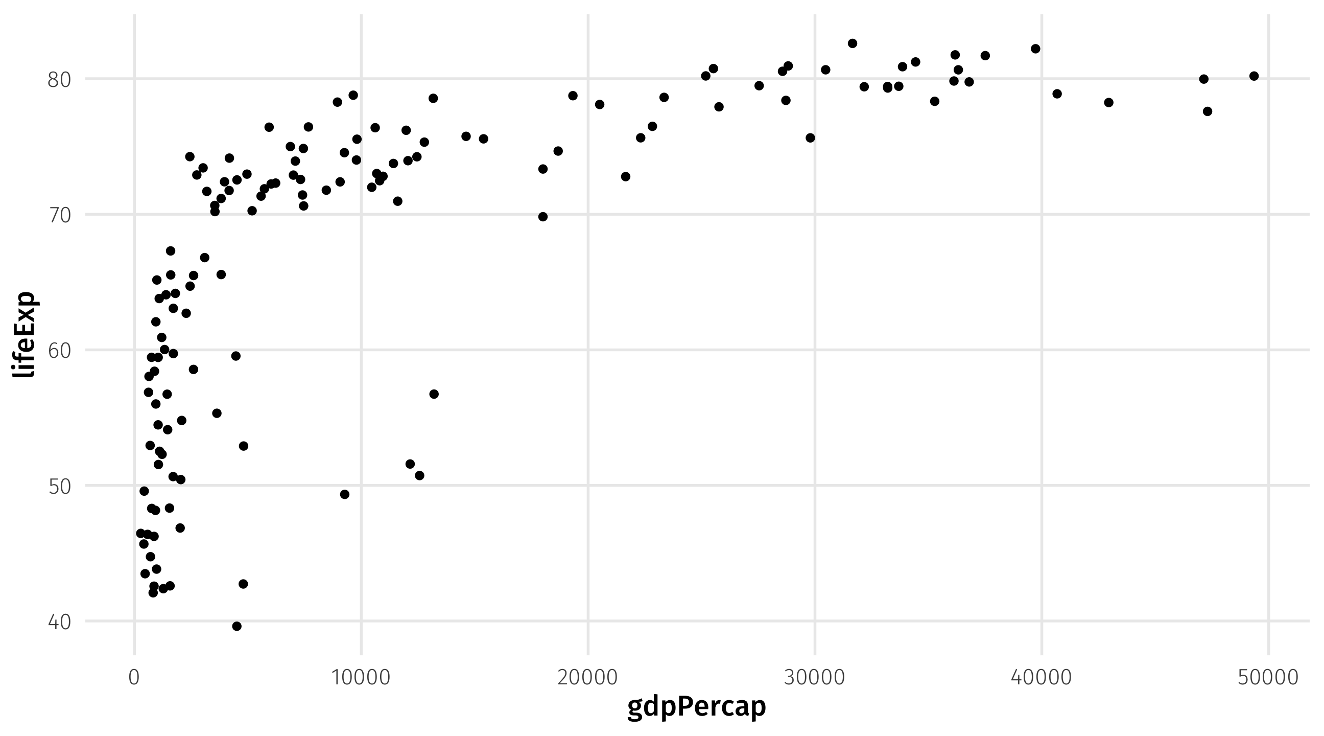
Use aes() to map variables to aesthetics
add geometries and layers using +
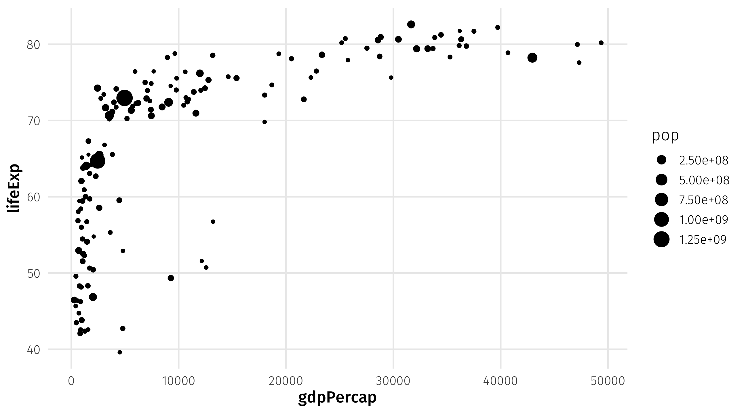
mapping population to size in aes()
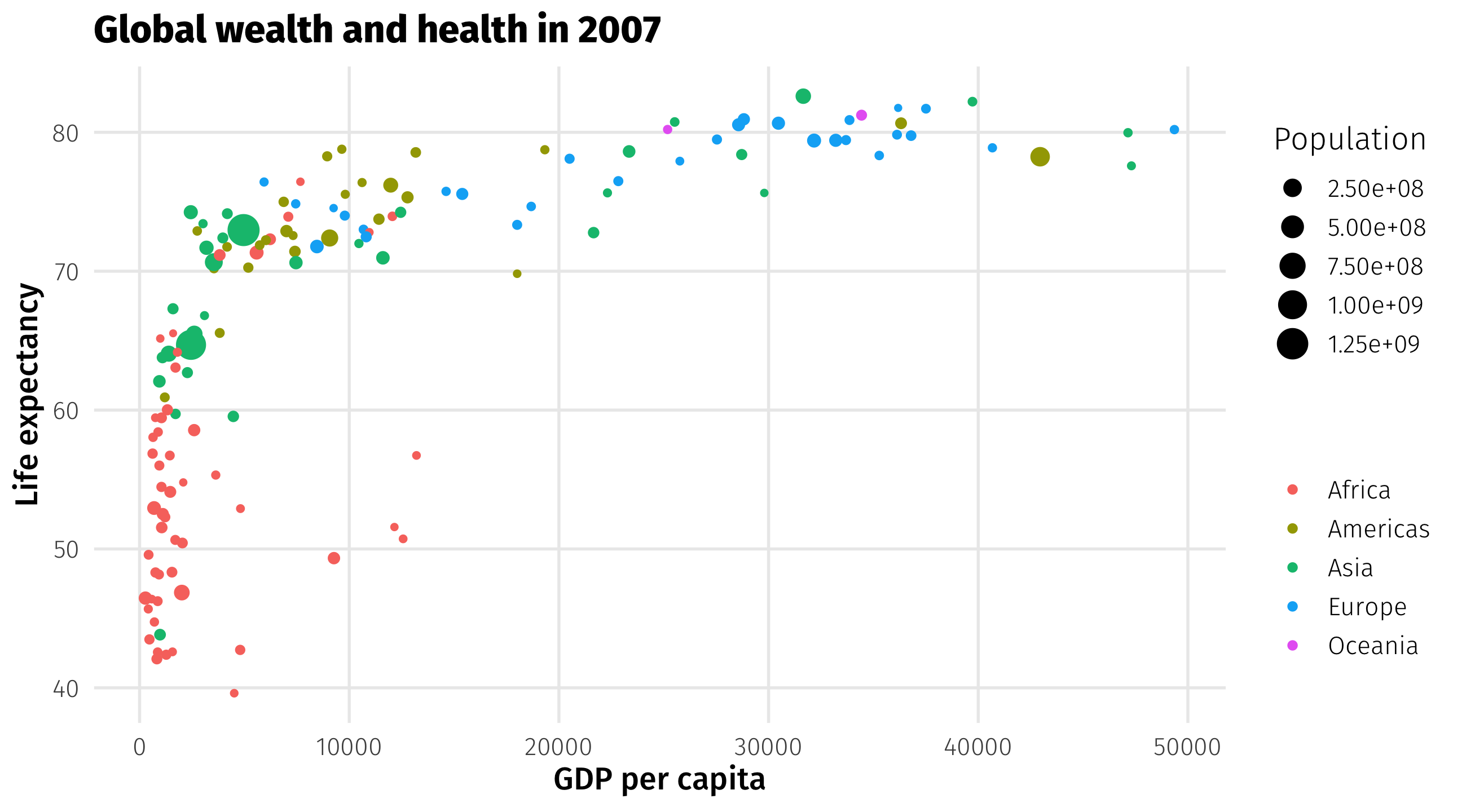
mapping continent to color in aes()

Other layers: add the missing titles with labs()
Notice that text is placed within quotation marks!
Other layers: add a theme
There are many more themes, here are a few
What’s that country way out on the bottom right?
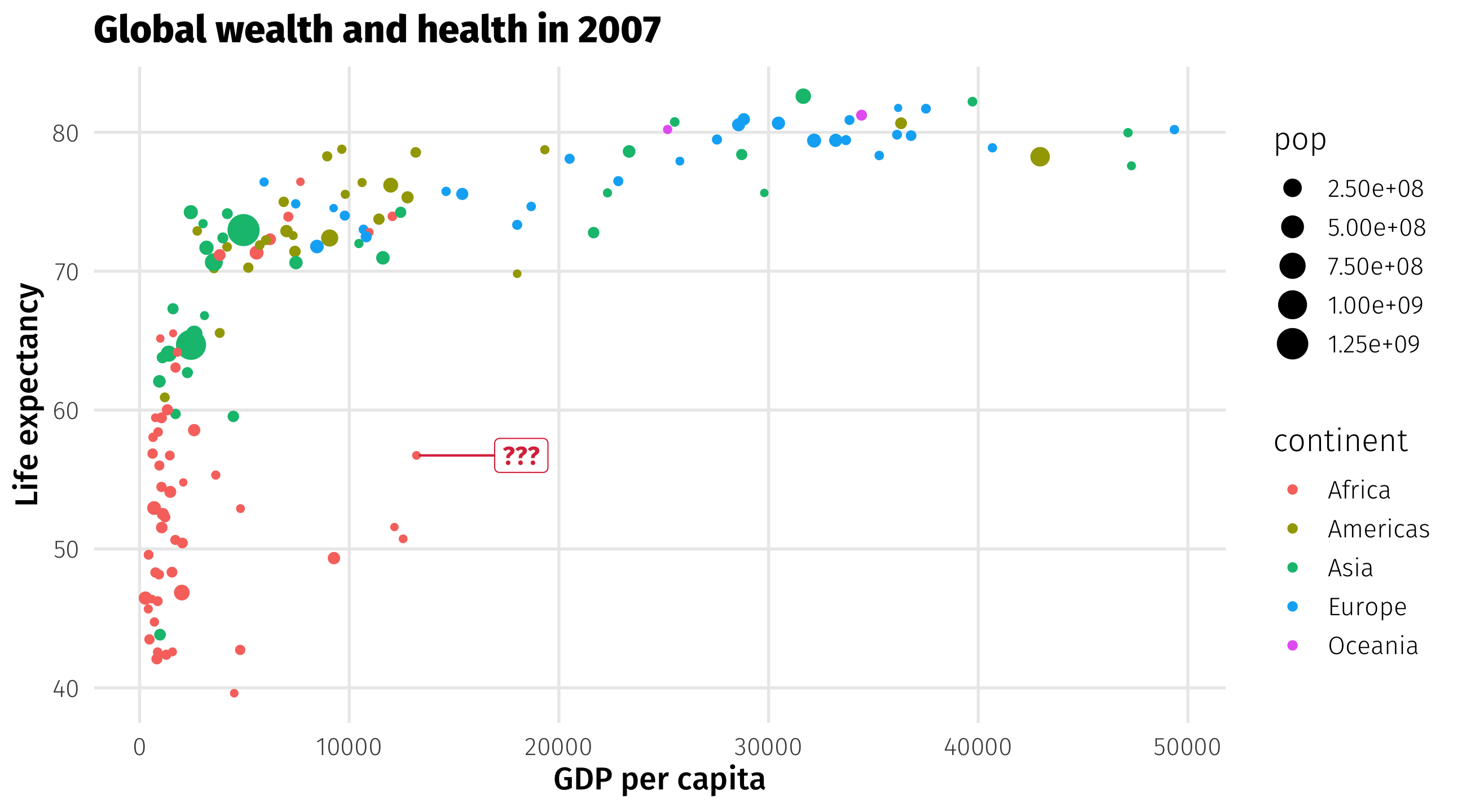
The basic plot

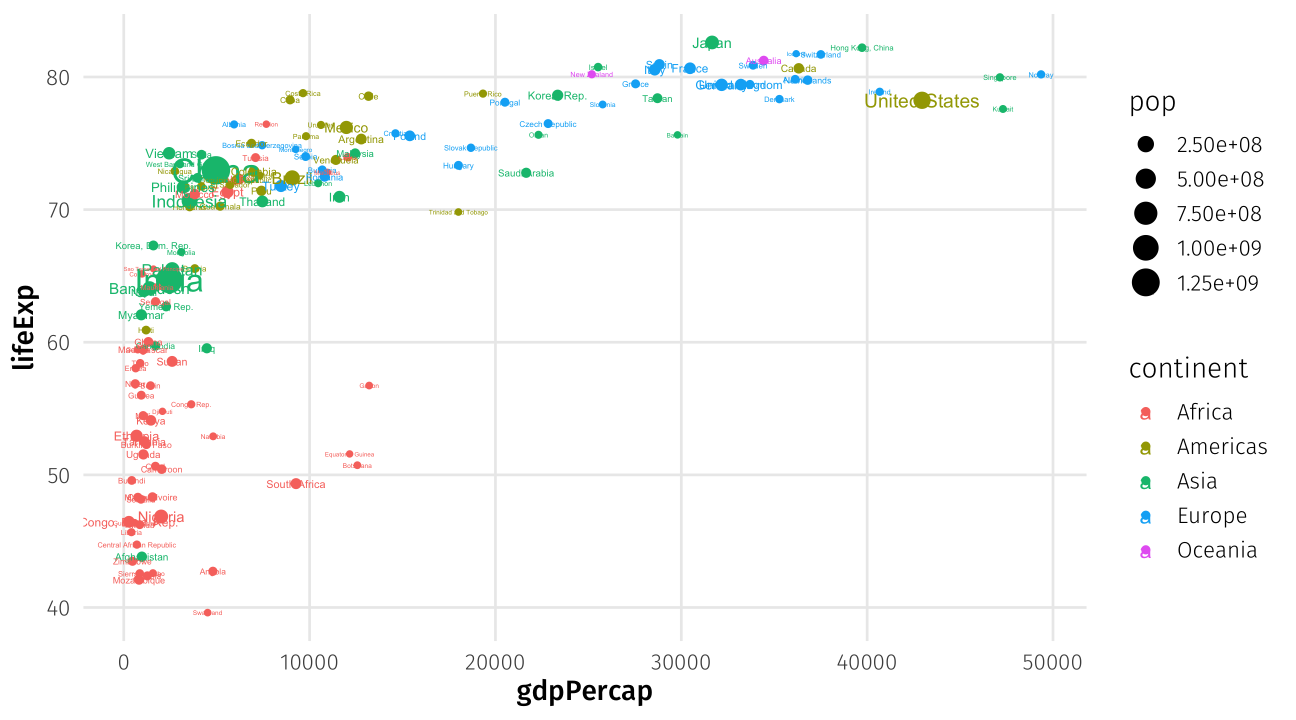
Map country names to label aesthetic
Plot the labels
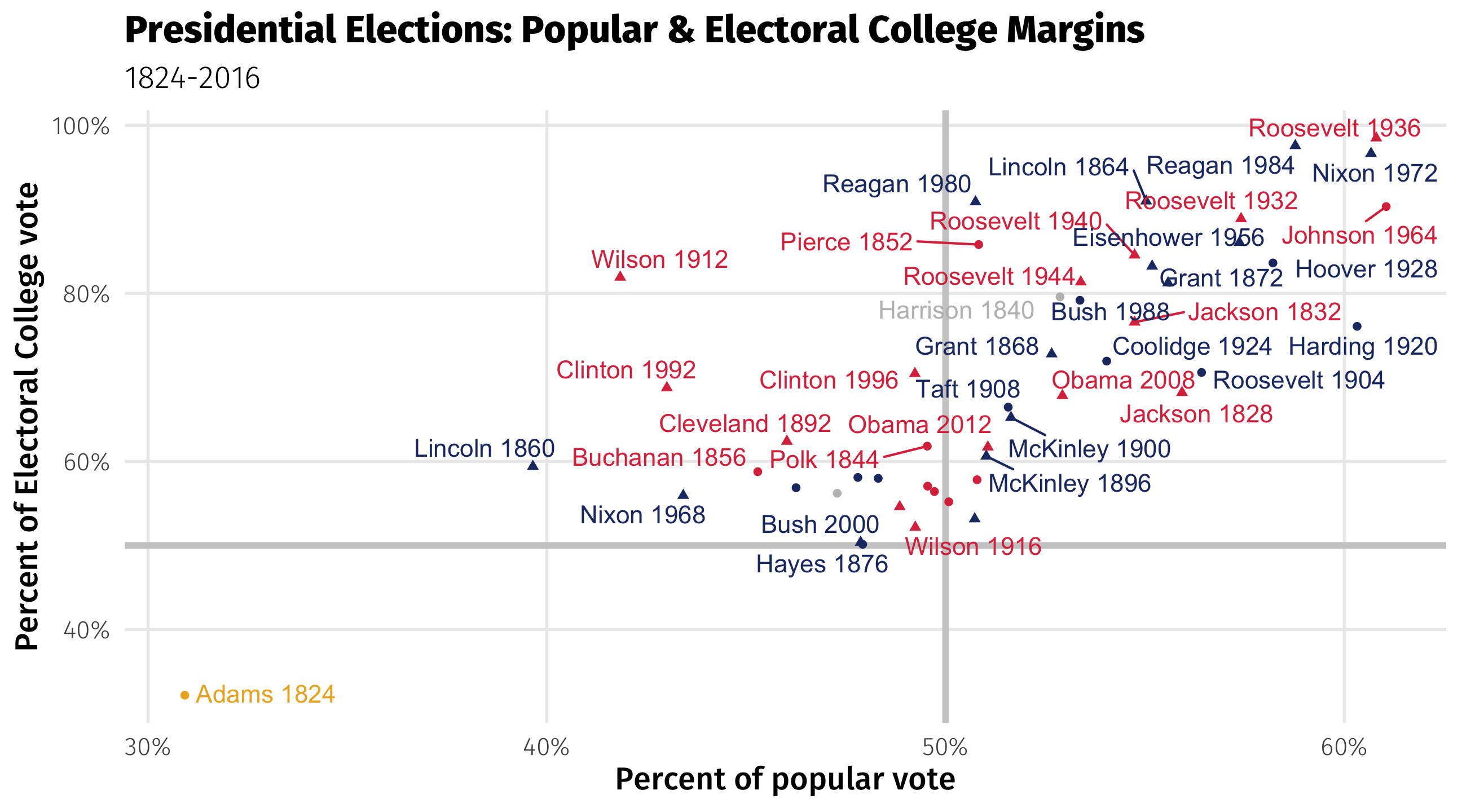
US Presidents